Core concepts
Workspace
Workspace
app.navattic.com/your-company.Product demo
Product demo
Copilot
Copilot
Agent demo
Agent demo
Building demos
Capture
Capture
- Web captures are interactive copies of your application that form the foundation of your demo
- Media captures include static screenshots, videos, or GIFs
Capture collection
Capture collection
Capture editor
Capture editor
- From a capture collection, click any capture and select Edit
- From a capture collection, select the three dots and click Edit capture
- From the flow builder, click any capture in a step and select Edit
Click to Capture
Click to Capture
Flow
Flow
Flow builder
Flow builder
Bulk editor
Bulk editor
Checklist
Checklist
Demo types
Interest area
Interest area
Interest level
Interest level
Sandbox demo
Sandbox demo
Step types
Modal
Modal
Tooltip
Tooltip
Invisible step
Invisible step
Form step
Form step
Embed step
Embed step
- Calendar tools: Embed Calendly or ChiliPiper to let visitors schedule appointments without leaving your demo
- Forms: Embed Marketo or HubSpot forms directly into your demo
Video step
Video step
Flow features
Beacon
Beacon
Trigger
Trigger
Backdrop
Backdrop
Escape view
Escape view
Presenter mode
Presenter mode
Presenter notes
Presenter notes
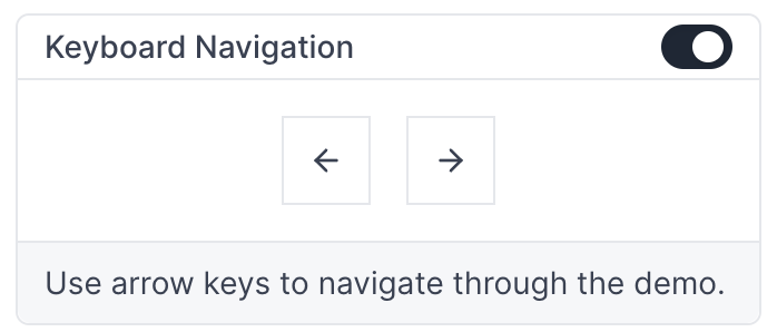
Keyboard navigation
Keyboard navigation
Personalization
Personalization variable
Personalization variable
{{property_name}}.Fallback value
Fallback value
Responsive options
Scale width
Scale width
Scale width and height
Scale width and height
Responsive
Responsive
Fixed
Fixed
Mobile options
Mobile options control how your demo appears on devices smaller than 800px wide, including most smartphones and smaller tablets.Mobile zoom
Mobile zoom
Mobile swipe demo
Mobile swipe demo
Mobile alert
Mobile alert
Mobile scaled view (legacy)
Mobile scaled view (legacy)
Sharing demos
Preview
Preview
Publish
Publish
Website embed
Website embed
- Inline embed: Scales to the size of its parent element
- Full page embed: Takes up the full height and width of the screen
- Pop up: Opens a Navattic pop up to reveal the demo
Lazy load embed
Lazy load embed
Share link
Share link
Password protection
Password protection
Expiration date
Expiration date
Tracking and integrations
Tracking scripts
Tracking scripts
Direct integrations
Direct integrations
Navattic JS
Navattic JS
Account-based engagement
Account-based engagement
Custom property
Custom property
Query parameter tracking
Query parameter tracking
Auto form tracking
Auto form tracking
Playbook
Playbook
Playbook run
Playbook run
Playbook replay
Playbook replay
Analytics
Unique visitors
Unique visitors
Engaged visitors
Engaged visitors
CTA clicks
CTA clicks
Click-through rate
Click-through rate
Completion rate
Completion rate
Drop-off
Drop-off
Time spent per session
Time spent per session
Steps viewed
Steps viewed
A/B testing
A/B testing
Pipeline impact
Pipeline impact
Conversion event
Conversion event
Visitors and accounts
Visitor
Visitor
Engaged
Engaged
Converted
Converted
Identified
Identified
Navigated
Navigated
Account
Account
Audience
Audience
Workspace organization
Theme
Theme
Board
Board
Label
Label
Team
Team
Version
Version
Workspace settings
Demo defaults
Demo defaults
Flow defaults
Flow defaults
Custom domain
Custom domain
demo.yourcompany.com. See custom domains for setup instructions.Offline demos
Offline demos
Launchpad
Launchpad
Demo library
Demo library
Hidden accounts
Hidden accounts
User roles
| Role | Create & edit demos | View & share demos | Invite teammates | Update billing |
|---|---|---|---|---|
| Admin | Yes | Yes | Yes | Yes |
| Builder | Yes | Yes | No | No |
| Viewer | No | Yes | No | No |
| Billing | No | No | No | Yes |