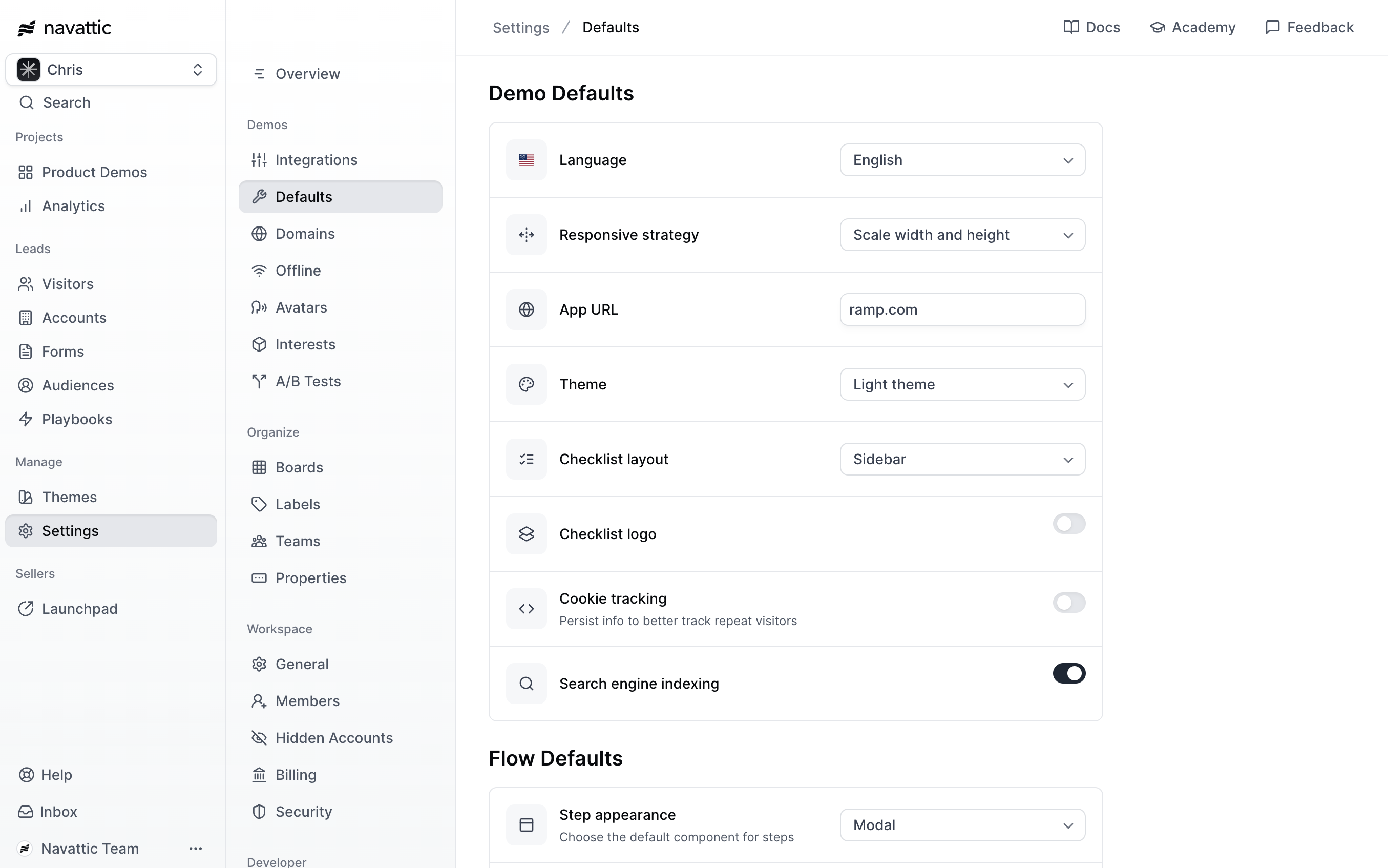
Demo Defaults
These settings are applied to all new demos in your workspace.- Language: Languages allows you to automatically translate your demo and find the share links for translated versions. You can use Language to determine the default language your demos should use.
- Responsive strategy: Navattic provides four different Responsive Strategies that determine how your Navattic demo appears on viewports of different sizes.
- App URL: Enter in a URL to automatically launch a Capture session to this site whenever a new Capture Collection is created.
- Theme: Themes allow you to customize your demo with your company brand. Navattic comes prepared with a Light Theme and a Dark Theme. You can duplicate an existing Theme to make edits, or select “Create new” to start from scratch
- Checklist layout: Determine whether your Checklist uses the Sidebar or Floating layout.
- Checklist logo: Add a default logo to your Checklists.
- Cookie tracking: Control whether cookies are stored when viewers interact with your demos. Toggle off to disable all tracking. When enabled, choose between Events (track engagement events only) or Events + forms (track events and persist form fills across sessions).
- Search engine indexing: Enable or disable search engine indexing.
Flow Defaults
These settings are applied to all new Flows in your workspace. Keep in mind that a demo can include multiple Flows; see above for demo-level defaults.- Step appearance: Select one of our five Step Types to set as the default when creating a new flow or adding steps to an existing one.
- Backdrop: Adding a backdrop with your Tooltip can help highlight important elements, even on a smaller mobile screen.
- Beacon: A Beacon is a small pulsing dot or highlight attached to an element within your Capture. A step may contain multiple Beacons.
- Navigation buttons: Navigation buttons add “Next” and “Back” buttons to all of your Modals and Tooltips.
- Step progress: Include a step count in your Modals and Tooltips.
- Escape view: This introduces a CTA step when a user exits your demo
- Keyboard navigation: Use your keyboard arrows to navigate through the demo
- Presenter mode: Press “Ctrl + P” to make dialog boxes disappear