

The Themes section is only visible to members whose role has theme permission enabled.
Workspace admins can manage theme permissions per role at Settings > Roles. Setting a
theme as your workspace default requires the Admin role.
1
Create a theme
Navattic comes prepared with a Light Theme and a Dark Theme. Themes are available to all members of your Workspace. Once created, apply your Theme to any Flow or Checklist in order to view changes.Go to Themes > Create theme and choose how to start:
- Extract my brand colors: enter your website or app URL under Your website or app URL, then click Create. Navattic reads the site and fills in the accent, text, and background colors, the corner radius, and a matching font style, then names the theme after the site. Anything it cannot find keeps the Navattic default, so review the colors before you use the theme.
- Start from an existing theme: pick a published theme under Select existing theme to work from a copy of it. The copy opens with
(copy)added to its name, and the theme you copied is untouched. - Start from scratch: opens a new Untitled Theme built on the defaults.
If extracting brand colors fails, Navattic shows Failed to create theme from website and the modal stays open. Check the URL, or start from scratch and set the colors yourself.
2
Apply a theme
To apply a Theme to your demo, navigate to a Product Demo > Build > Theme. Apply a single theme throughout your entire demo, or select a different theme for each flow.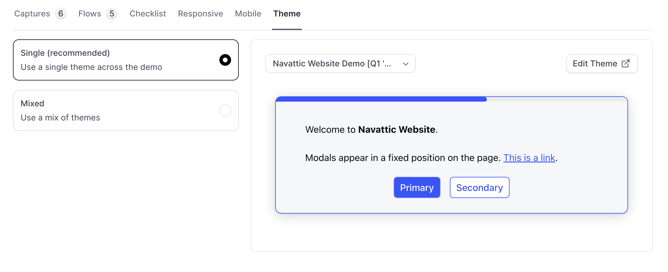
FAQs
How can I customize my theme colors?
How can I customize my theme colors?
To customize your theme colors, go to Themes. The simple editor provides three color inputs: Accent, Text, and Background. These colors automatically apply to all demo elements including buttons, beacons, tooltips, and more.To access the full token editor, click the Advanced editor button at the bottom of the theme sidebar.
How can I change the font?
How can I change the font?
To edit the font used in your demo, go to Themes > Shared styles > Typography. You can edit the font family, font color, size, line height, link color, and link hover color. You can also upload a custom font.Font style presets available are: Sans, Serif, and Mono.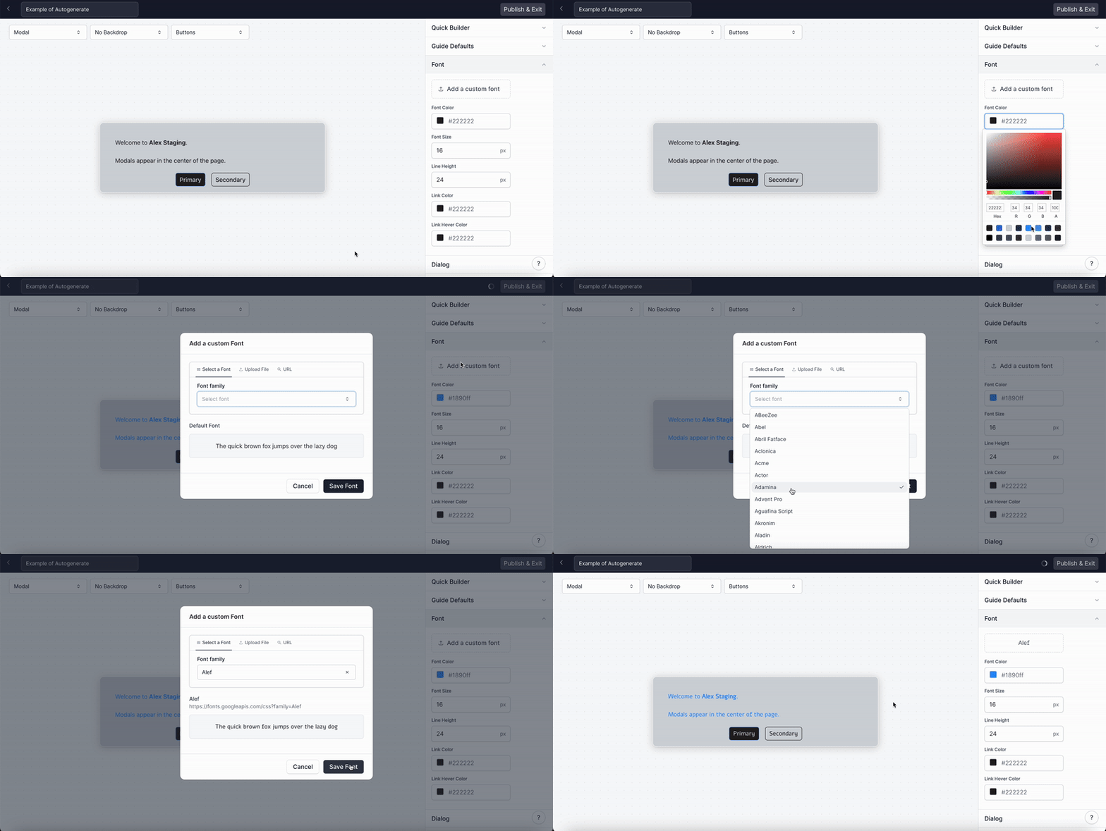
To customize a Button, go to Themes > Select Buttons in the shared styles panel. From here you can edit the Button border, text color, background color, font weight, and padding.Buttons have three state tabs: Default, Hover, and Active (the pressed state). You can customize background, border, and shadow for each state on both Primary and Secondary button variants.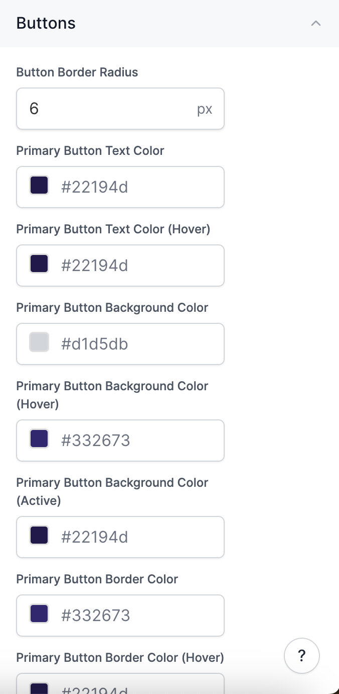
How do I edit the Beacon color and size?
How do I edit the Beacon color and size?
To edit the color and size of the Beacon, go to Themes > Select Beacons in the menu on the right.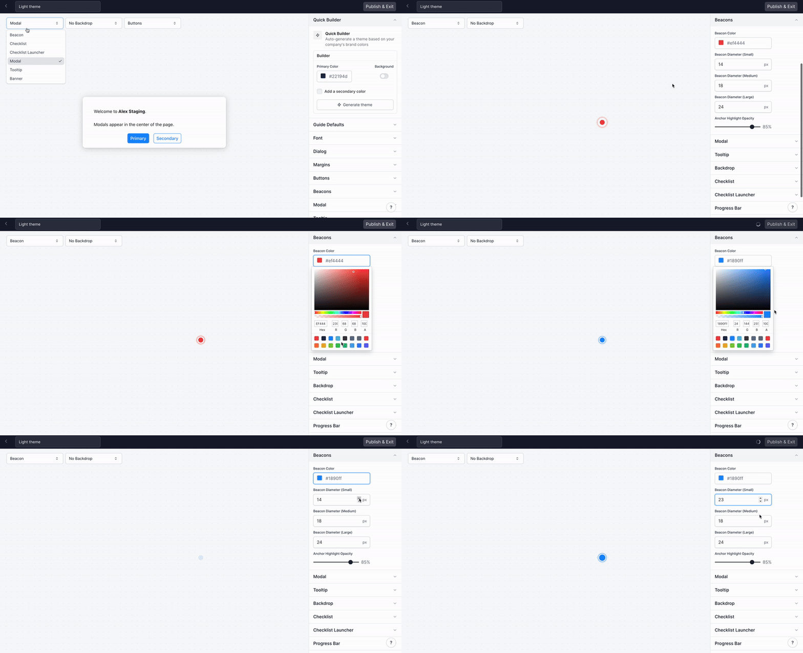
How can I change the modal width?
How can I change the modal width?
To edit the modal width, go to Themes > Select Modal in the menu on the right. Use the arrows to change the modal width. This will change the width of all modals in demos with this Theme.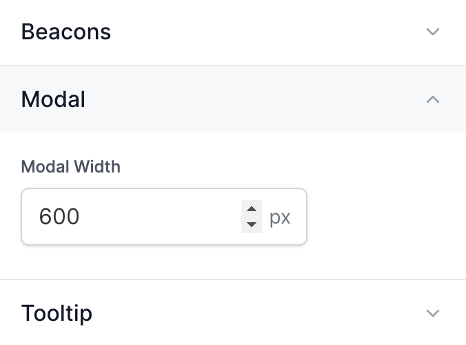
How can I customize the width of my Tooltips?
How can I customize the width of my Tooltips?
To edit the Tooltip width, go to Themes > Tooltip. Use the arrows to change the Tooltip widths for
Small, Medium, and Large. Check out
Customize Tooltip Width
for more details.
How do I edit the Checklist background color, border, and font?
How do I edit the Checklist background color, border, and font?
To edit your Checklist background color and border, go to Themes > Use the dropdown to select Checklist > Select Surfaces.To edit the typography in your Checklist, select Typography directly above Surfaces. Make sure to Publish & Exit after making changes to your Checklist.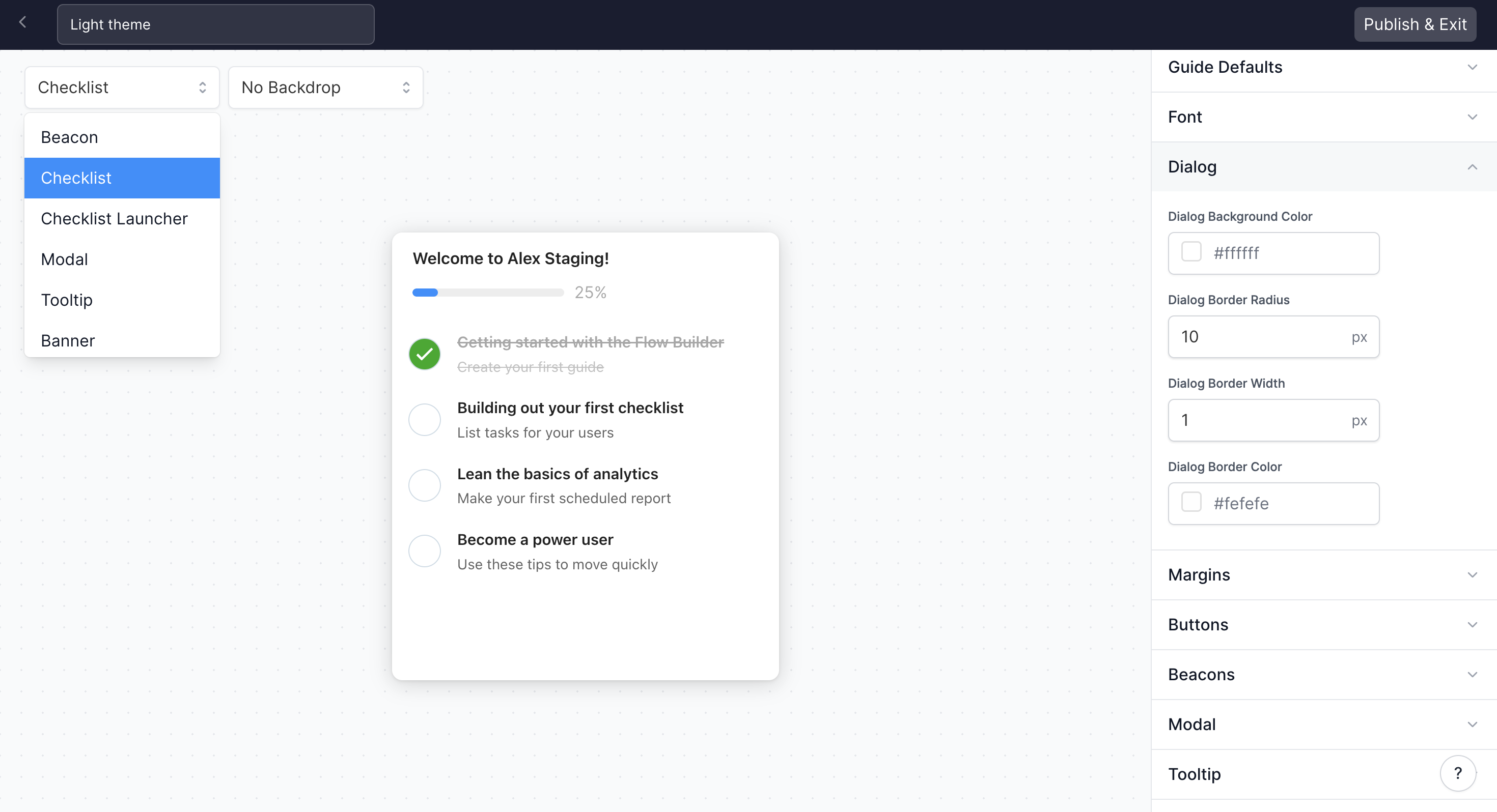
How do I edit the Checklist checkmark color and task completion decoration?
How do I edit the Checklist checkmark color and task completion decoration?
To edit the Checklist checkmark color visit Themes > Select Checklist in the right-hand menu.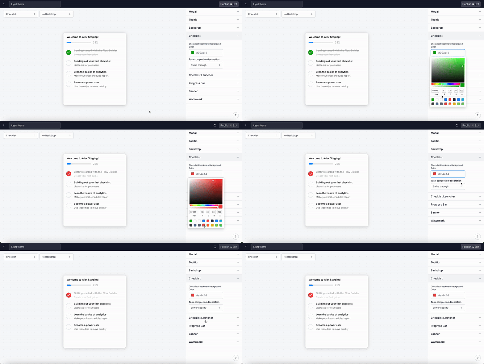
How do I edit the Checklist Launcher?
How do I edit the Checklist Launcher?
To edit the Checklist Launcher visit Themes > Select Checklist Launcher in the right-hand menu.You can edit the placement, the horizontal and vertical padding, the border radius, the background color, the text color, and the font weight.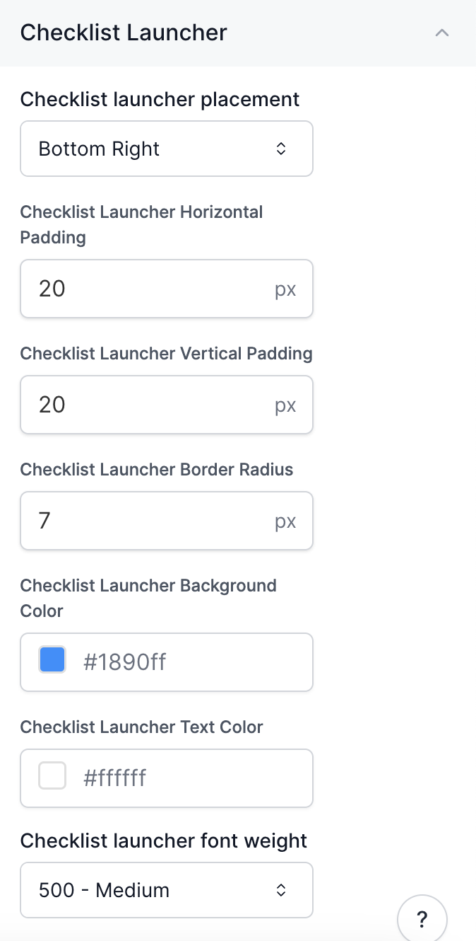
How do I edit the Progress Bar?
How do I edit the Progress Bar?
To edit the Progress Bar (for your Modals, Tooltips and Checklist), visit Themes > Shared styles > Progress bar. Select “Show checklist progress bar” to turn on the Progress Bar for Checklists or “Show dialog progress bar” to turn on the Progress Bar for Modals and Tooltips.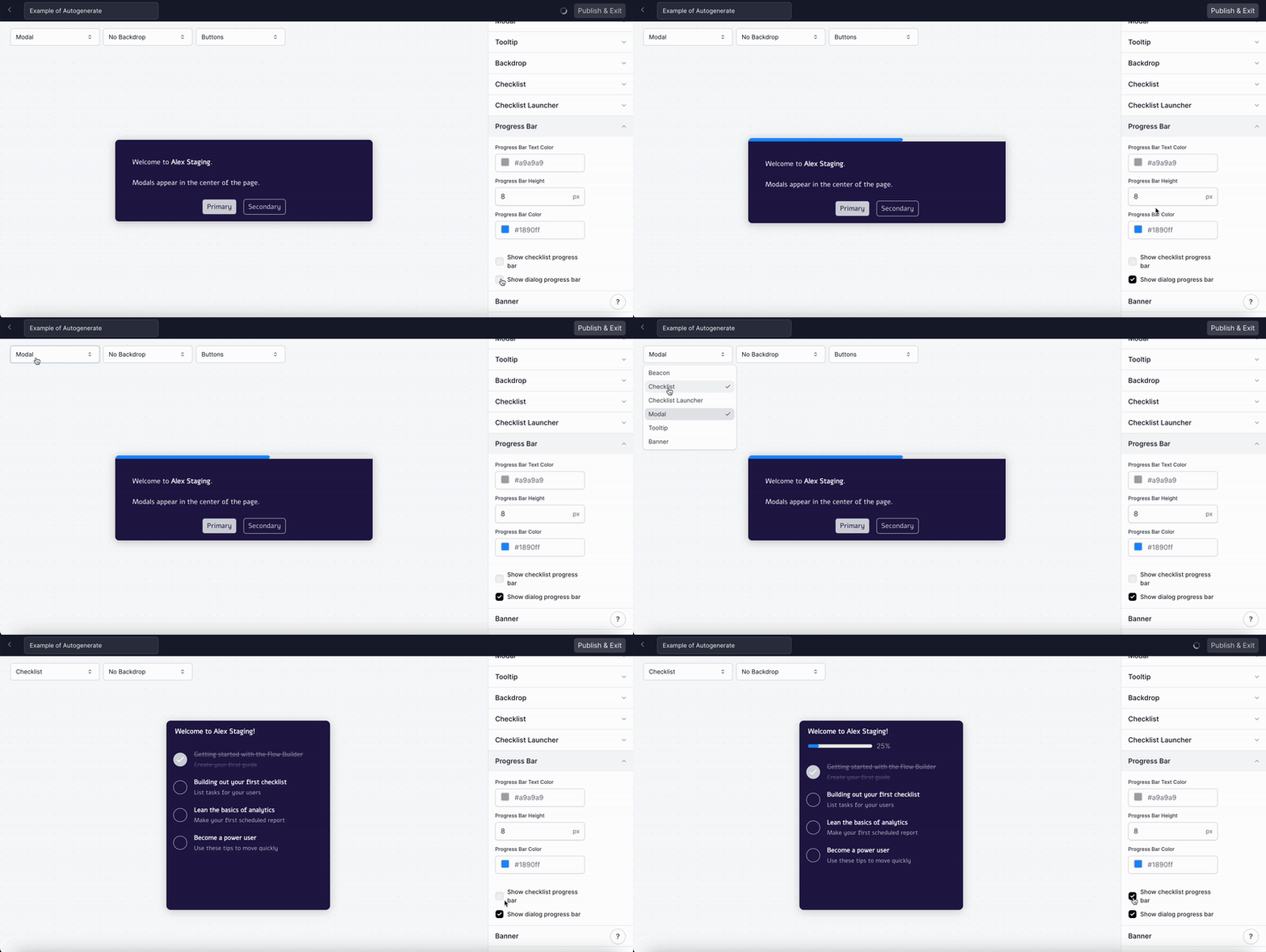
To preview what the Progress Bar will look like for Modals, Tooltips, or the Checklist you can use
the dropdown menu in the top left-hand corner.
Visit Themes > Banner to create a custom CTA Banner for your demos. Customize the banner’s colors, text, and linked resources. Publish & Exit to add your banner to existing projects.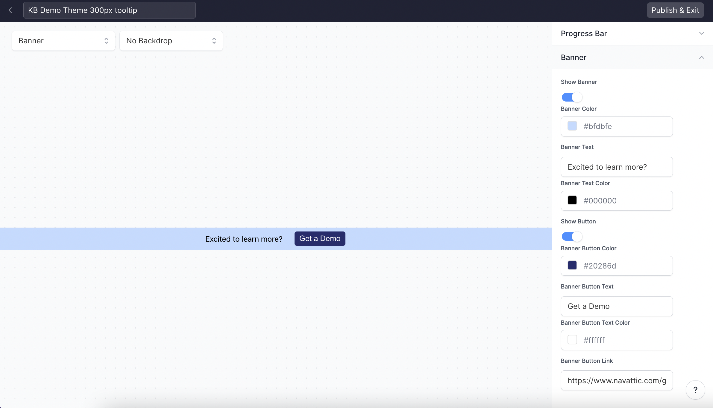
How can I add a custom watermark to Tooltips and Modals?
How can I add a custom watermark to Tooltips and Modals?
Visit Themes > Shared styles > Watermark to upload an image to be used in Modals and Tooltips, and set your watermark’s position, CTA link, and opacity.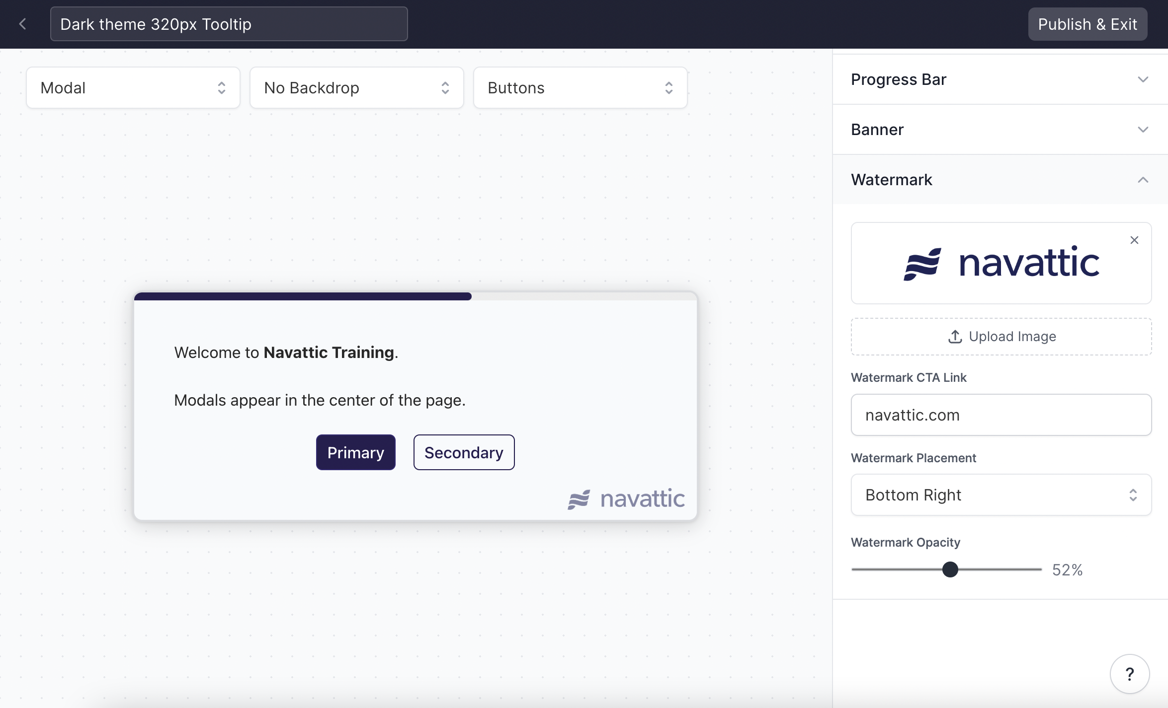
How can I change the Tooltip Border Color when paired with a Backdrop?
How can I change the Tooltip Border Color when paired with a Backdrop?
Visit Themes > Tooltip > Anchor backdrop highlight color to change the backdrop border color.
Check out how to
add a backdrop to your Tooltip.
What is the Advanced editor?
What is the Advanced editor?
The Advanced editor gives you direct access to the full theme token editor, where you can customize every design property in your theme. To open it, click Advanced editor at the bottom of the theme sidebar.Use the Advanced editor when the simple editor’s controls don’t cover what you need.