- Is your goal to create a high-level overview or to showcase a detailed portion of your product?
- How do you want users to interact with your product during the demo? (ex. Click a button, type a string of text, explore a dashboard)
- This storyboard template may help plan the steps for your Flow.
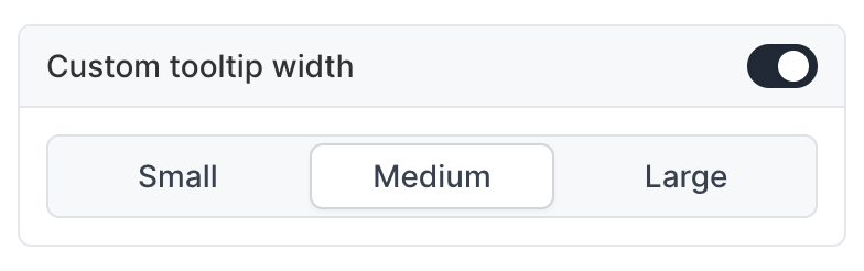
Step Appearance
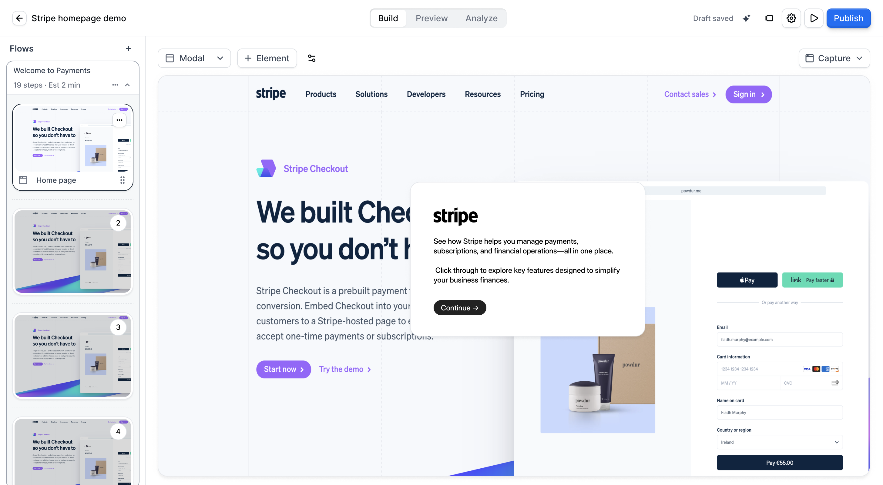
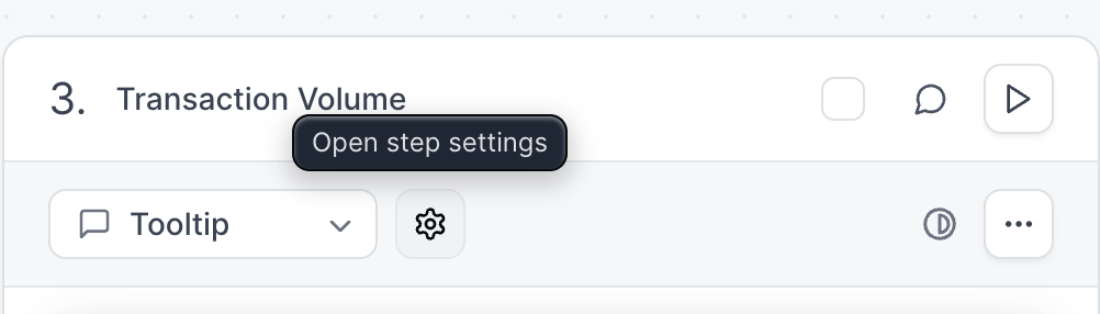
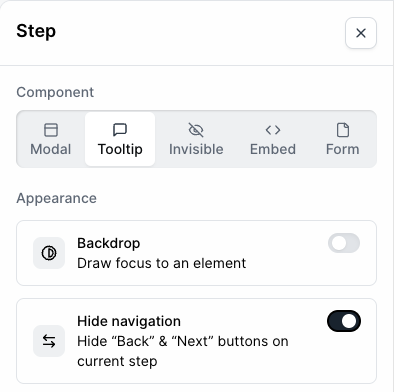
The Flow Builder contains different step types to help create an engaging demo. To change step types, click the description on your desired step and select an option from the right-hand menu that appears.- Modal
- Tooltip
- Invisible Step
- Form
- Embed
- Video
Interactive Elements
Interactive elements provide additional ways for users to interact with your product. By default, engaging with these elements will send the user to the next step (this is a “click action”). You can adjust the click action to be one or more of the following:- Beacon
- Input Trigger
- Timer Trigger
- Element Trigger
- Voiceover
- Avatar
Editing Rich Text
The Rich Text editor allows you to format the content inside of the Dialog. You can add headings, lists, links, and use Copilot to improve writing, fix grammar, or adjust length.- Image
- Video
- Personalization
Flow Settings
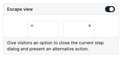
From the Flow Builder, click Settings to customize your demo further. Here you can:- Escape view
- Continue behavior
FAQs
How do I add additional media files to a Flow?
How do I add additional media files to a Flow?
How should I end my Flow?
How should I end my Flow?
How do I use Navigation Buttons and CTA Buttons together?
How do I use Navigation Buttons and CTA Buttons together?
How can I highlight multiple elements in a single step?
How can I highlight multiple elements in a single step?
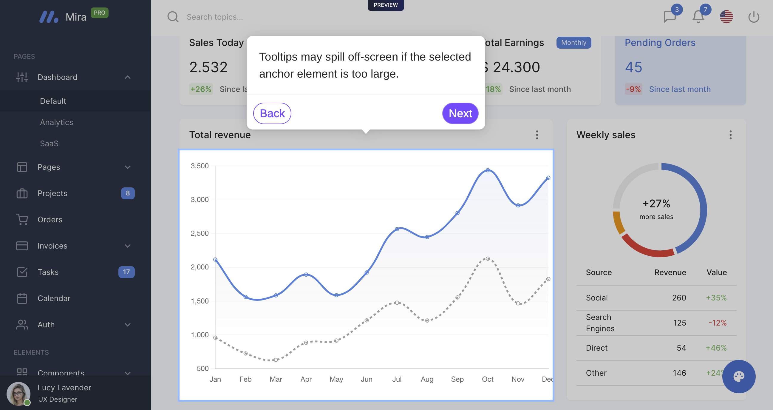
How do I fix a Tooltip that appears to run offscreen?
How do I fix a Tooltip that appears to run offscreen?
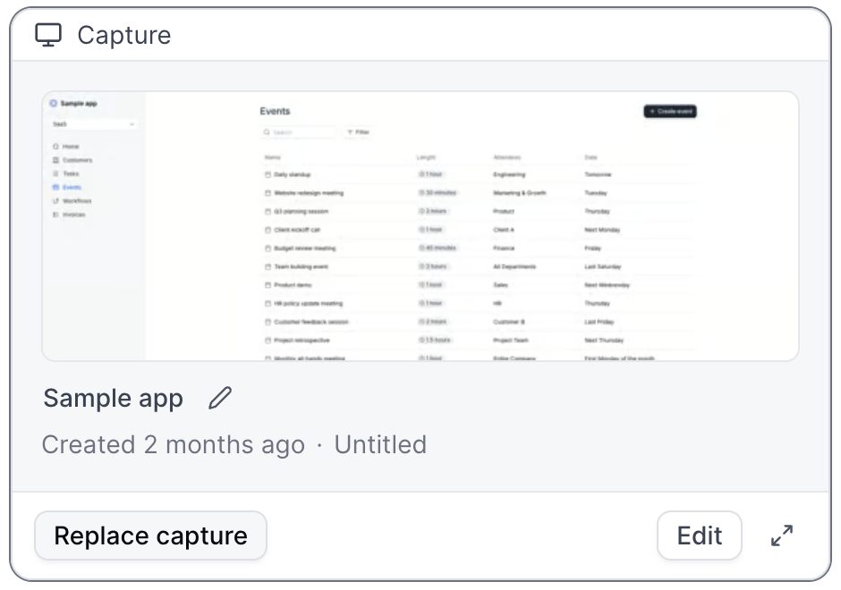
How do I replace Captures within a Flow?
How do I replace Captures within a Flow?
How will the Escape View appear in a Flow?
How will the Escape View appear in a Flow?
When should I include a Form in my demo?
When should I include a Form in my demo?
I am unable to select elements within the Flow builder.
I am unable to select elements within the Flow builder.
How do I enable a text input trigger?
How do I enable a text input trigger?
Can I highlight elements without using Tooltips?
Can I highlight elements without using Tooltips?
Can I make edits across multiple steps at once?
Can I make edits across multiple steps at once?
- Updating all beacons to triggers
- Turning multiple modals into tooltips
- Changing all beacons to have a highlight appearance instead of pulse
- Deleting multiple beacons or triggers at the same time
- Copying or Moving Steps to other Flows within your demo or to other Demos
- Deleting multiple steps at the same time
- and more!
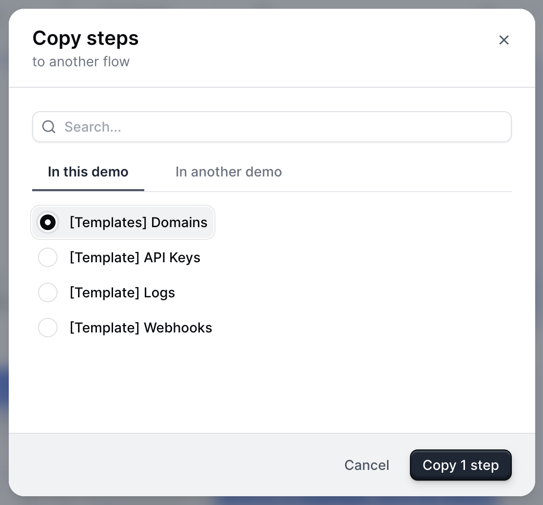
Can I copy or move steps into another Flow?
Can I copy or move steps into another Flow?
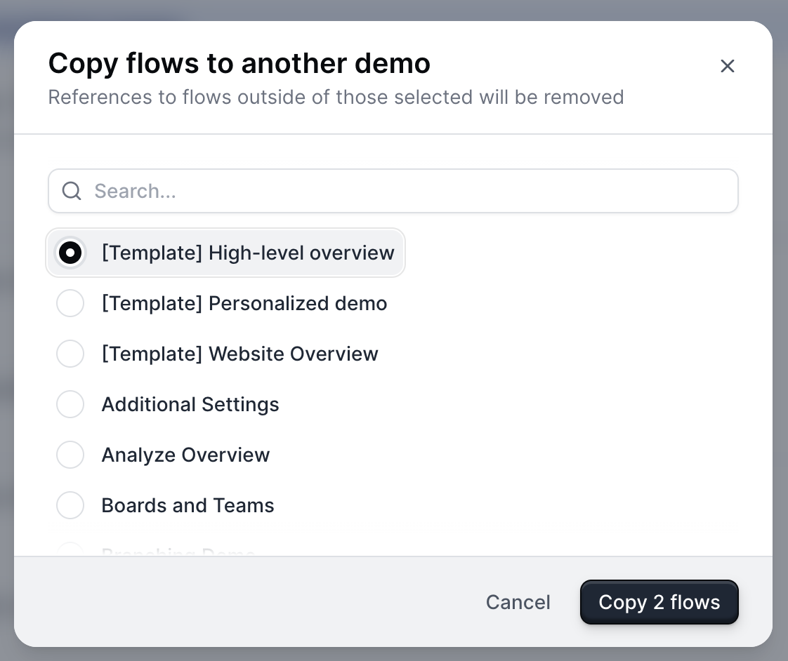
How do I copy or move a flow to another Demo?
How do I copy or move a flow to another Demo?
Can I add navigation buttons to my demo without using a Modal or Tooltip?
Yes, you can add navigation buttons without using a modal or tooltip by creating a Theme with a transparent dialog box and border.To create a Theme, visit Themes > + Create theme. From here, select Dialog > Dialog Background Color > use the opacity slider under the color picker to make the dialog box transparent. Repeat this step with the Dialog border color.Learn more about Themes.Can I add navigation buttons to my demo without using a Modal or Tooltip?
Can I add navigation buttons to my demo without using a Modal or Tooltip?
Can I include superscript formatting in a Modal or Tooltip?
Can I include superscript formatting in a Modal or Tooltip?
- Use https://lingojam.com/SuperscriptGenerator to generate the superscript.
- Copy/paste it into the Tooltip or Modal directly. No additional formatting is needed.