Web Captures
How do I capture a dropdown or popup menu?
How do I capture a dropdown or popup menu?
How do I edit a Capture after adding it to a Flow?
How do I edit a Capture after adding it to a Flow?
How do I edit the background when a popup or modal is present?
How do I edit the background when a popup or modal is present?
Magic Editors and Overlay and select Ignore Overlay. You may have to remove the Overlay on a few different layers before being able to access the element you are hoping to edit.How do I edit text in my Captures?
How do I edit text in my Captures?
I am unable to load the Chrome Extension.
I am unable to load the Chrome Extension.
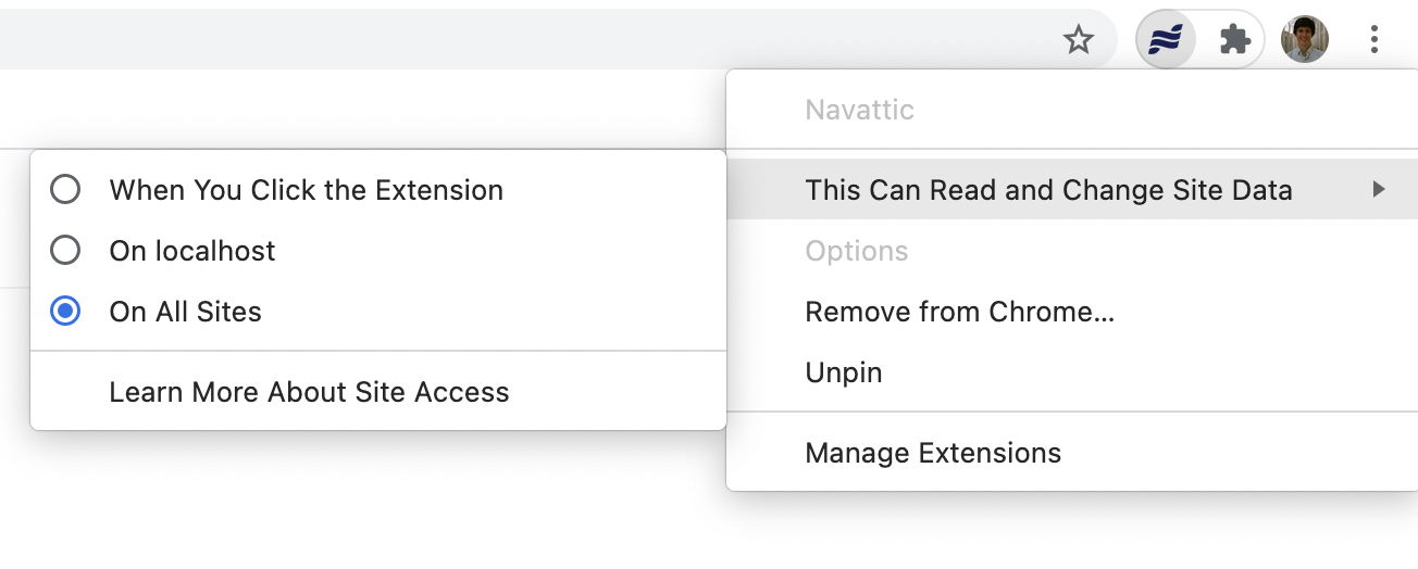
- Click on the Navattic icon in the Chrome extension bar. If it’s not visible click the puzzle icon and select it from the dropdown menu (click the pin to add it to the extension bar).
- Open the tab “This Can Read and Change Site Data”
- Select the appropriate sites
-
Refresh app.navattic.com and any pages that you have open where you want to run the extension.
How can I take a Web Capture of a Figma file?
How can I take a Web Capture of a Figma file?
Media Captures
Can I add device borders to a screenshot?
Can I add device borders to a screenshot?
How can I get my screenshot to better fit the device borders?
How can I get my screenshot to better fit the device borders?
Can I edit a media capture using the Capture Editor?
Can I edit a media capture using the Capture Editor?
What is the recommended resolution for screenshots in Navattic?
What is the recommended resolution for screenshots in Navattic?
How do I avoid the need to scroll when using a device border?
How do I avoid the need to scroll when using a device border?
Flows
How do I add additional media files to a Flow?
How do I add additional media files to a Flow?
How should I end my Flow?
How should I end my Flow?
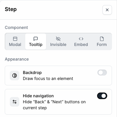
+ to add a Button to the Modal or Tooltip, or hide Navigation
Buttons on the last step if needed. This will make it clear to your end user that they have completed the demo and encourage them to convert.How do I use Navigation Buttons and CTA Buttons together?
How do I use Navigation Buttons and CTA Buttons together?
How can I highlight multiple elements in a single step?
How can I highlight multiple elements in a single step?
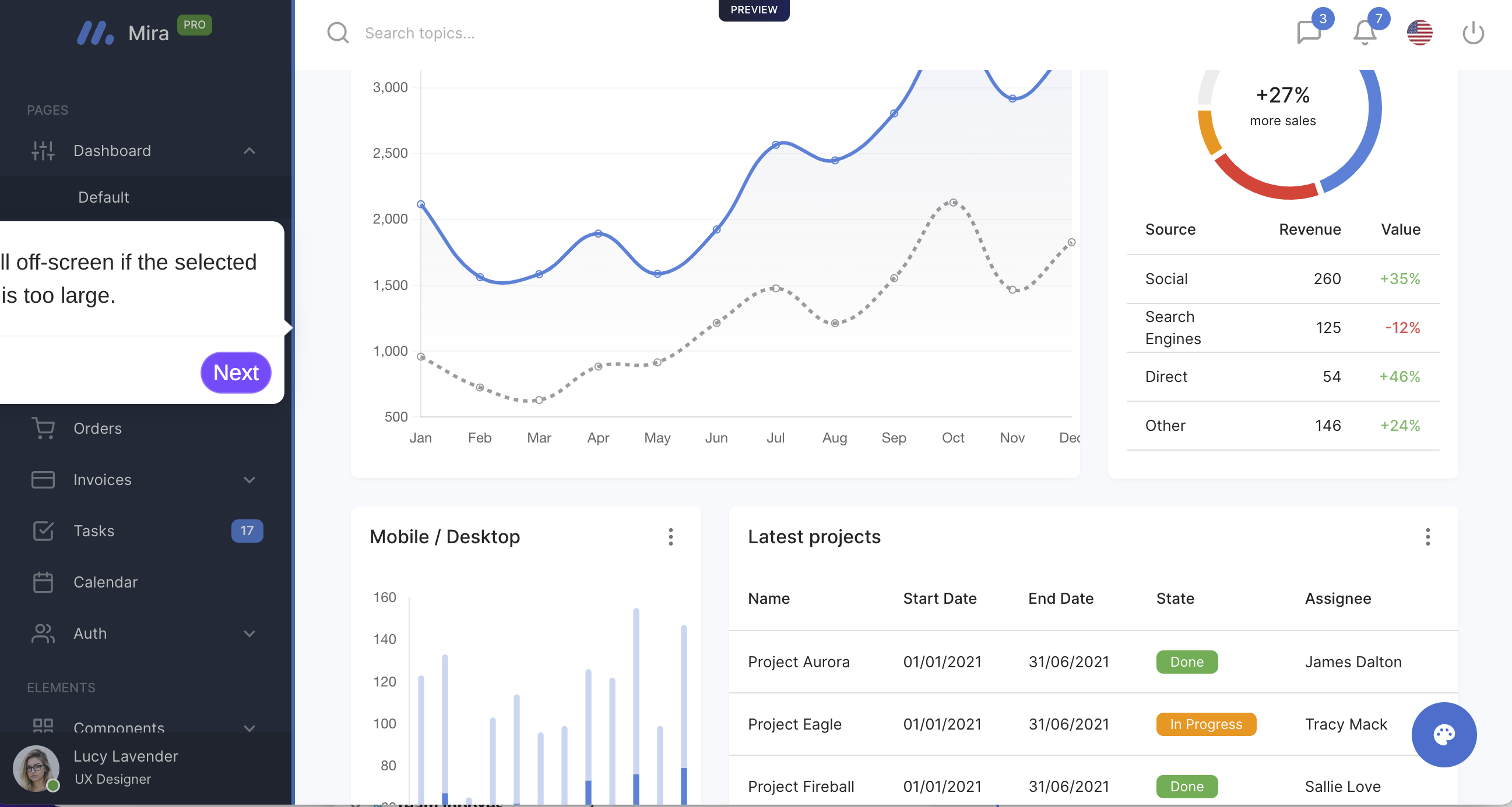
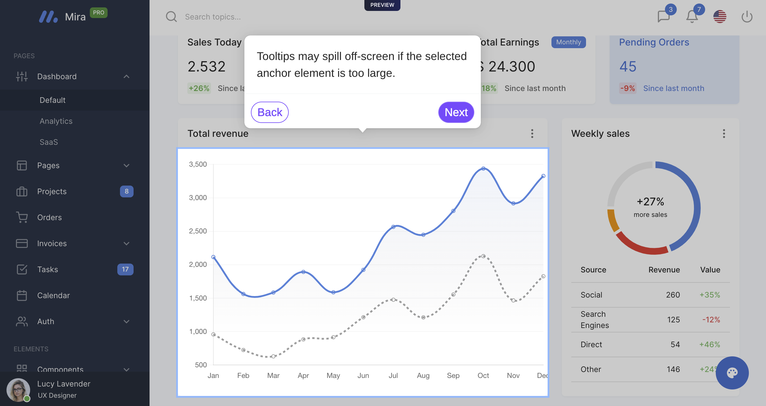
How do I fix a Tooltip that appears to run offscreen?
How do I fix a Tooltip that appears to run offscreen?
How do I replace Captures within a Flow?
How do I replace Captures within a Flow?
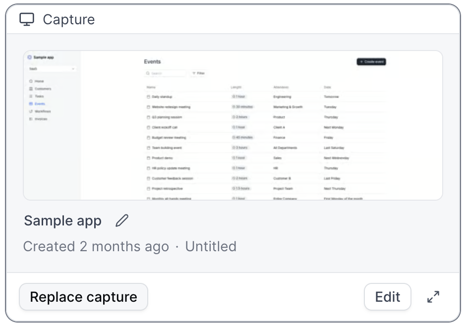
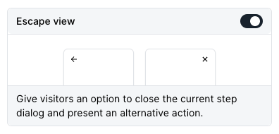
How will the Escape View appear in a Flow?
How will the Escape View appear in a Flow?
When should I include a Form in my demo?
When should I include a Form in my demo?
I am unable to select elements within the Flow builder.
I am unable to select elements within the Flow builder.
How do I enable a text input trigger?
How do I enable a text input trigger?
Can I highlight elements without using Tooltips?
Can I highlight elements without using Tooltips?
Can I make edits across multiple steps at once?
Can I make edits across multiple steps at once?
- Updating all beacons to triggers
- Turning multiple modals into tooltips
- Changing all beacons to have a highlight appearance instead of pulse
- Deleting multiple beacons or triggers at the same time
- Copying or Moving Steps to other Flows within your demo or to other Demos
- Deleting multiple steps at the same time
- and more!
Can I copy or move steps into another Flow?
Can I copy or move steps into another Flow?
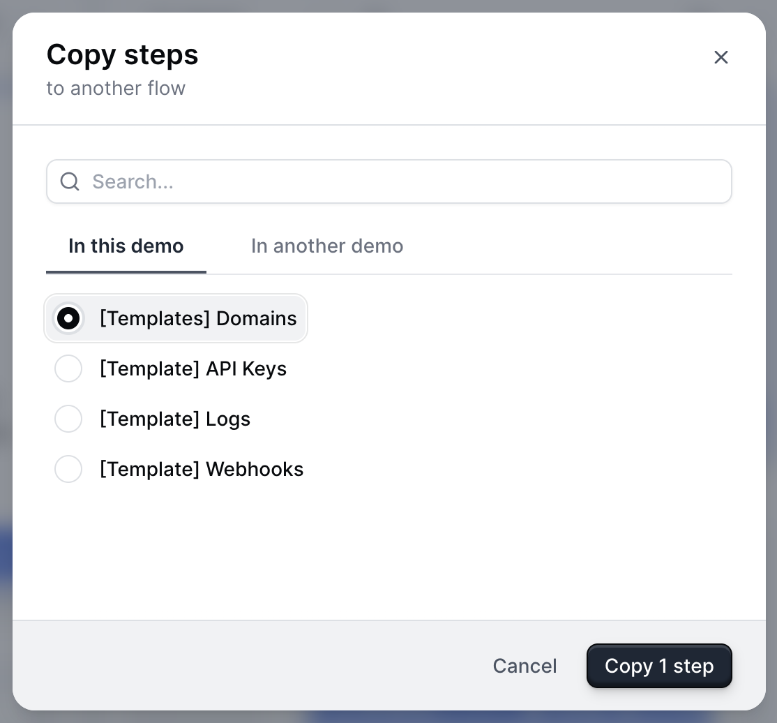
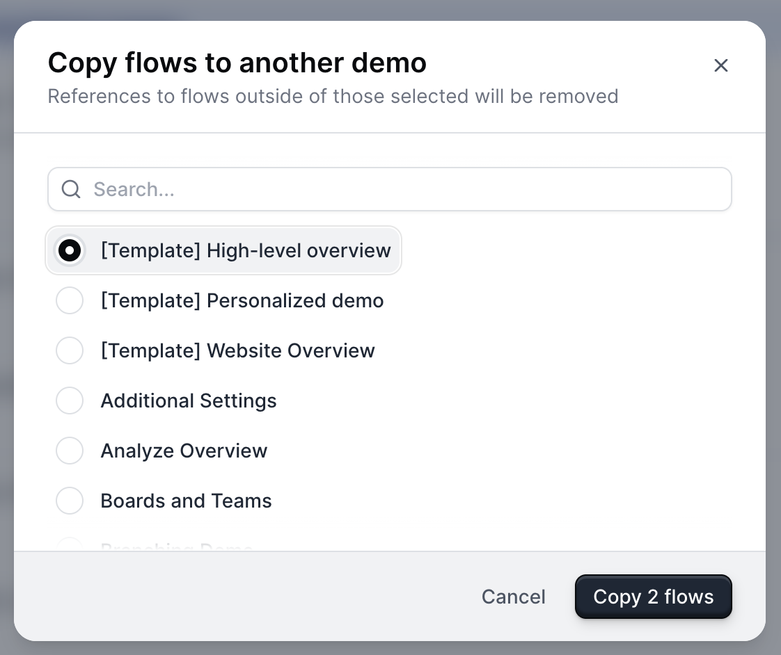
How do I copy or move a flow to another Demo?
How do I copy or move a flow to another Demo?
Can I add navigation buttons to my demo without using a Modal or Tooltip?
Yes, you can add navigation buttons without using a modal or tooltip by creating a Theme with a transparent dialog box and border.To create a Theme, visit Themes > + Create theme. From here, select Dialog > Dialog Background Color > use the opacity slider under the color picker to make the dialog box transparent. Repeat this step with the Dialog border color.Learn more about Themes.Can I add navigation buttons to my demo without using a Modal or Tooltip?
Can I add navigation buttons to my demo without using a Modal or Tooltip?
Checklists
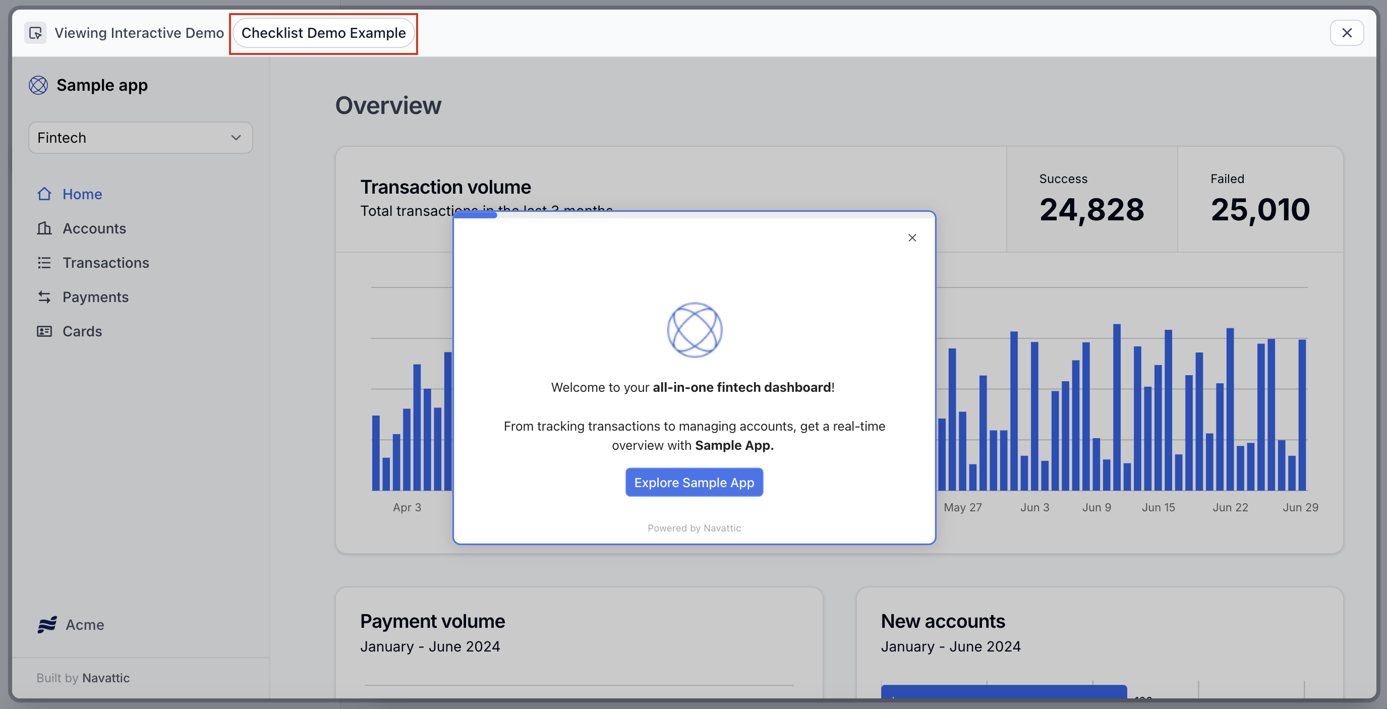
How do I make a Checklist appear for the viewer?
How do I make a Checklist appear for the viewer?
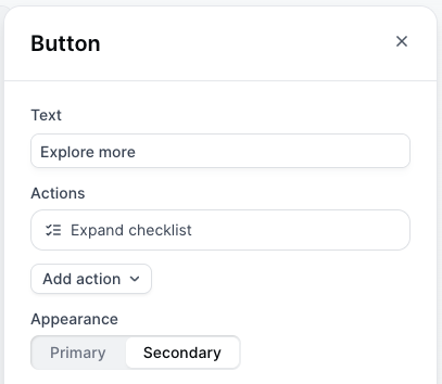
How do I adjust the appearance of my Checklist?
How do I adjust the appearance of my Checklist?
- Adjust the shape and size of your Checklist Launcher
- Change the color of the checkmark
How do I view the Checklist created?
How do I view the Checklist created?
How do I move my Checklist to the left or right of the screen?
How do I move my Checklist to the left or right of the screen?
How do I reset my progress in a Checklist?
How do I reset my progress in a Checklist?
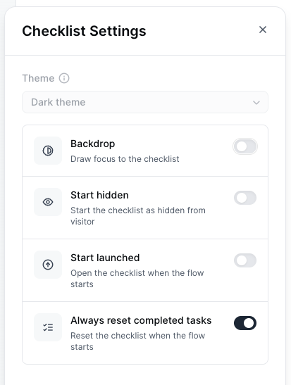
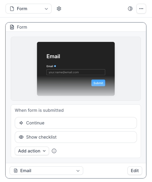
How do I hide my Checklist until after a Form is submitted?
How do I hide my Checklist until after a Form is submitted?
Share
How do I customize Product Demo links for sharing?
How do I customize Product Demo links for sharing?
How do I remove responsiveness from my Product Demos?
How do I remove responsiveness from my Product Demos?
How do I create a .GIF or Video (.MP4) of my Product Demos?
How do I create a .GIF or Video (.MP4) of my Product Demos?
How do I optimize a demo of a Mobile App for viewing on Mobile Devices?
How do I optimize a demo of a Mobile App for viewing on Mobile Devices?
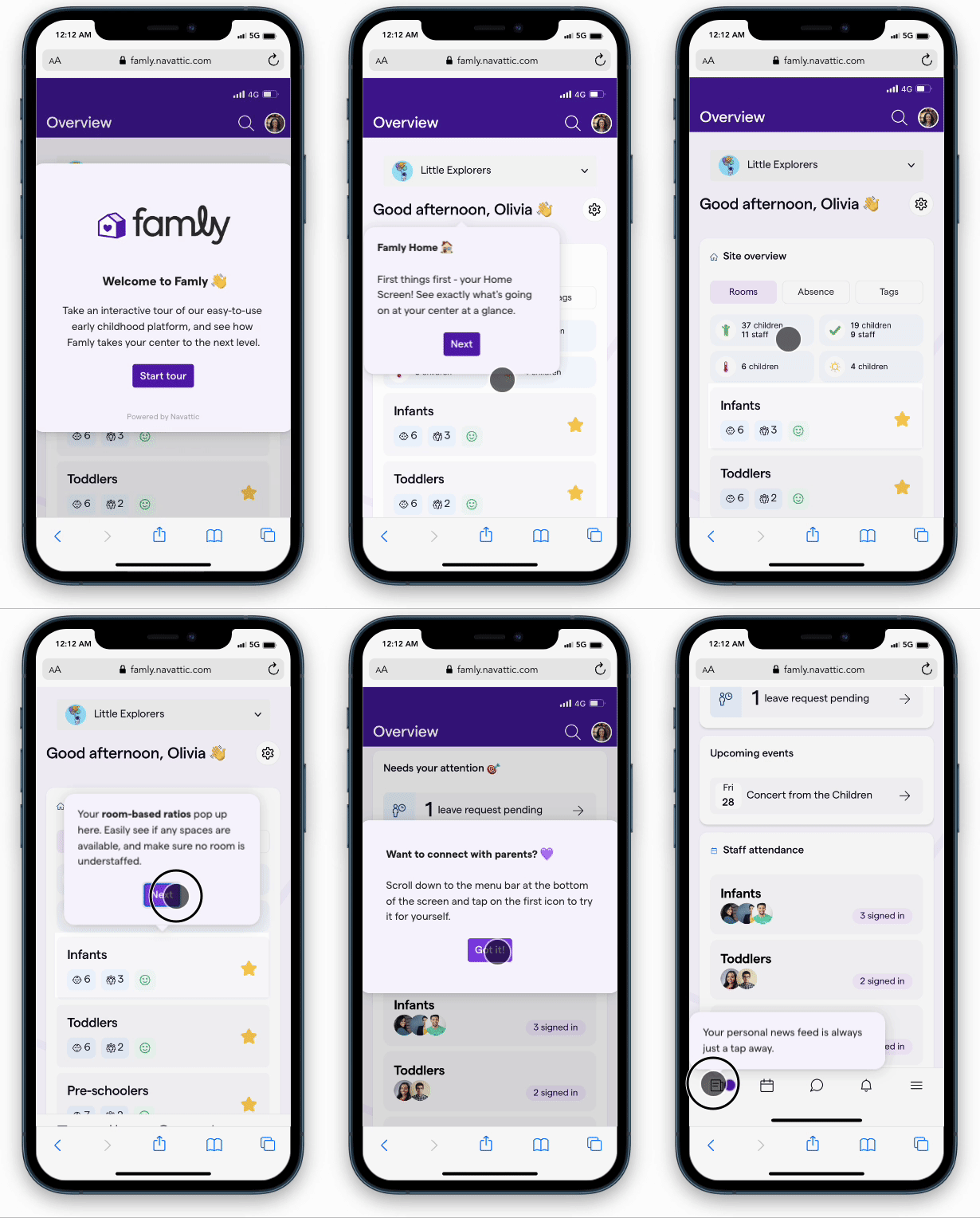
- If you are creating a demo of a Mobile Website rather than a Mobile App, here is a tutorial for taking scrollable screenshots of a Mobile Website. GoFullPage is a helpful browser extension for this.
- Use Tooltips rather than Modals to create an engaging experience
- Add a heavy backdrop to steps that include a Tooltip. This helps highlight important elements, even on a smaller mobile screen
- Add Beacons when necessary to show users where to click
- Include Navigation buttons to help users easily progress thorugh the demo
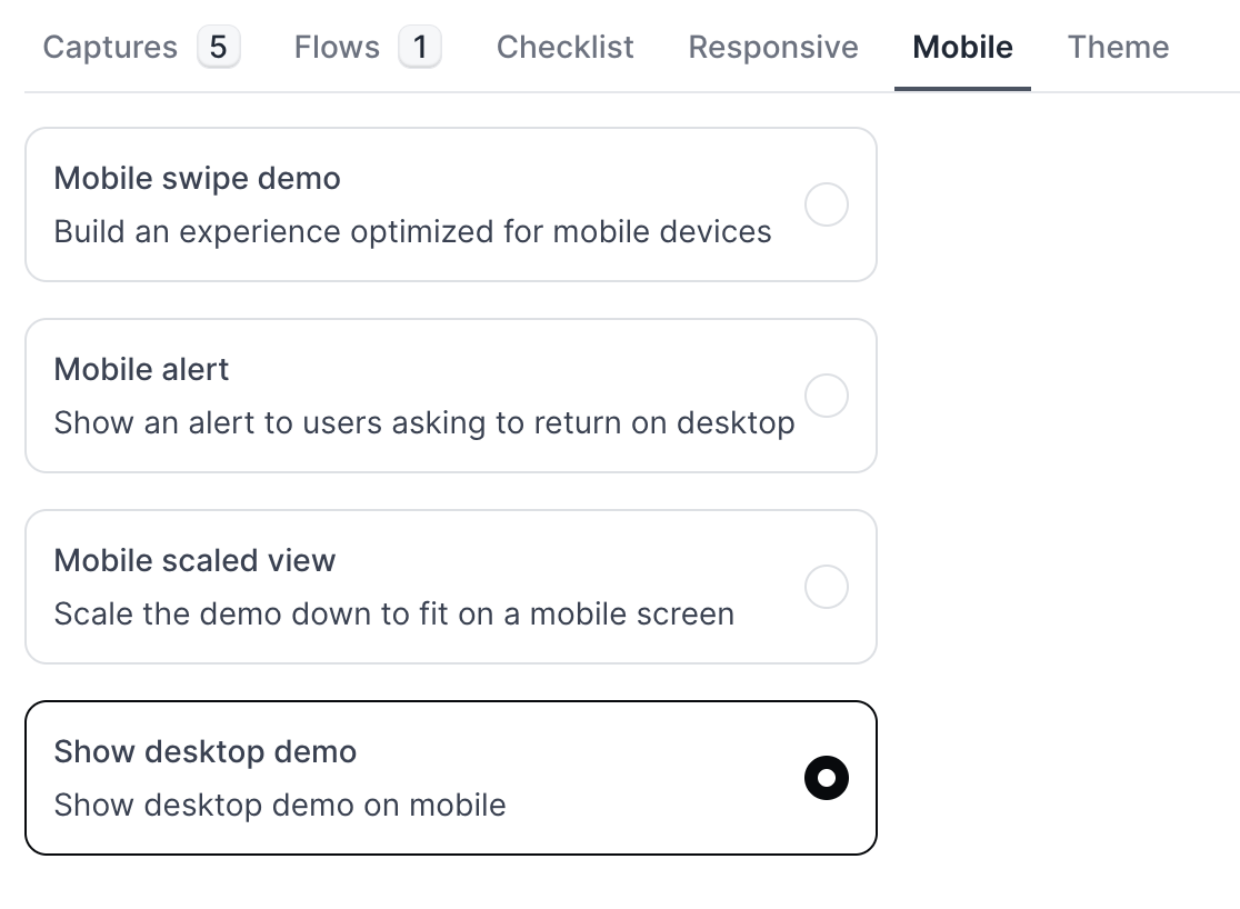
How can I set up my demo so visitors can select the desktop or mobile app based on their device?
How can I set up my demo so visitors can select the desktop or mobile app based on their device?
-
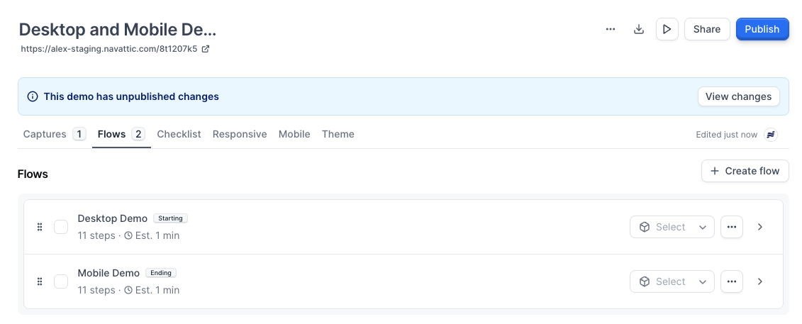
Build out two Flows in the same demo:
- Desktop App Demo: Follow these instructions to build a Flow of your desktop demo.
- Mobile App Demo: Check out the FAQ above to learn how to build a demo of a Mobile App for viewing on Mobile Devices.
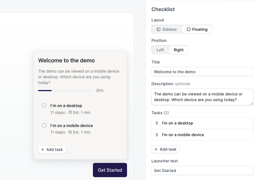
- Add a checklist to your demo: After building out the desktop Flow and mobile Flow in the same demo, add a checklist to your demo that will serve as the device selector.
- Set the checklist to “Floating”: This ensures that it takes up a small portion of the screen.
-
Add the two checklist tasks and update the descriptions to something like:
- **“I’m on a desktop” **— Directs users to the desktop version of your demo.
-
“I’m on a mobile device” — Sends mobile users to your mobile-optimized demo.
- Turn on “Start launched”: Within the Checklist Settings, toggle on Start launched, which ensures the checklist automatically opens when the demo loads, prompting the visitor to choose their experience right away.
-
(Optional but recommended) Enable “Backdrop” in the Checklist Settings:
This subtly dims the rest of the screen so the device selector stands out, reducing the chance a visitor misses it.
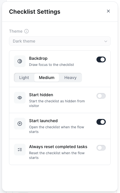
- Preview and publish: Test both paths to confirm the desktop and mobile flows open as expected. Once everything looks good, publish your demo.
How do I embed my demo in my Zendesk help center?
How do I embed my demo in my Zendesk help center?
How do I change the text in the banner of a Pop Up Embed Demo?
How do I change the text in the banner of a Pop Up Embed Demo?
Can the embedded demo automatically show the visitor’s preferred language based on location or browser settings?
Can the embedded demo automatically show the visitor’s preferred language based on location or browser settings?
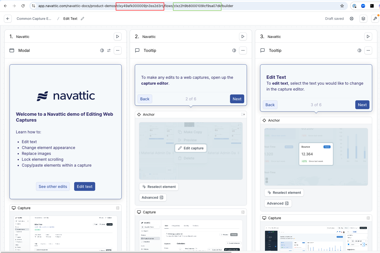
How do I link to a specific flow within a multi-flow demo?
How do I link to a specific flow within a multi-flow demo?
Can I add a full screen option to my embedded demo?
Can I add a full screen option to my embedded demo?
Tracking
How do I pass UTMs from a landing page URL into an embedded demo?
How do I pass UTMs from a landing page URL into an embedded demo?
- Use this resource by WickedReports to pass UTMs into the demo iframe.
-
Locate your iframe source (“iframe src”) in your demo embed code. It will look like this. Add your UTM_source to the end of this iframe src, as highlighted below.

- You will now see Visitor UTMs appear in your CSV export and your Visitors tab > expand a Visitor > “Tracking” section.
What are the app.navattic.com cookies used for?
What are the app.navattic.com cookies used for?
Does Navattic collect cookies for demo visitors?
Does Navattic collect cookies for demo visitors?
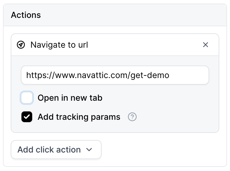
How can I add tracking parameters to CTA buttons?
How can I add tracking parameters to CTA buttons?
Visitor Analytics
How do I track converted Visitors in Navattic?
How do I track converted Visitors in Navattic?
How do I see the total number of Visitors for a Demo?
How do I see the total number of Visitors for a Demo?
How do I separate Product Demo Analytics for different embeds or links?
How do I separate Product Demo Analytics for different embeds or links?
Do demos with or without Forms see more user engagement?
Do demos with or without Forms see more user engagement?
Why are there a lot of Step 1 views?
Why are there a lot of Step 1 views?
Why are there more Views for later steps?
Why are there more Views for later steps?
How do I add UTMs to an embedded demo?
How do I add UTMs to an embedded demo?
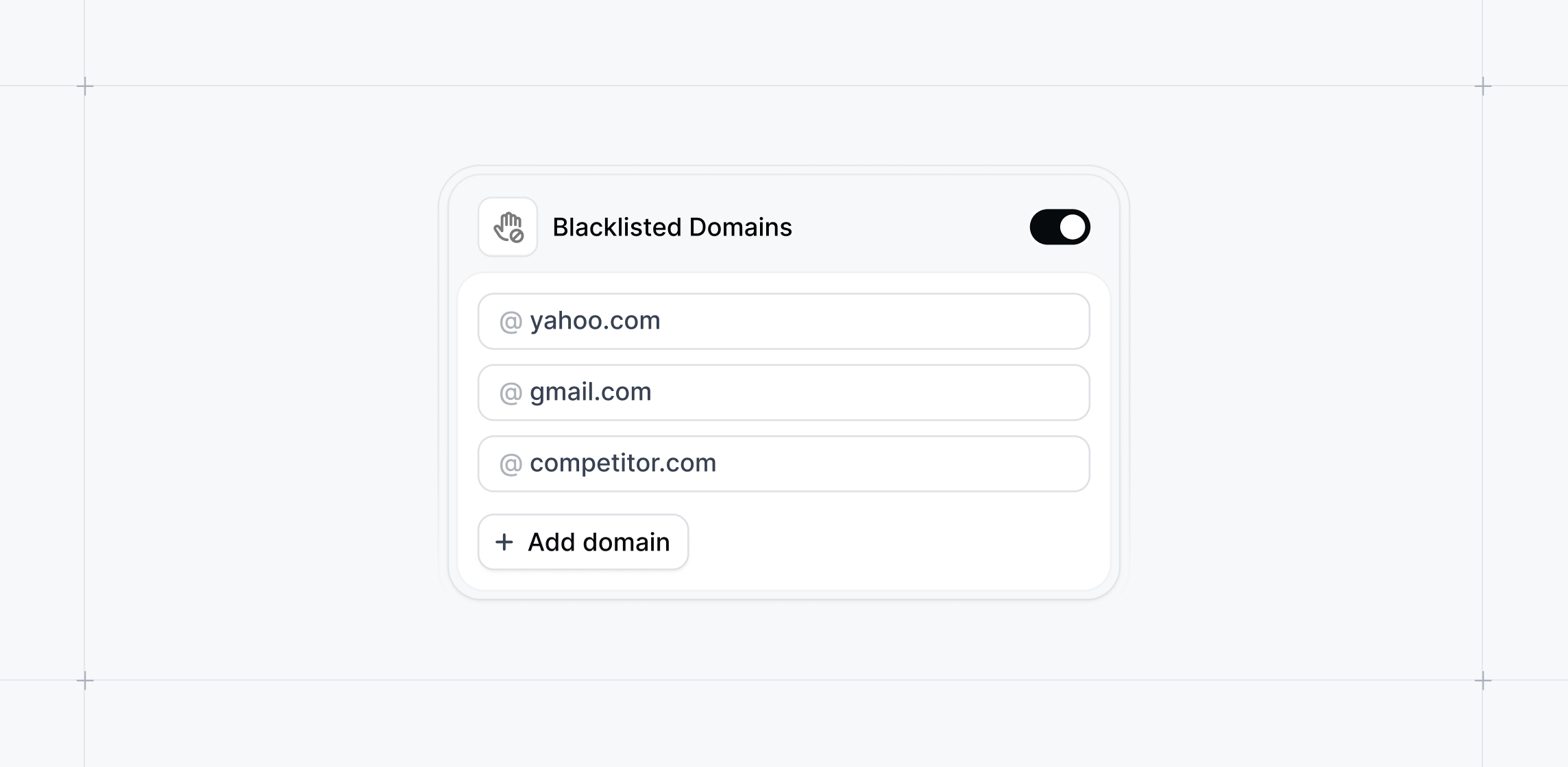
How can I configure my Navattic form to accept only business/work emails?
How can I configure my Navattic form to accept only business/work emails?
How can I block unwanted email domains from accessing my demos?
How can I block unwanted email domains from accessing my demos?
Themes
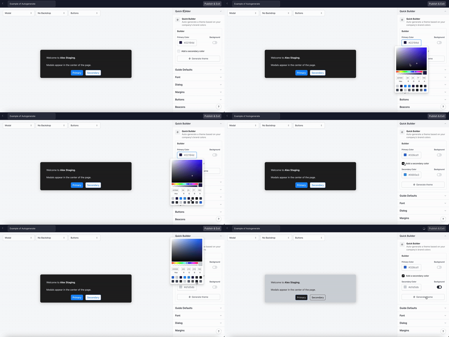
How can I autogenerate a Theme using my company colors?
How can I autogenerate a Theme using my company colors?
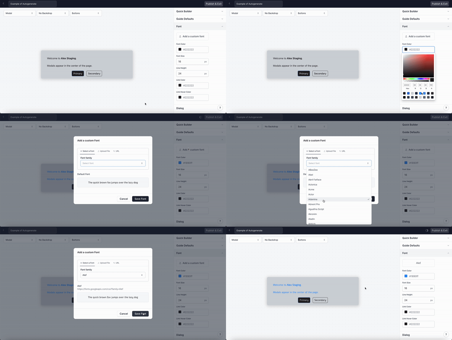
How can I change the font?
How can I change the font?
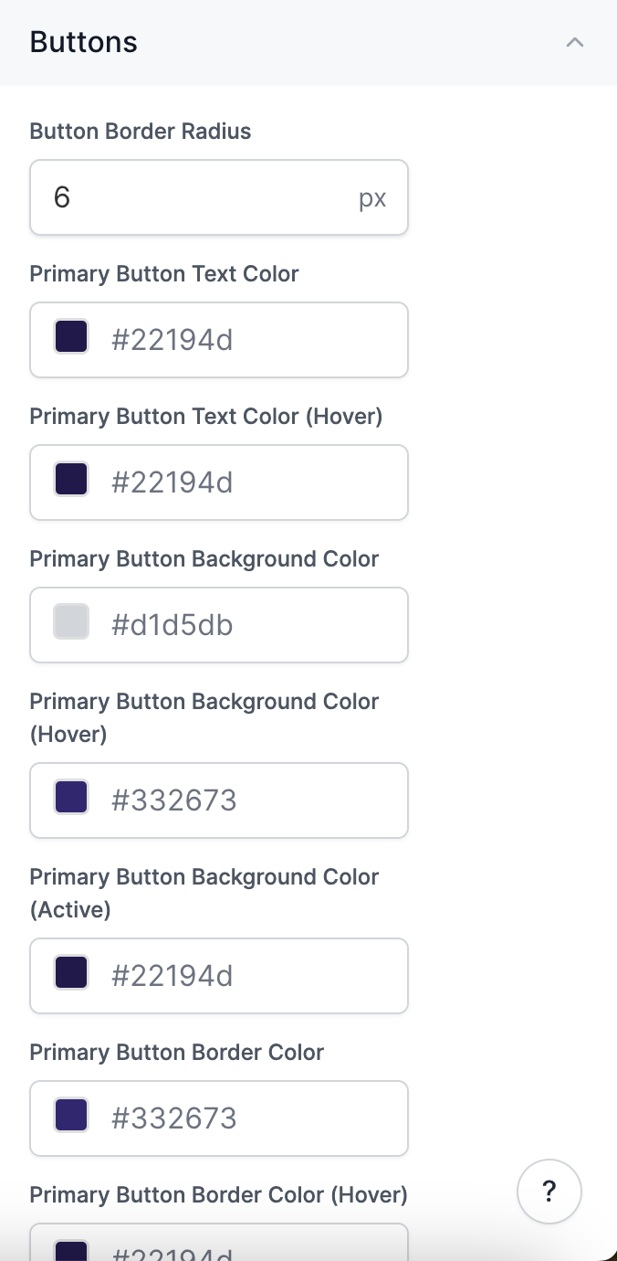
How do I edit the Button color and size?
How do I edit the Button color and size?
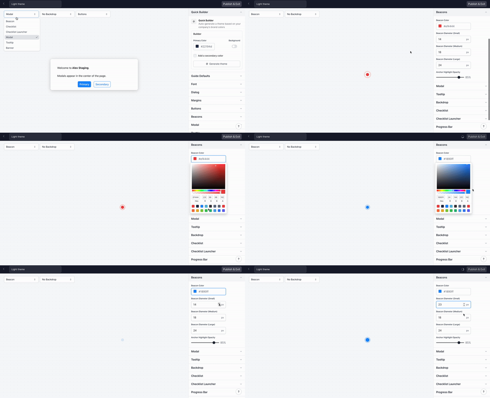
How do I edit the Beacon color and size?
How do I edit the Beacon color and size?
How can I customize the width of my Tooltips?
How can I customize the width of my Tooltips?
How do I edit the Checklist background color, border, and font?
How do I edit the Checklist background color, border, and font?
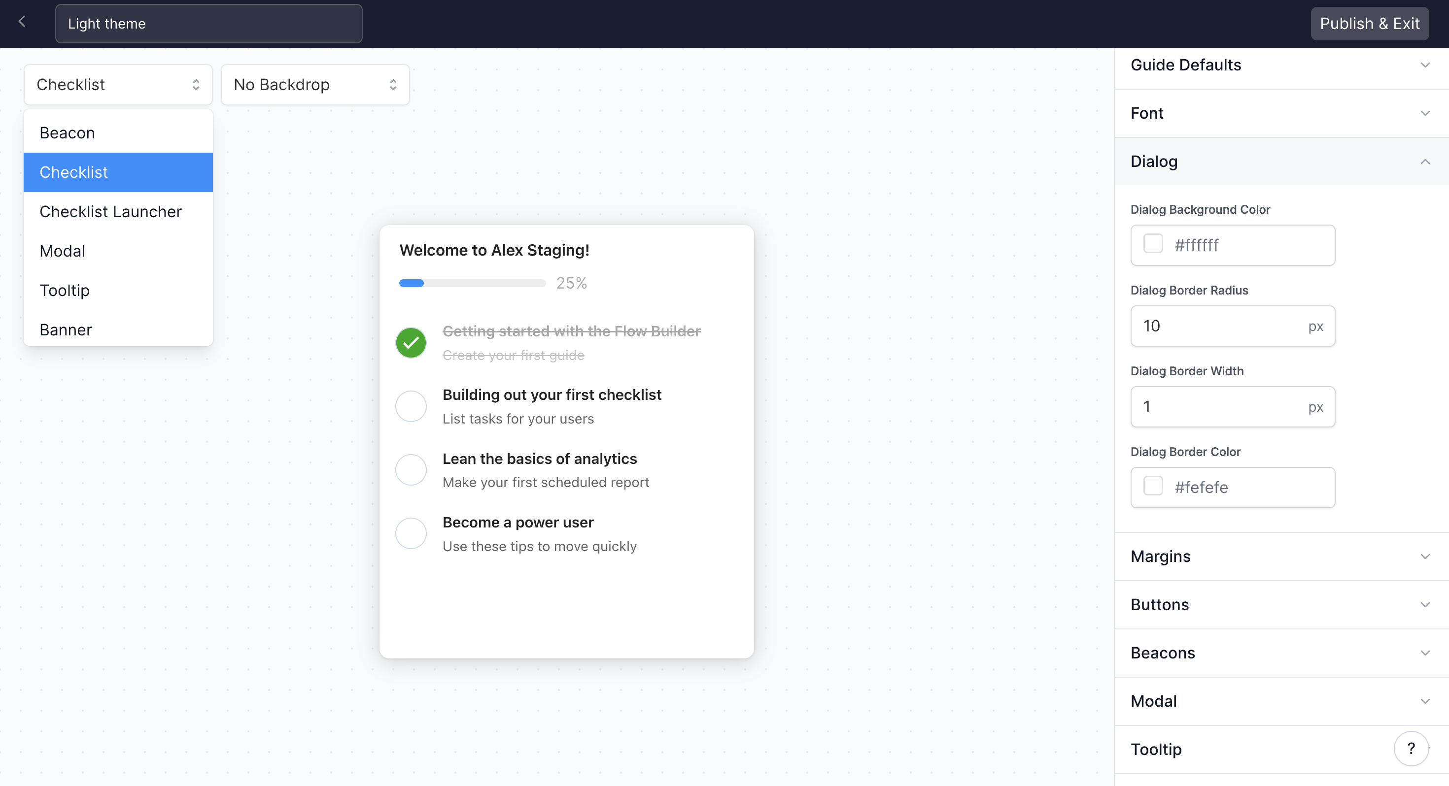
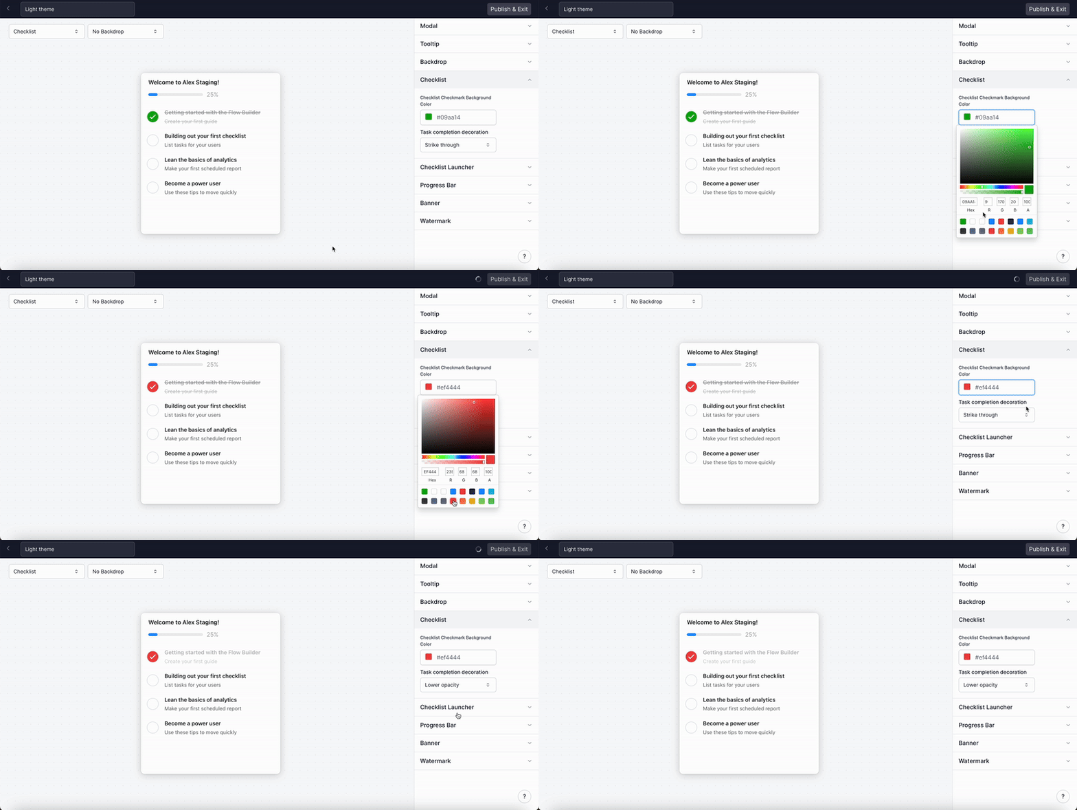
How do I edit the Checklist checkmark color and task completion decoration?
How do I edit the Checklist checkmark color and task completion decoration?
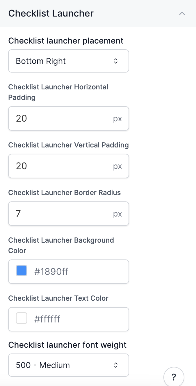
How do I edit the Checklist Launcher?
How do I edit the Checklist Launcher?
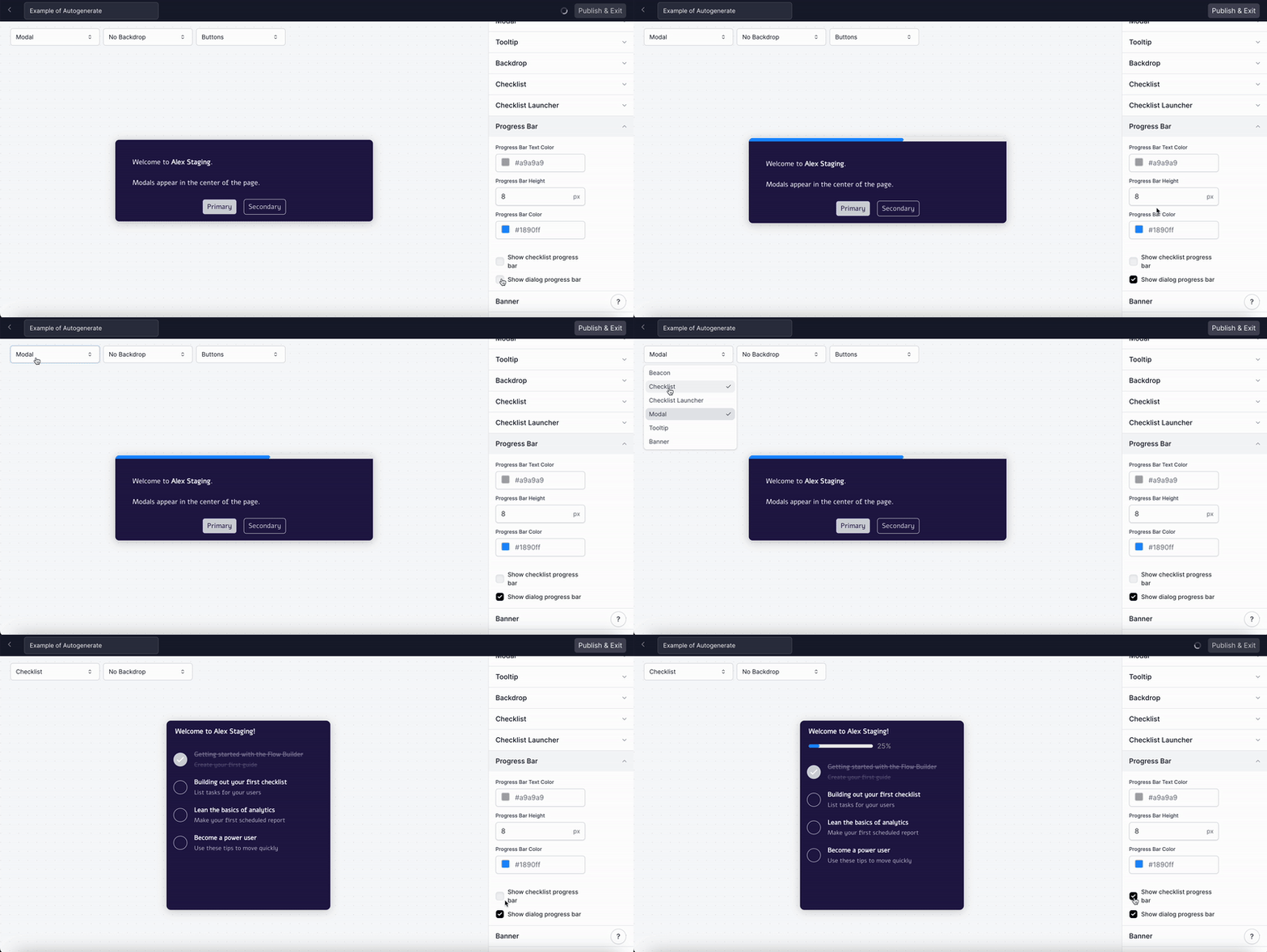
How do I edit the Progress Bar?
How do I edit the Progress Bar?
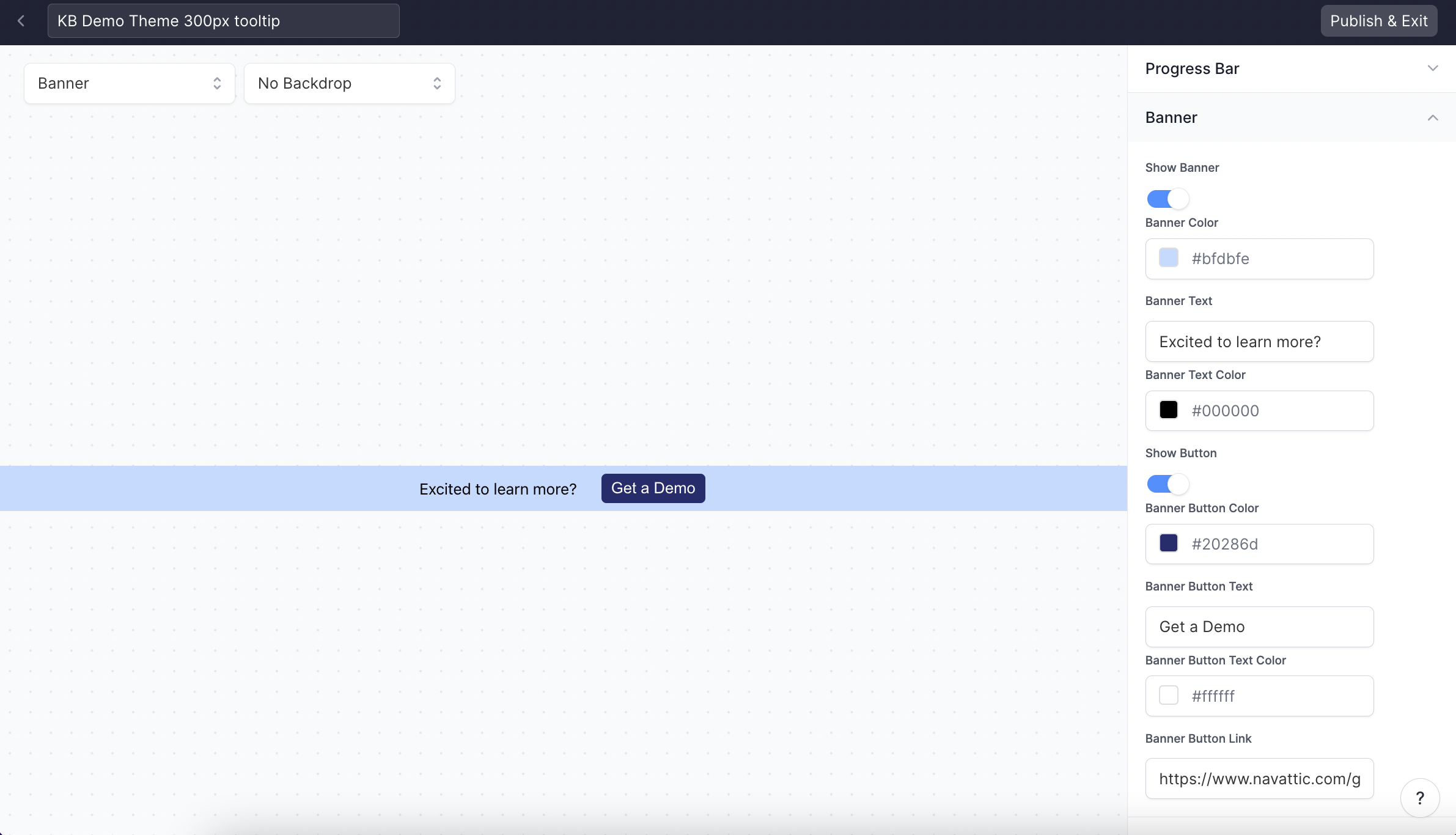
How can I add a CTA banner to my demo?
How can I add a CTA banner to my demo?
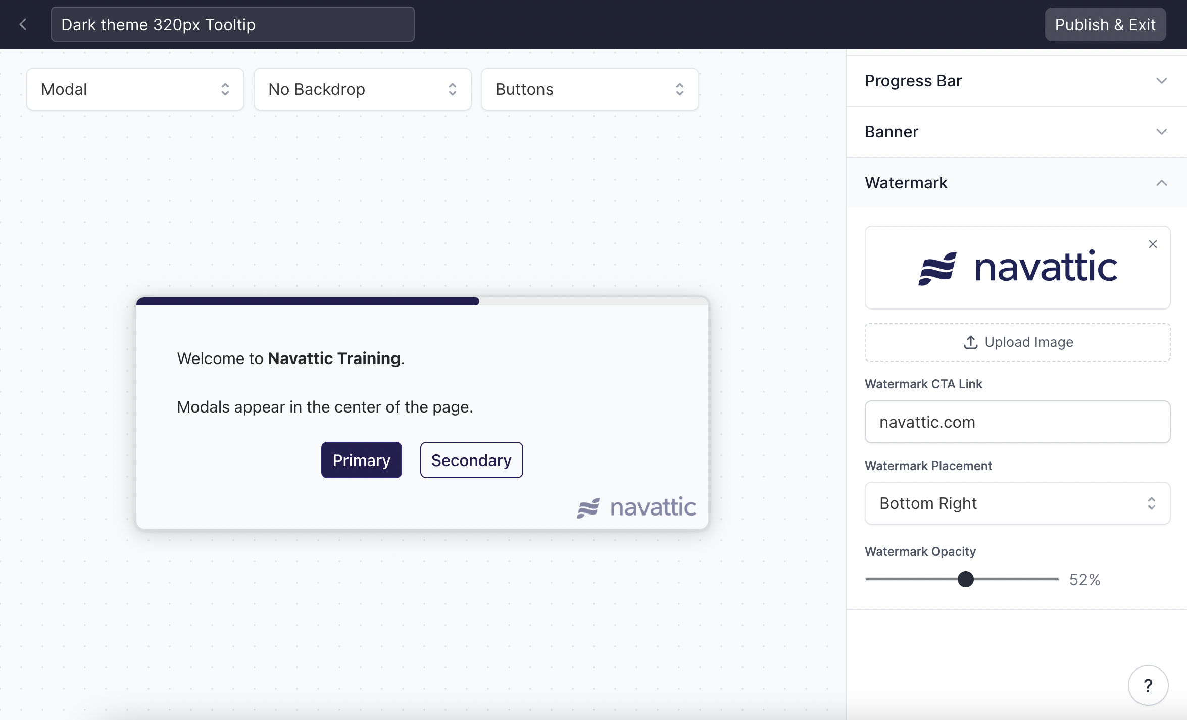
How can I add a custom watermark to Tooltips and Modals?
How can I add a custom watermark to Tooltips and Modals?
How can I change the Tooltip Border Color when paired with a Backdrop?
How can I change the Tooltip Border Color when paired with a Backdrop?
Versions
What are Versions?
What are Versions?
What can I do with a previous version?
What can I do with a previous version?
- Restore: Revert your current draft to a previous version.
- Preview: View a specific version to see how it looked and functioned.
- Edit Details: Update the title and description of a version to keep your history organized.
How do I restore a previous version of my demo?
How do I restore a previous version of my demo?
- From the demo header, open the menu and select Versions.
- A timeline of all your demo’s versions will appear.
- Find the version you want to restore and select the Restore option.
What happens when I restore a version?
What happens when I restore a version?
Does restoring a version automatically publish it?
Does restoring a version automatically publish it?
Workspace FAQs
How can I preview my demo?
How can I preview my demo?

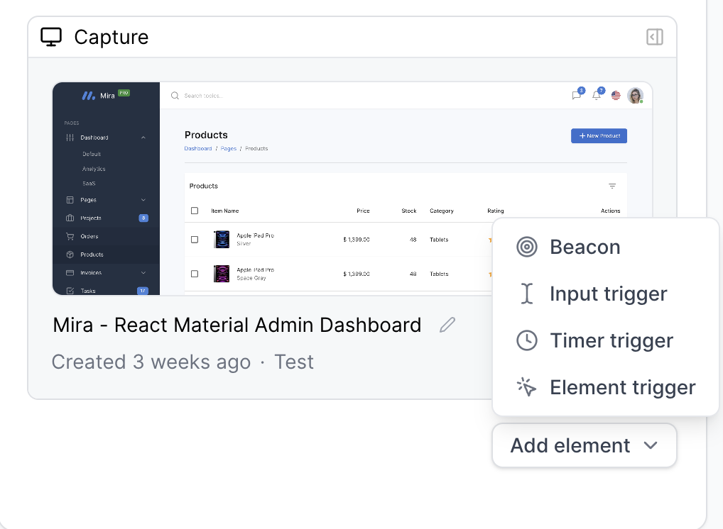
How can I add a beacon or trigger?
How can I add a beacon or trigger?
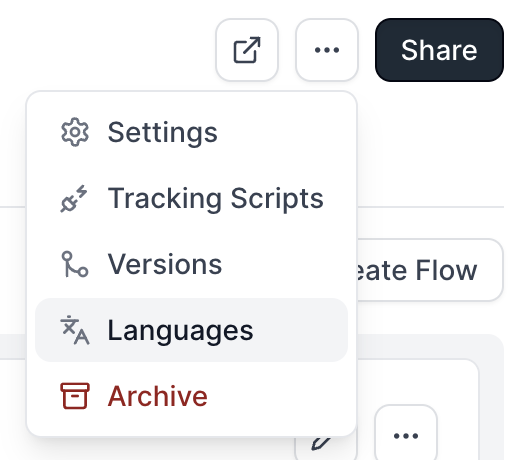
Where can I find Tracking Scripts?
Where can I find Tracking Scripts?
Where can I find Languages (Share links to translated demos)?
Where can I find Languages (Share links to translated demos)?
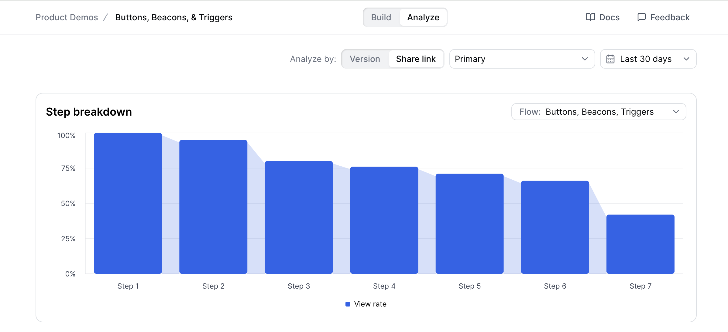
Where can I find the Flow Activity and step breakdown?
Where can I find the Flow Activity and step breakdown?
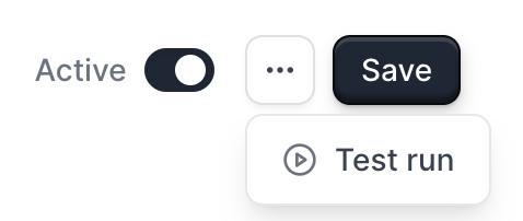
How can I send a Test run in Playbooks?
How can I send a Test run in Playbooks?
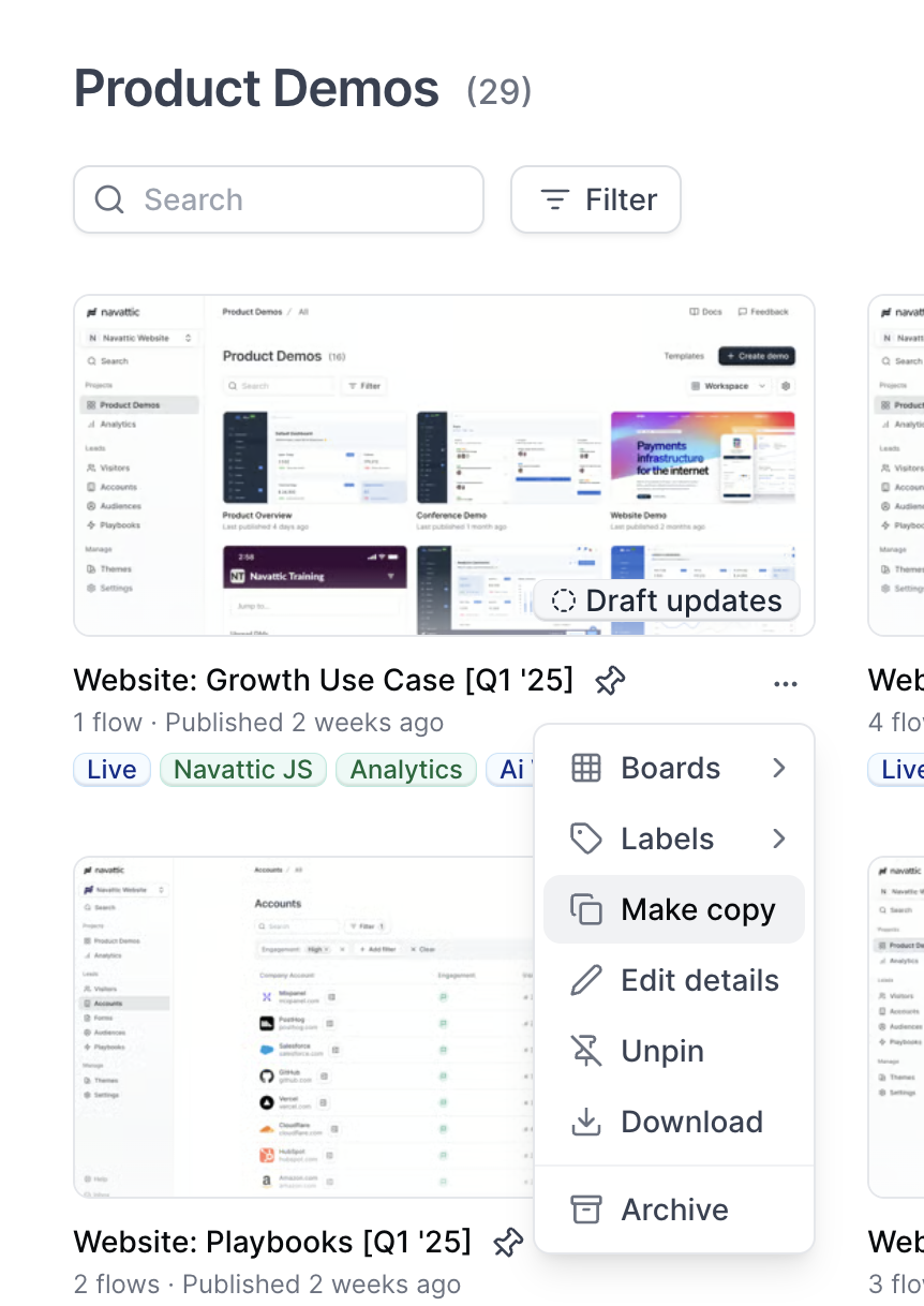
How do I copy a demo?
How do I copy a demo?
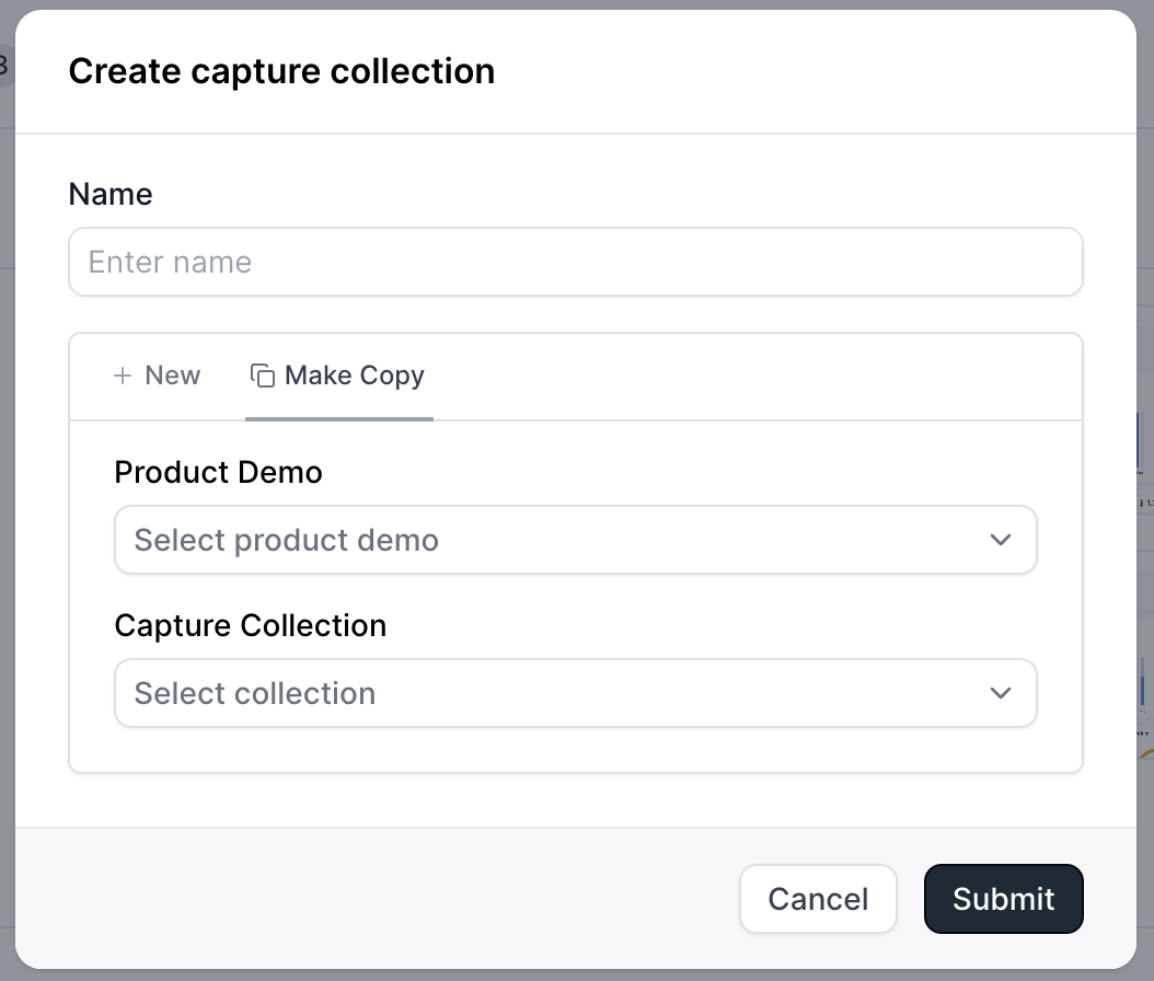
How do I copy a capture collection?
How do I copy a capture collection?
How do I archive a product demo?
How do I archive a product demo?
How do I find archived product demos?
How do I find archived product demos?
How can I update my Workspace Name, Slug, and Logo?
How can I update my Workspace Name, Slug, and Logo?

How can I prevent Builders in my workspace from editing a published demo?
How can I prevent Builders in my workspace from editing a published demo?
 When this setting is turned on, only the Project Owner or a Workspace Admin can publish changes to a demo that has already been published. Other builders will still be able to view the demo, but they won’t be able to publish updates to the live version.If a non-authorized builder attempts to publish changes, they’ll see a message indicating that the demo is locked and that they should contact the project owner or a workspace admin.