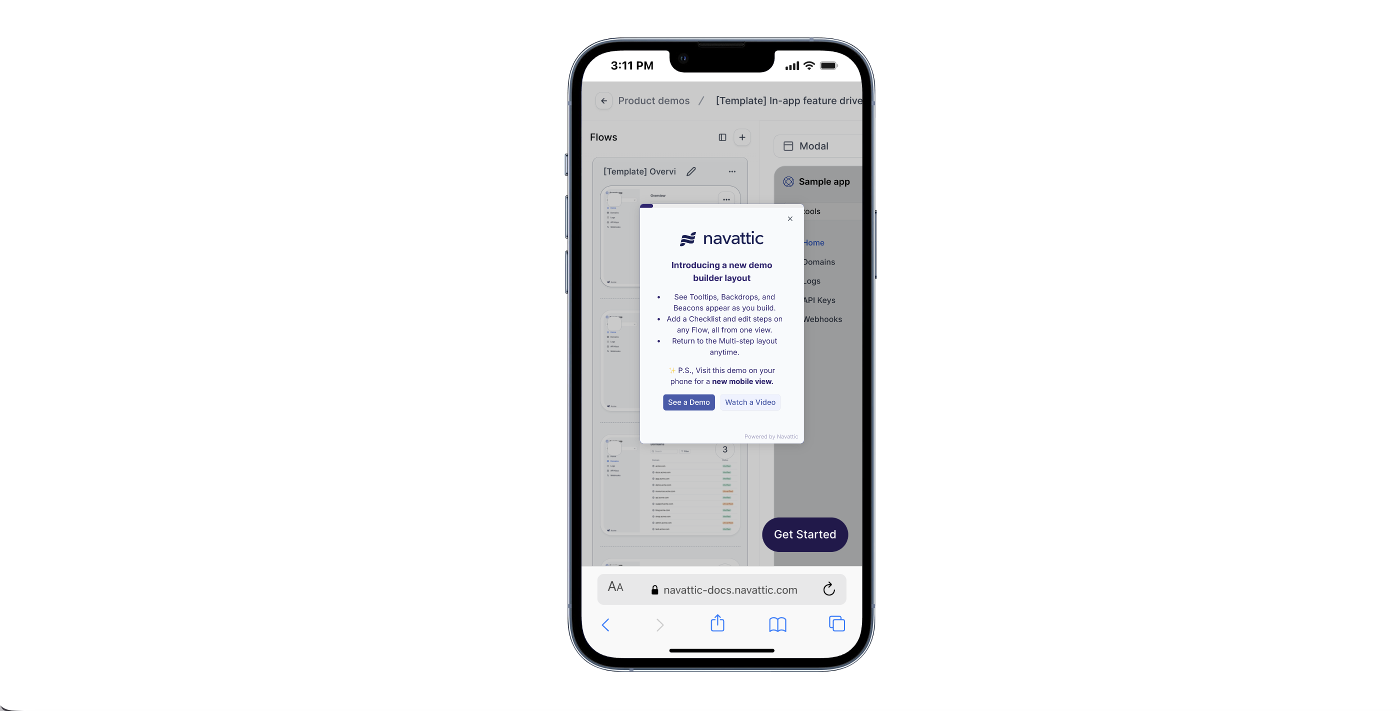
Mobile tab on the Product demo page.
Mobile options
There are a few different options for viewing interactive demos on mobile devices:- Mobile zoom
- Mobile swipe demo
- Mobile alert
- Mobile scaled view
- Show desktop demo
The Mobile zoom option allows you to serve your standard desktop demo directly to users on mobile devices. When enabled, viewers can use familiar pinch-to-zoom gestures to enlarge, navigate, and interact with the product on their smaller screens. This provides a simple way to maintain your original layout while ensuring mobile visitors can comfortably explore your demo.
Customer examples of mobile demos
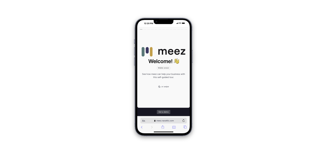
Meez: Take a Tour
Mobile swipe demo
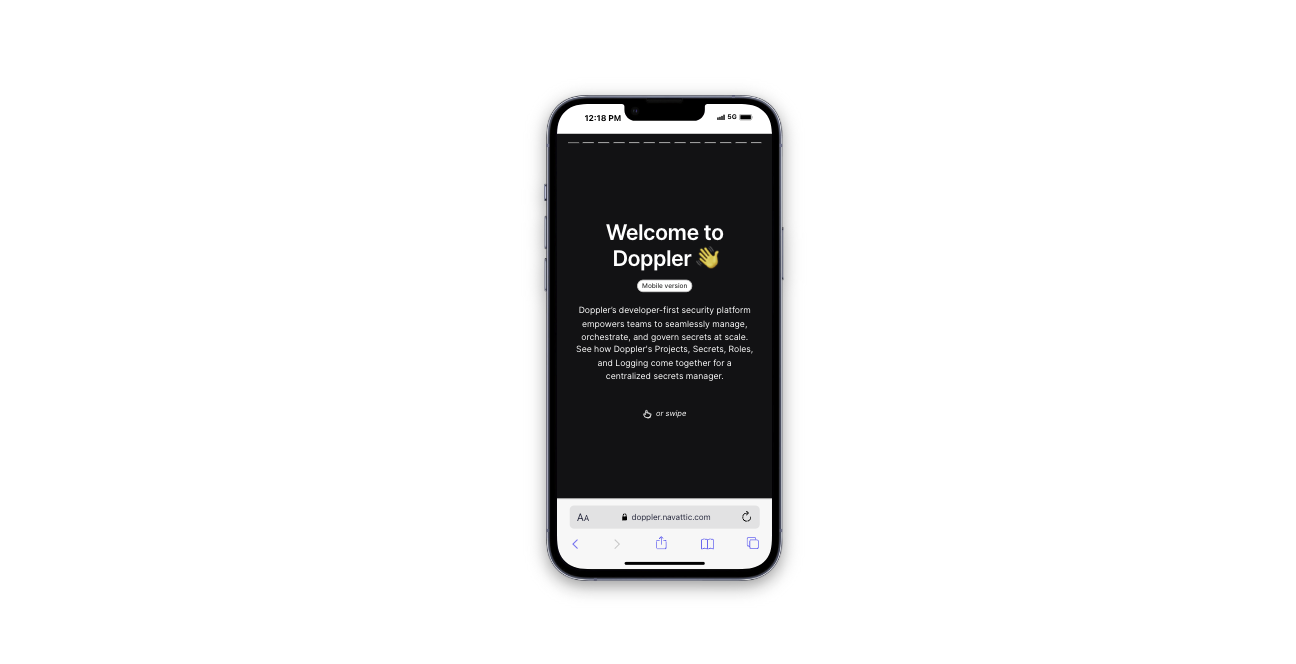
Doppler: Take a self-guided tour
Mobile swipe demo
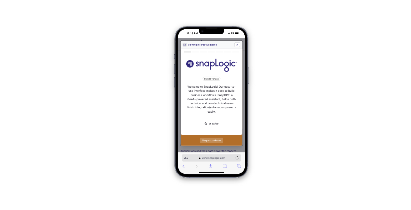
SnapLogic: Take a tour
Mobile swipe demo
Navattic: Single step view
Mobile zoom
View these examples in a window below 800px wide to activate the Mobile swipe view or use a mobile simulator like this Chrome
extension .