Embedding a demo
Follow these steps to embed your demo on a webpage:Click share and select embed option
On a Product Demo, select 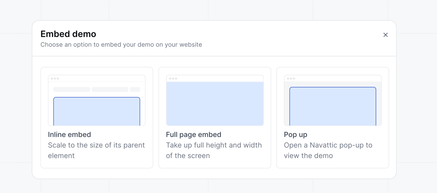
Share. For Share via select Website embed. Select between the
sharing options to embed your demo on your website or product.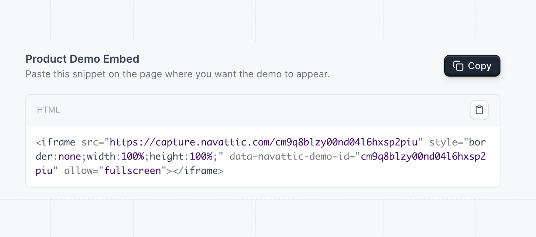
Embedding an Agent Demo
Agent Demos support the same three embed strategies as product demos — inline, full page, and pop-up. To get the embed code for an Agent Demo:- Open the Agent Demo from the Agents section. The demo must be published.
- Click Share in the editor toolbar.
- Under Embed on your website, click Embed.
- Choose an embed strategy (inline, full page, or pop-up) and click Get Embed Code.
- Copy the code and drop it into your website.
The lazy-load overlay option is available for Agent Demo embeds, but the auto-generated background image is not supported. Upload a custom background image in the embed settings instead.
Choosing an embed type
Navattic offers three embed types. Select the one that best fits where and how you want to present your demo.- Inline embed
- Full page embed
- Pop-up embed
The inline embed renders the demo directly on the page, scaling to fit its parent container. Visitors see the demo immediately without needing to click anything.When to use:
- Blog posts and content marketing pages
- Product or feature pages where you want to showcase a workflow
- Landing pages where the demo is the primary content
- Tutorial or documentation pages
Recommendation: Use inline embeds for content-heavy pages where the demo is part of the narrative. Use full page embeds for dedicated demo pages where you want an immersive experience. Use pop-up embeds for CTA buttons where you want to keep the page lightweight and let visitors choose when to engage.
Inline sizing options
When using an inline embed, you can choose how the demo scales within its container. Select a sizing strategy in the embed modal after choosing the inline embed type.- Fixed aspect ratio
- Responsive
- Fixed dimensions
The demo fills 100% of the container width, and the height scales automatically to maintain a consistent aspect ratio. The default ratio is 16:10.When to use: Most marketing pages and landing pages. This option provides responsive width while maintaining consistent proportions across all screen sizes.
Recommendation: Use Fixed aspect ratio (16:10) for most marketing pages — it looks great on desktop and scales down gracefully on mobile. Use Responsive when embedding inside a container with a defined height. Use Fixed dimensions only when you need exact pixel control.
Customizations
Follow the instructions below to enable Lazy Load, disable demo pre-loading, or manage the embed lifecycle using JavaScript. Lazy Load Overlay When the lazy load overlay toggle is selected for an embedded interactive demo, an overlay will appear over the top of the demo frame. This can be helpful to improve page load times, reduce load traffic to the demo, or provide better guidance on how to engage with the interactive demo. The default background image (the first capture in the Product Demo) as well as the call to action to launch the interactive demo can be adjusted by updating the embed code as shown in this video.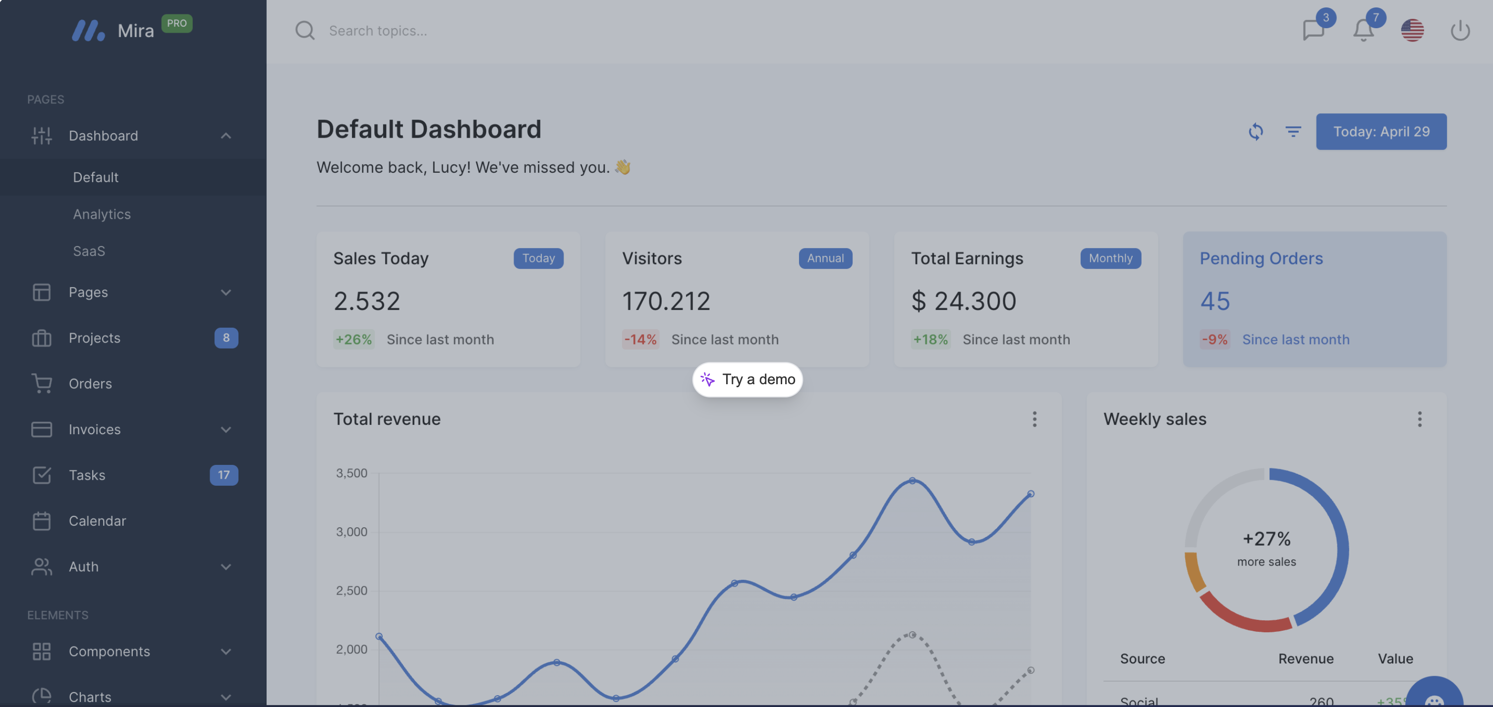
data-navattic-preload="false" data attribute to the button that is opening the demo.
Control lifecycle of the embed with Javascript
The default embed code for the lazy-load and pop-up embed types use HTML in order to make the embed process as simple as possible. If more control over the initialization and loading of the embed is required, the embeds.js script includes the Javascript class, NavatticEmbed which includes a few methods that can be helpful for controlling the lifecycle of the embed elements:
NavatticEmbed.loadEmbeds(): initializes all lazy-load embeds on the pageNavatticEmbed.initPopup(<embed_url>, <config>): adds the pop-up embed to the page but hides it until the below method is called- The second argument is an object containing configuration properties for the embed. The following (optional) properties are supported:
title: the title that will appear in the header of the demopreload: if this is set to false, the demo won’t be pre-loaded when it’s initialized. It will only start to render the demo when it’s opened. Defaults to true.onClose: a callback that is triggered when the visitor closes the pop-up.
- The second argument is an object containing configuration properties for the embed. The following (optional) properties are supported:
NavatticEmbed.openPopup(<embed_url>): opens the demo so that the modal appears overlayed on the page. This would usually be attached to a click handler on the button that would be opening the pop-up demo.
Examples
See how leading companies embed Navattic demos on their websites:Wiz
Pop-up embed on an academy page
Atlan
Inline embed on homepage
Lattice
Inline embed on dedicated tour page