Documentation Index
Fetch the complete documentation index at: https://docs.navattic.com/llms.txt
Use this file to discover all available pages before exploring further.
"Our goal is to show customers the value of our product with as little friction as possible, and to encourage high-intent customers to have more in-depth conversations with sales. Anytime we release a new feature, we make a Navattic demo for it!"
Recommendations
For feature-specific demos, we recommend:- Keep your demo short (8-15 steps) to quickly show the “wow” moment of that feature
- If your demo is embedded on a landing page, consider an ungated experience (without a form at the beginning)
- Maintain consistent CTAs across each of the feature-specific demos
Blog: Read 6 Feature Announcement Examples from SaaS
Companies to see how other customers promote feature demos.
Feature Highlights Customer Examples
Below are some customer examples we love. Keep an eye out for the recommendations highlighted above.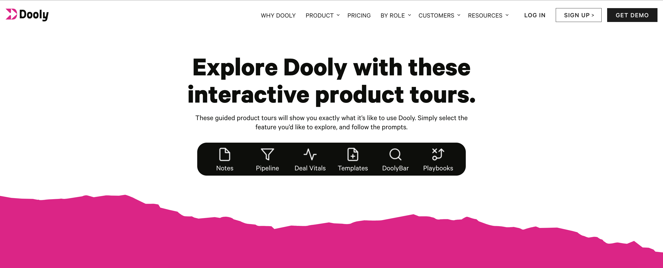
Dooly: In Action
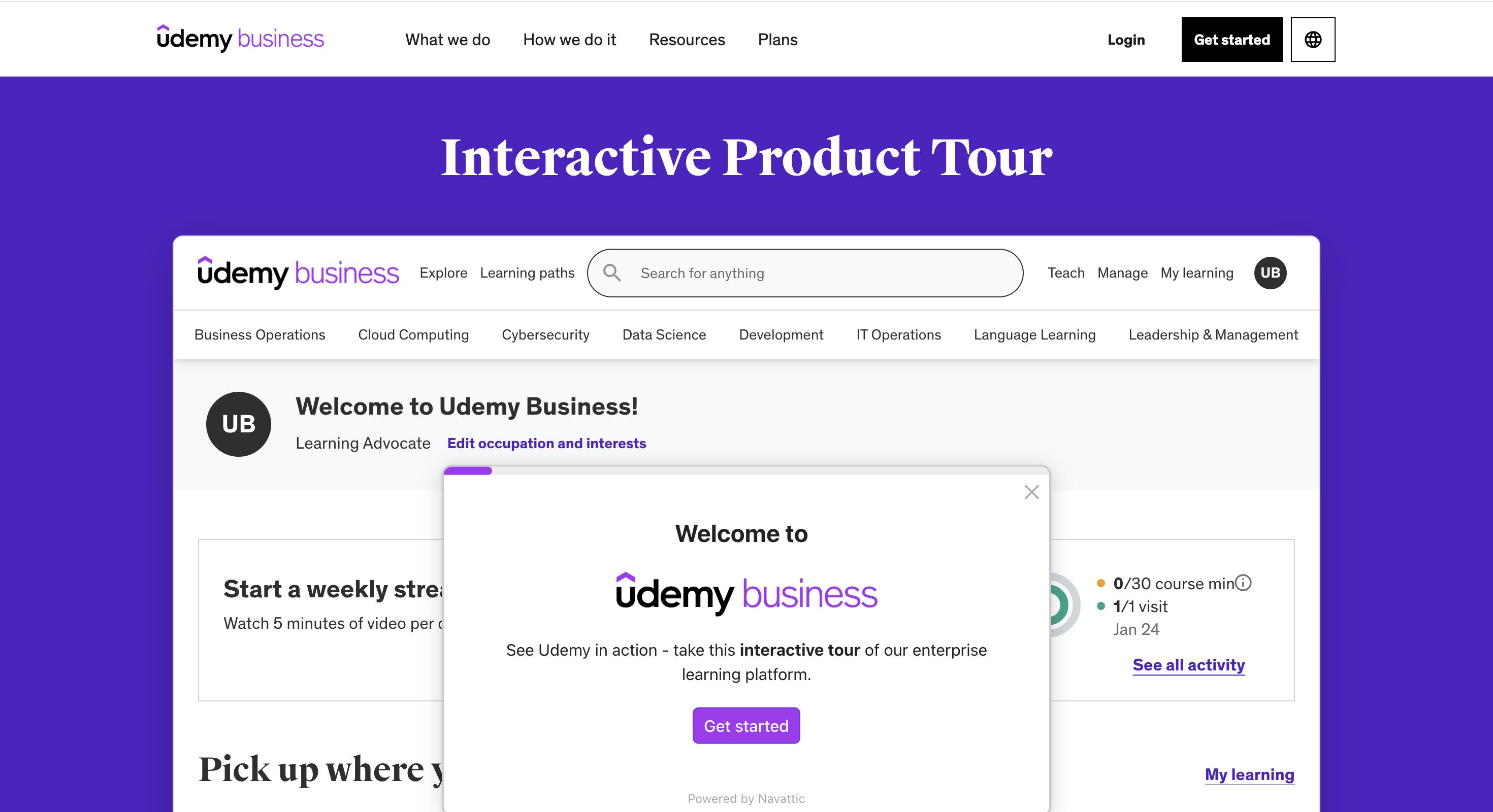
Udemy: Udemy business
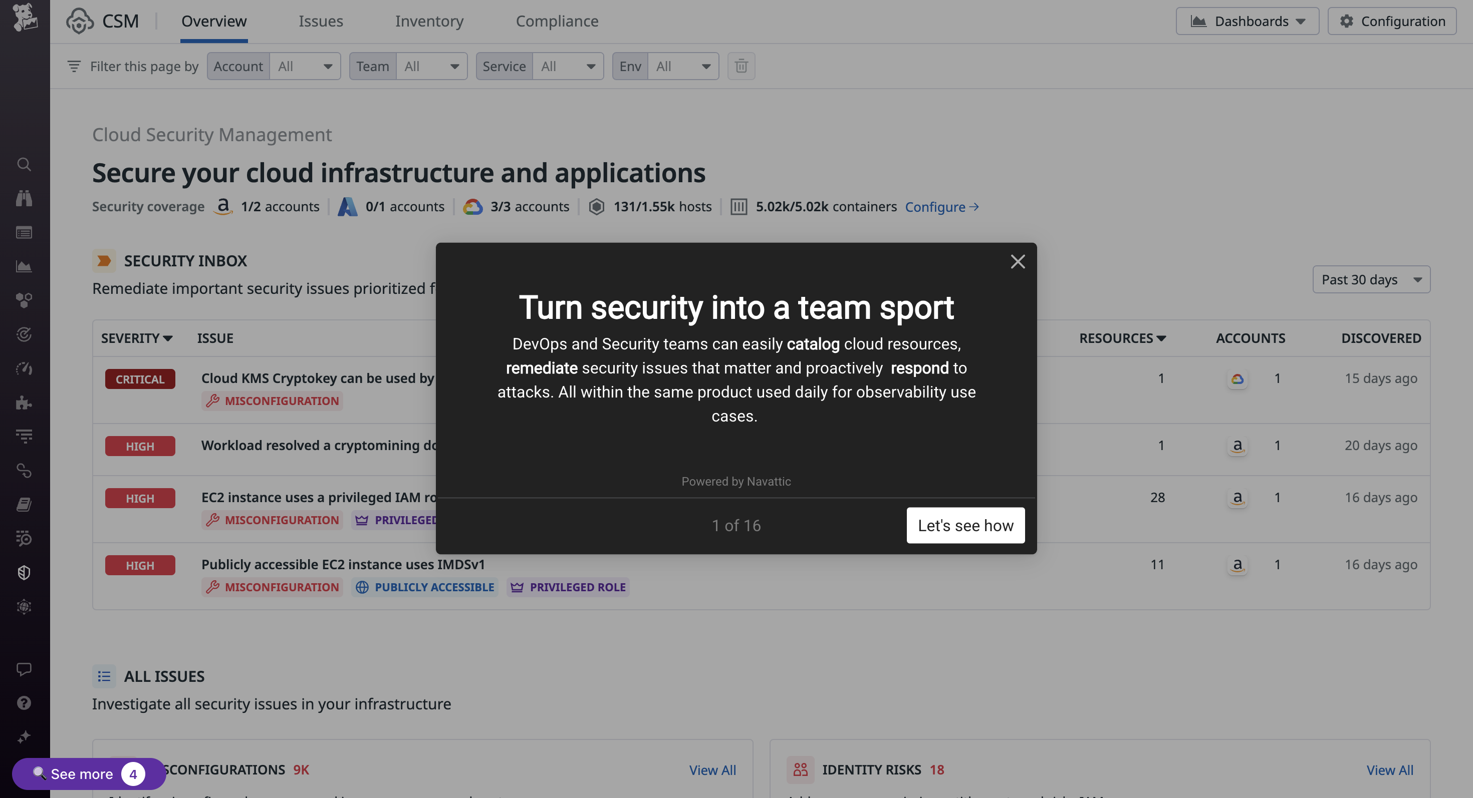
Datadog: Turn Security into a Team Sport
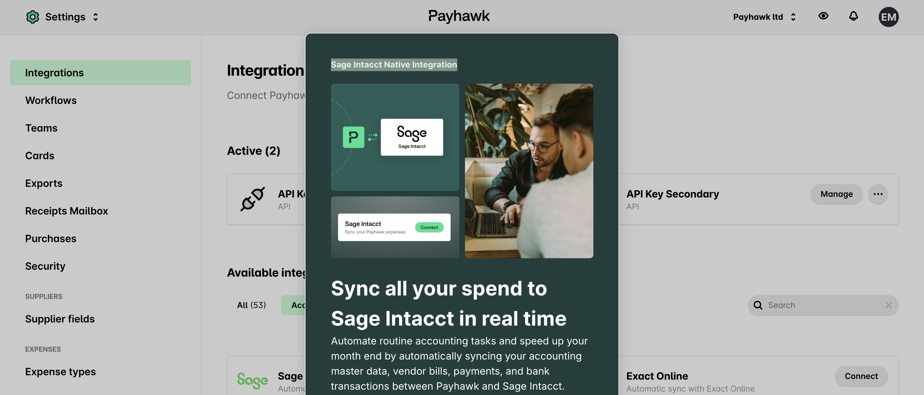
Payhawk: Sage Intacct Native Integration
Implementation Guide
Follow the guidance below to launch feature demos in no time. Use Navattic Analytics to assess completion rates (tip: from your Analytics page, select Compare All Demos to view engagement and conversion across all of your demos).Content
Focus on the problem: Aim for 8-15 steps that highlights the problem a specific feature or use case solves. Skip “how-to” style navigation in favor of value-driven storytelling.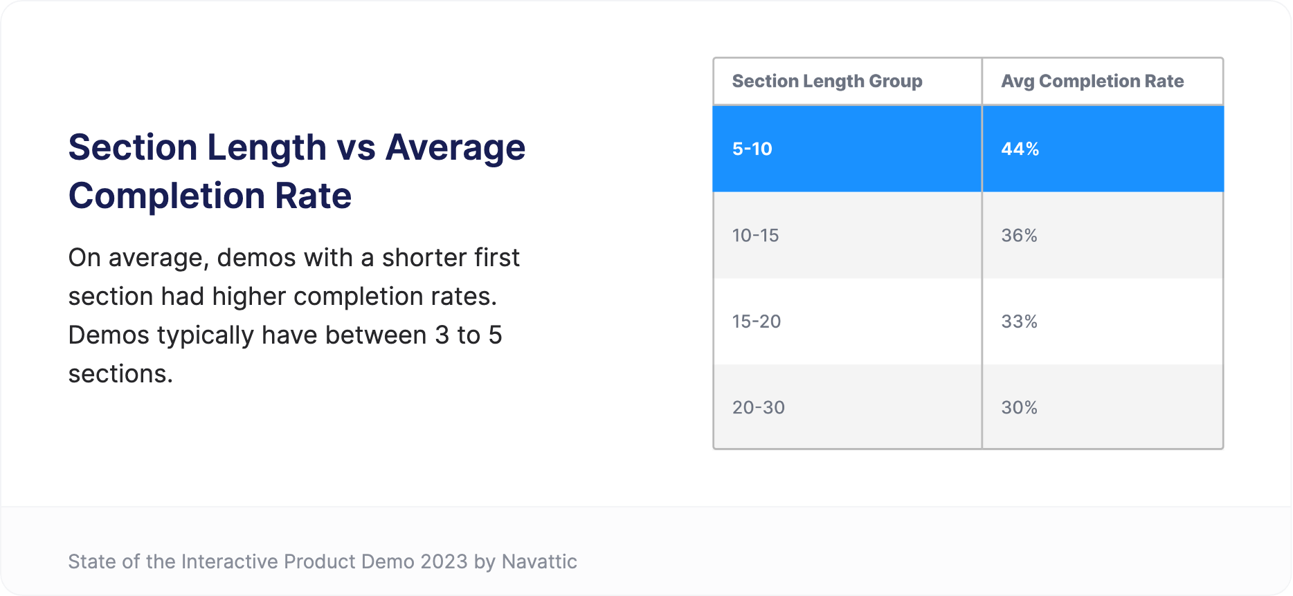

CTAs
Be direct and consistent: Include a single CTA at the end of the demo that pushes qualified prospects to a sales-led demo, free trial, or gated asset.
Tip: Common conversion CTAs are “Sign up free”, “Book a demo”, and “Get in touch”
Deployment
Provide options: Organize demos for various features or buyer personas, or use a checklist to present a list of options (ex. Navattic: What’s New?). Include a short blurb under each checklist item to help viewers identify the experience that is most relevant to themTry ungating: Remember, feature demos are used to qualify prospects and to set the stage for more in-depth sales conversations. If gating your demo, enable the Form Setting “Skip if already submitted” to reduce friction for returning visitors.
Recommended Structure
Steps 1-2: Share the context for your feature. What does this feature do? When is it used? (Klue’s Triage Mode demo is a great example)Steps 3-9: Use Tooltips, Beacons, and Triggers to create an interactive experience. Keep text minimal to keep the focus on your product - demonstrate how easy and foolproof this feature is to use.Steps 10-12: What is the next step for qualified prospects? Conclude your demo with 1 direct CTA that is consisent across all feature demos.
Tip: Drive middle-of-funnel engagement with a Demo Center
For website visitors that already know of your product, centralizing product demos is an effective way to drive site engagement. Include demos of new features or competitive differentiators and try organizing demos by use case or persona to connect prospects with the most relevant content. Consider a demo center when you have:- Multiple feature demos targeting the same persona
- Features that work together to support specific use cases
- Demo booths at in person events where prospects can explore independently
Customer Examples
Below are some customer examples we love.
Digital Ocean: Product Tours
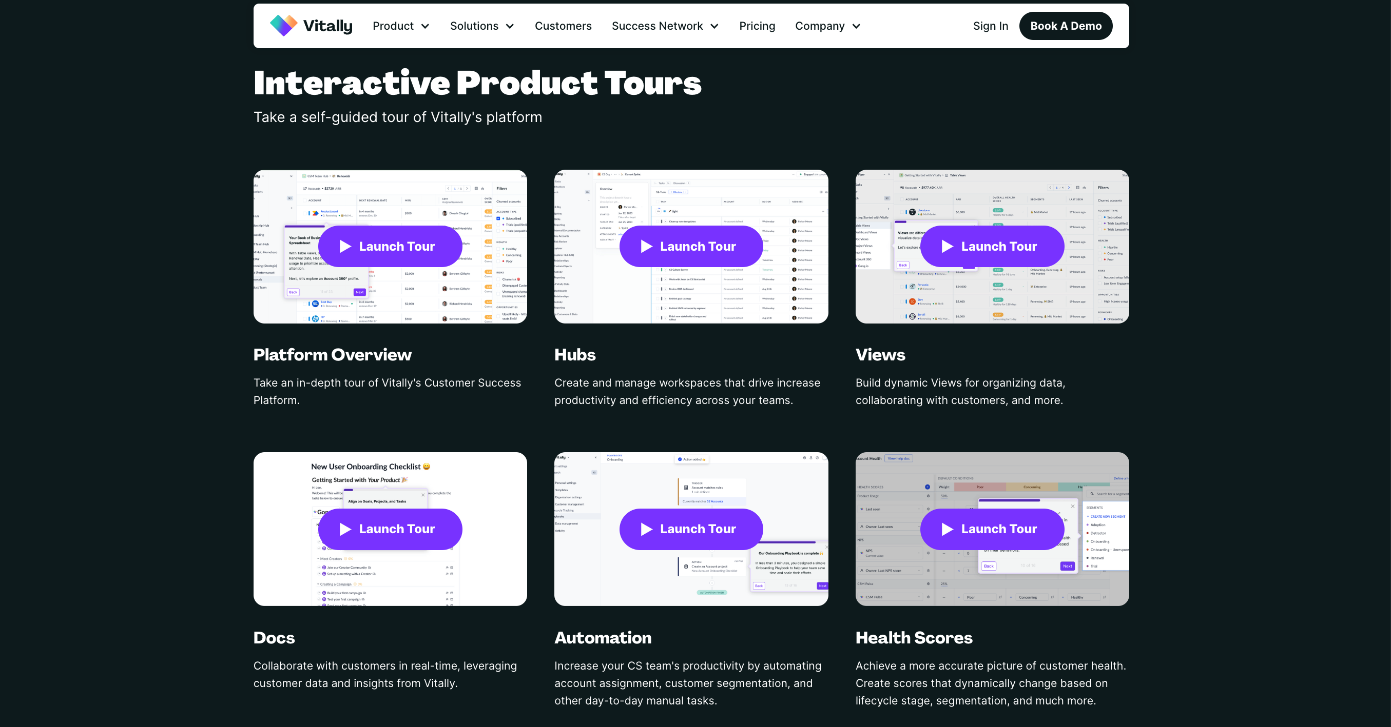
Vitally Academy
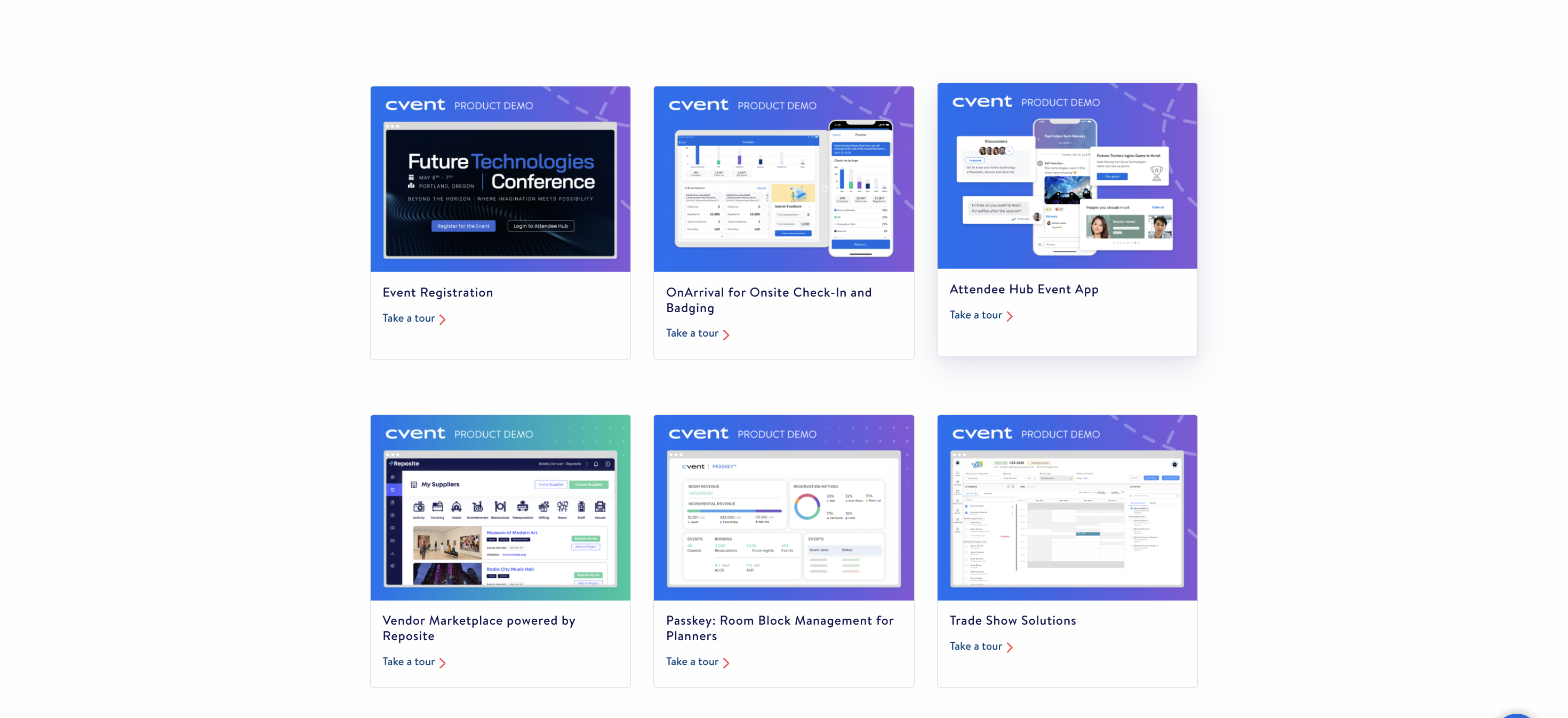
Cvent: Interactive Demo Library
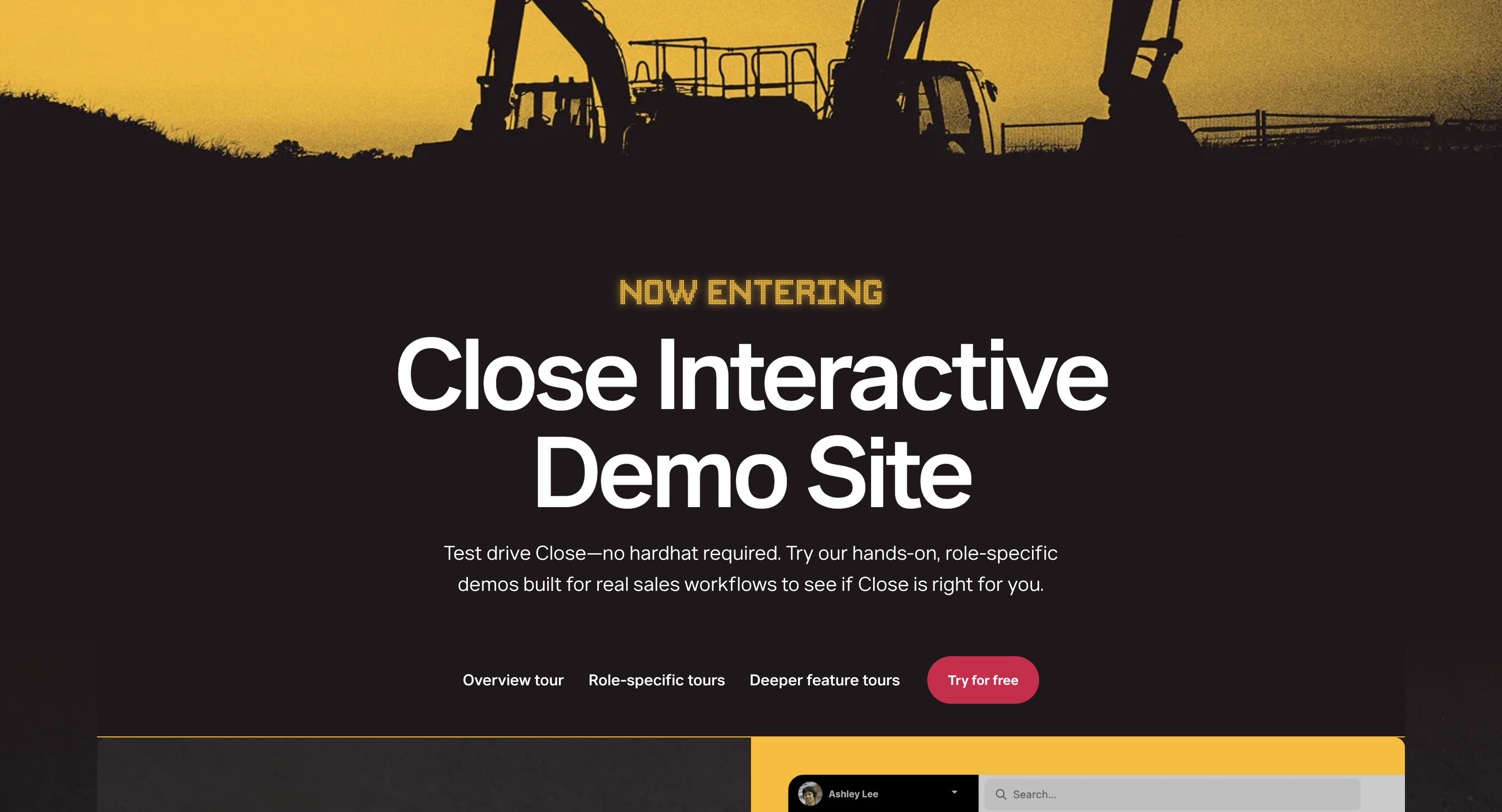
Close: Interactive Demo Site
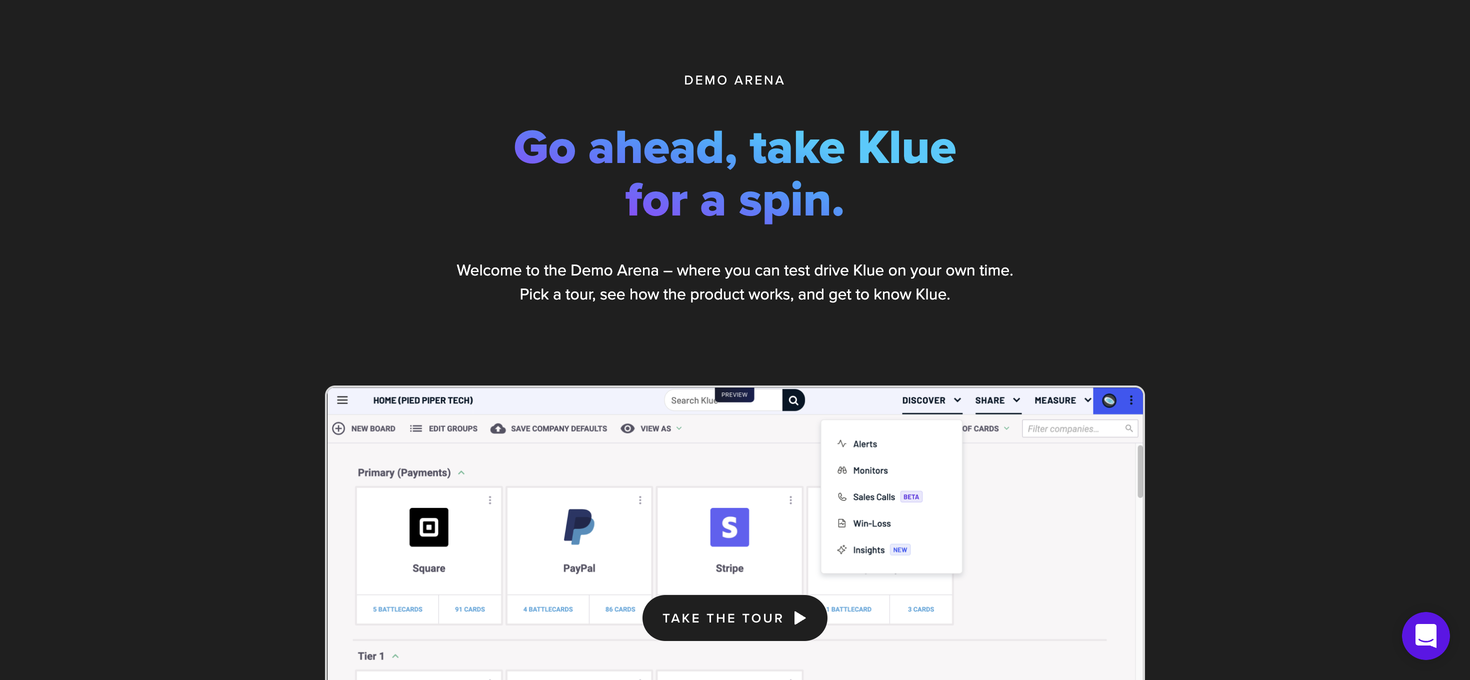
Klue: Demo Arena
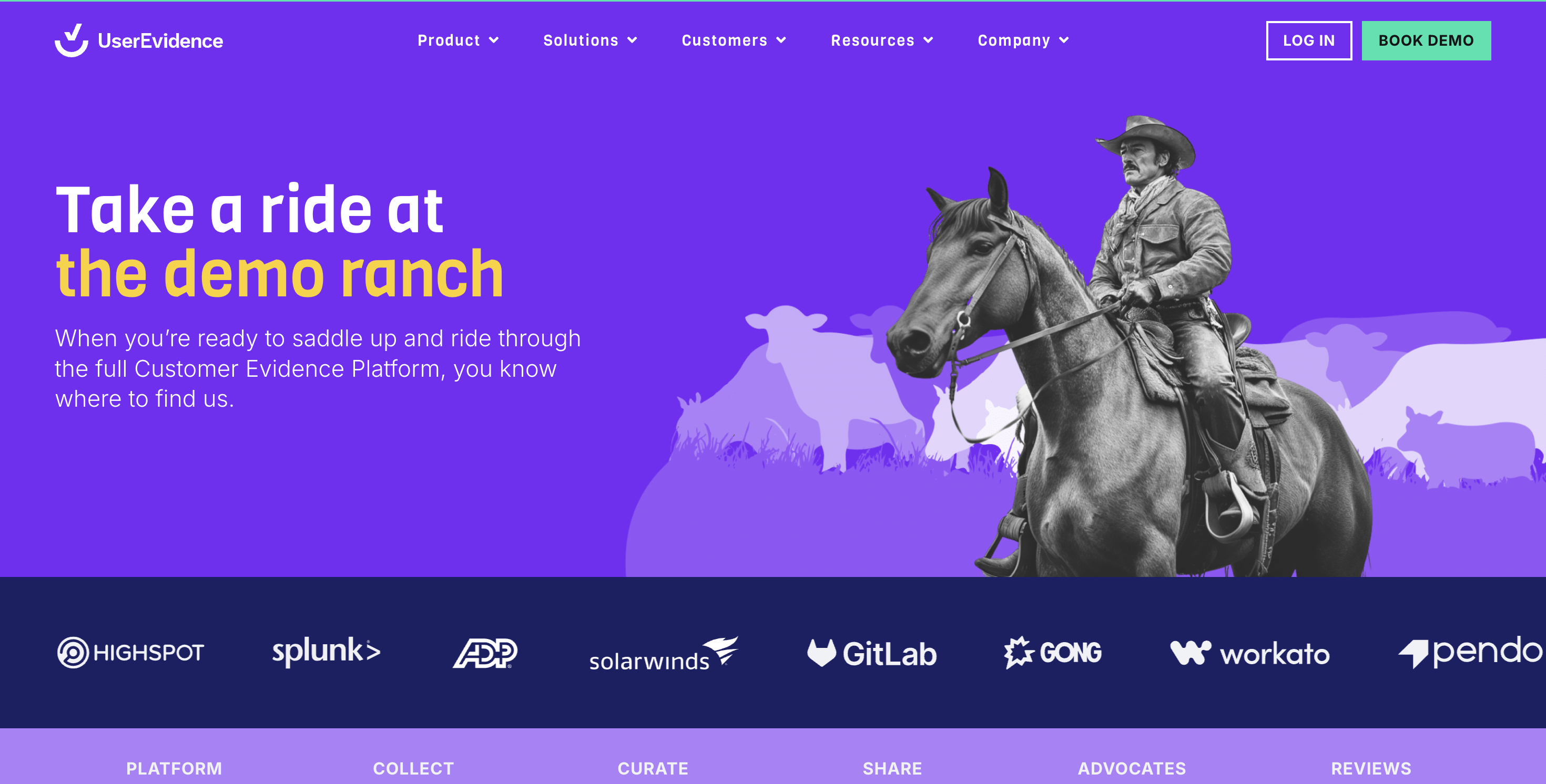
UserEvidence: Demo Ranch
Customer Interview Series
- See how Klue leverages Navattic for new feature announcements. Read about their strategy in the blog: Customer Interview Series: Integration Enablement with Jason Oakley
Watch video
Feature Highlights