Customer Examples
Below are some conference demos we love. Keep an eye out for:- Interactivity: How memorable is this on-site experience?
- Navigation and ease-of-use: Can a first-time user find their way through the demo?
- Integrations: How does your product fit seamlessly into existing workflows?
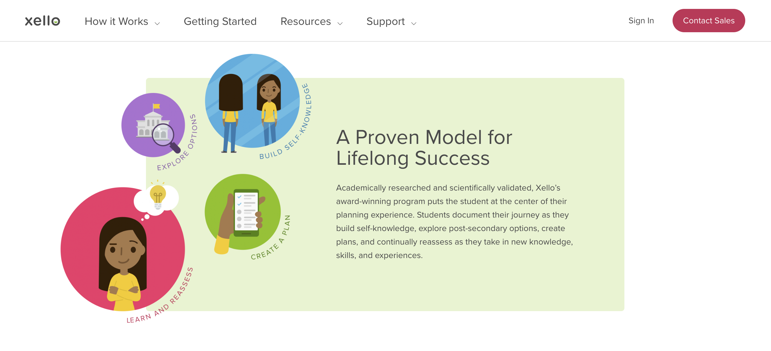
Xello: Educator Tools
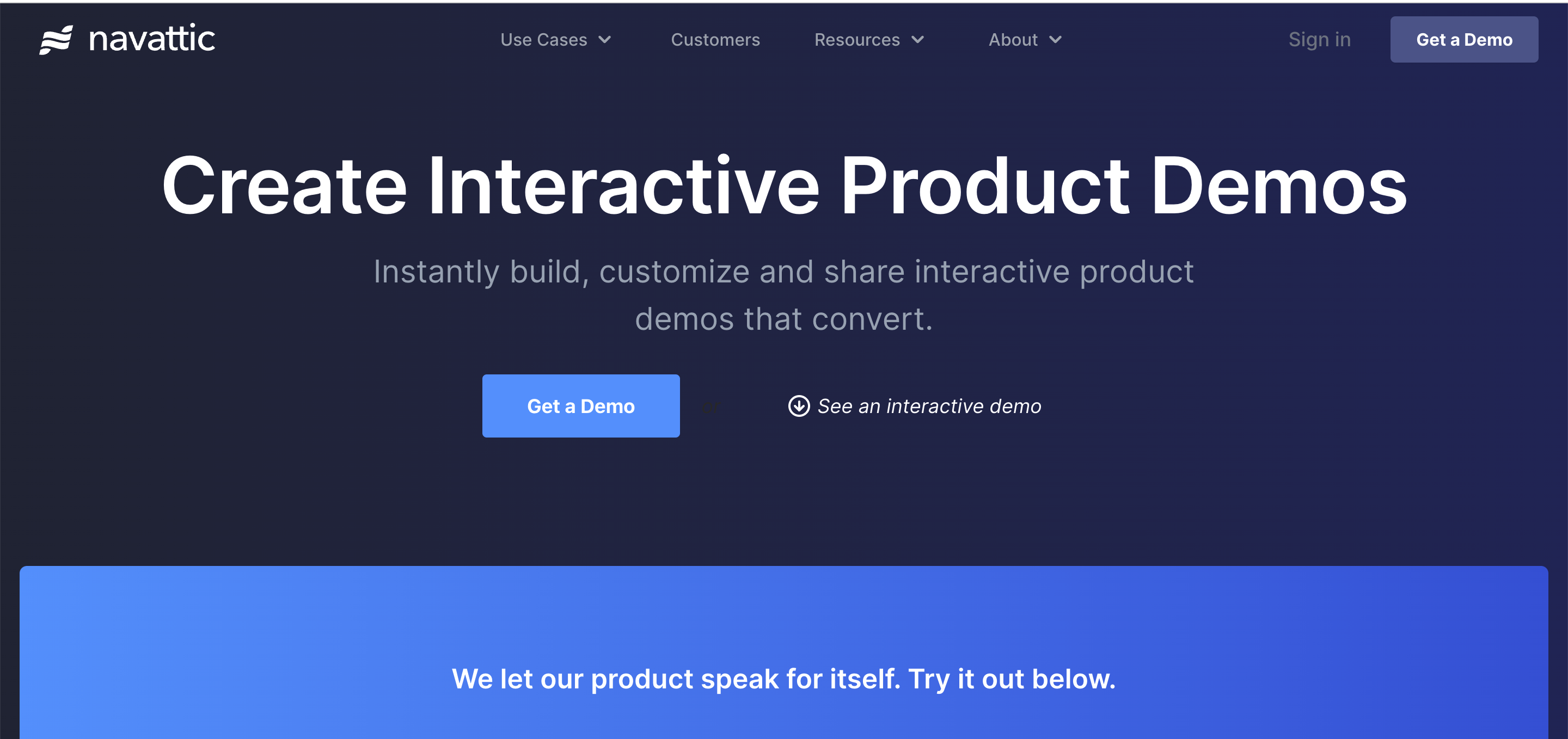
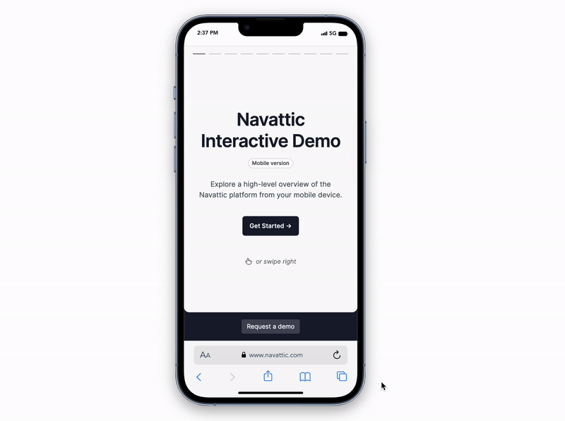
Navattic: Try it out
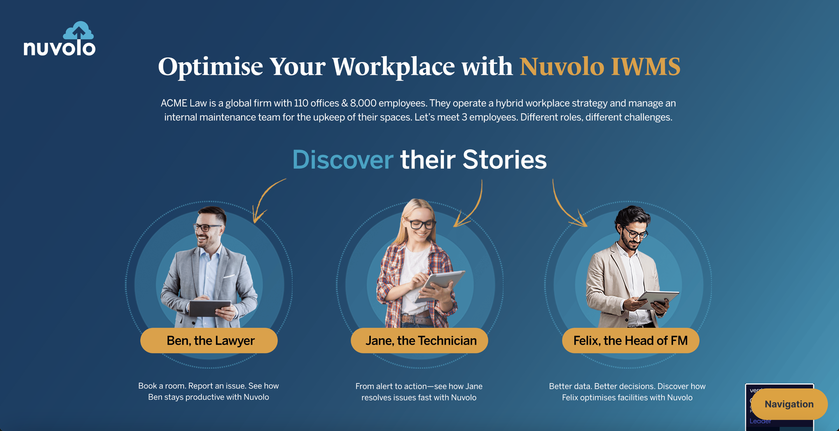
Nuvolo: Optimise your Workplace
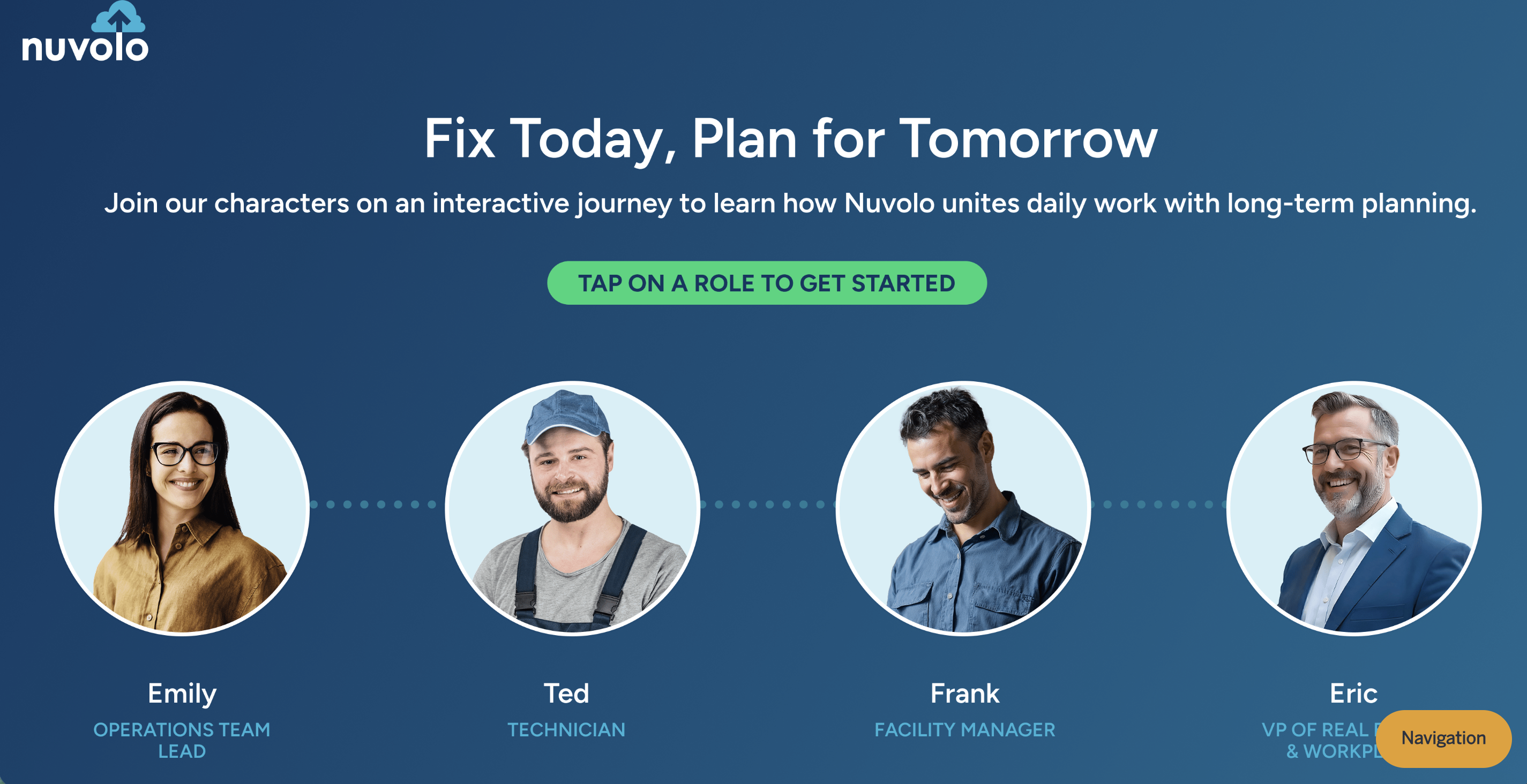
Nuvolo: Fix Today, Plan for Tomorrow
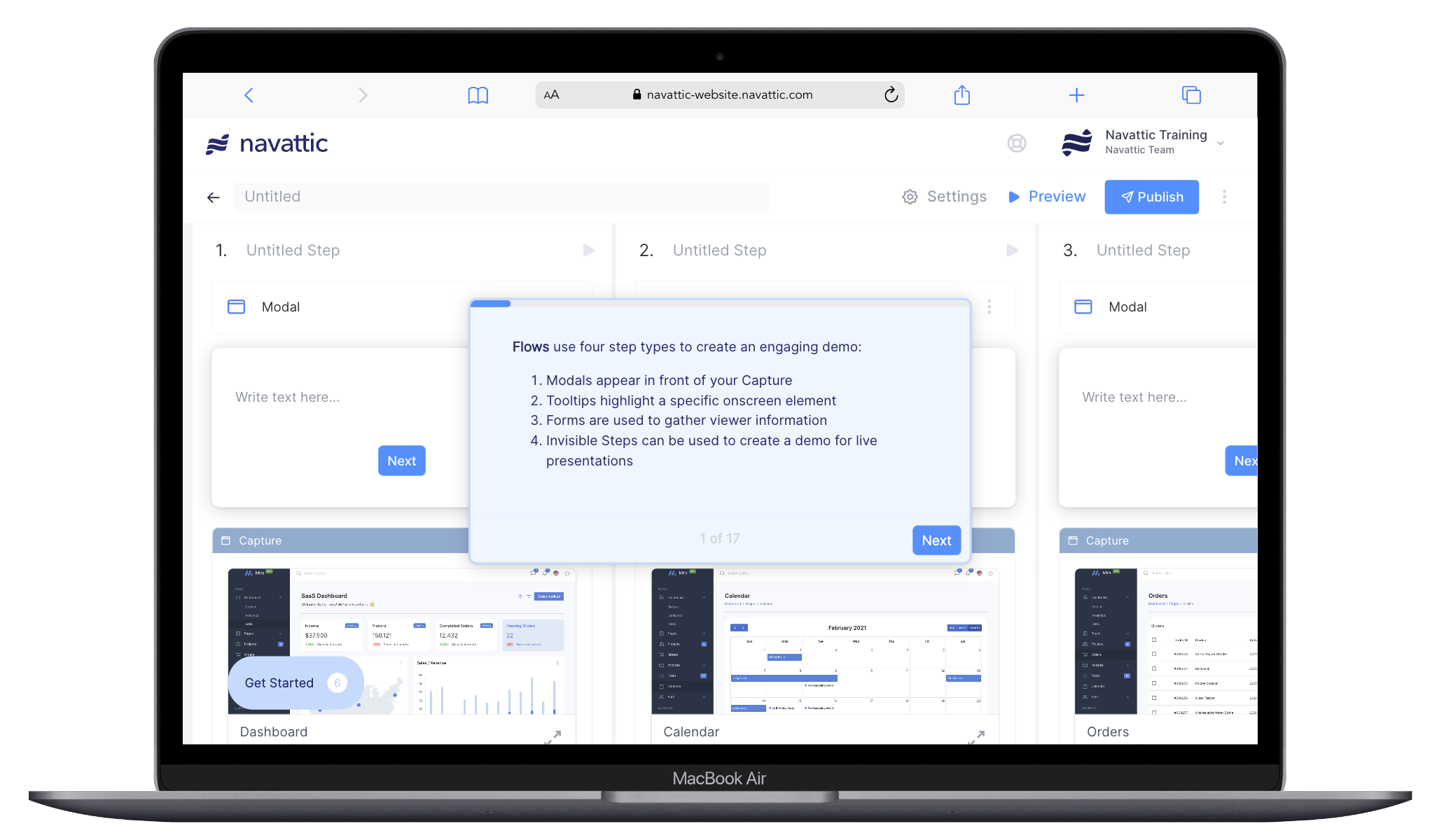
Implementation Guide
Use the guidance below to maximize engagement at your conference booth. We recommend providing desktops or laptops for participants to engage with, although iPads and mobile devices are also supported.Content
Make it memorable: Aim for a 2-3 minute memorable experience that will demonstrate the wow moments of your productMake it interactive: Use tooltips, triggers, and beacons to let viewers envision using your product in their day to dayCustomize it for your audience: Incorporate the theme of the conference throughout your demo by using custom Themes or uploading images.
Navigation
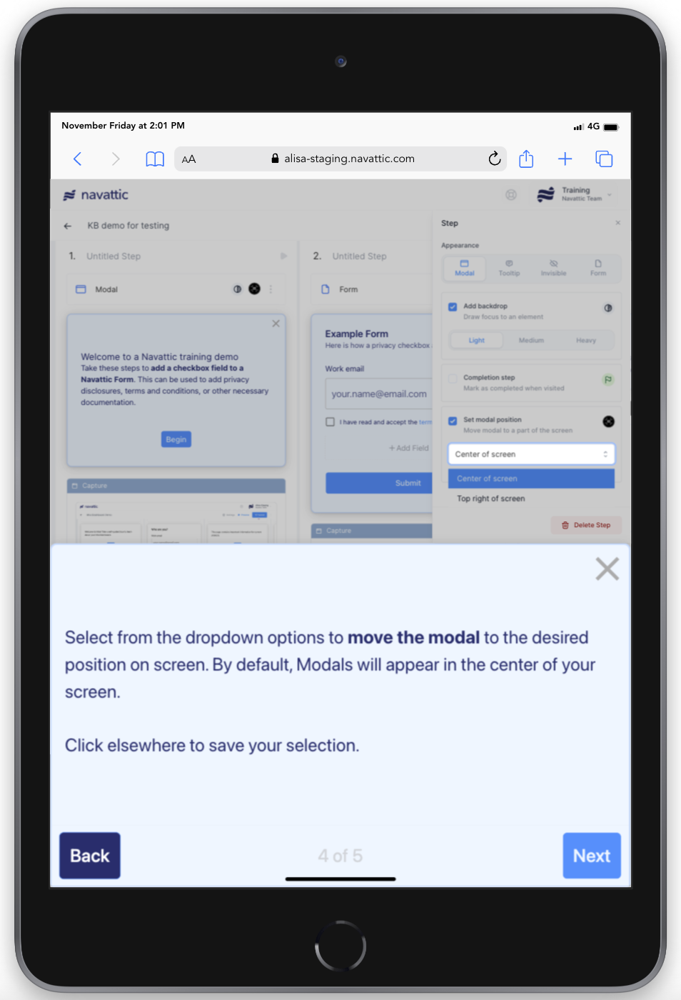
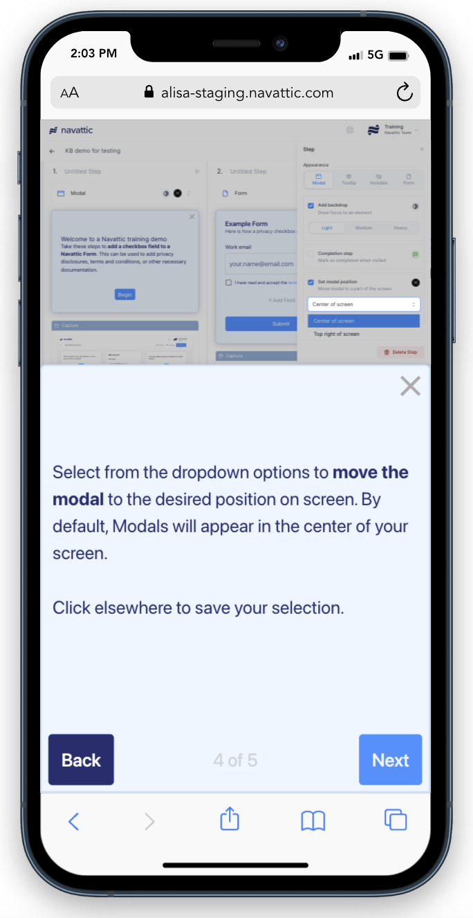
Keep text minimal: The product demo will likely support organic conversations that are already taking place at the booth. Smaller dialog boxes will also take up less space on mobile devices like iPads or smartphones, leaving more space for your product to shine.Use backdrops: Conference attendees may be seeing your product for the first time ever. Using backdrops alongside tooltips will help attendees find the most important areas of your product.Consider a Checklist: Allow interested viewers to explore multiple features in-depth while keeping the intro demo short.
Accessibility
Make it accessible: Optimize demos for viewing on a variety of devices. Include a QR code at your booth to send viewers directly to your demo.Enable internal champions: Share your demo afterwards to ensure engaged attendees are able to continue selling your product internally.Track engagement: Create a conference-specific project link to separate engagement data from multiple events.
Booth Setup
Below are a few tried and true conference setups. Reach out to team@navattic.com for tips on how to optimize your specific setup.
- TV connected to a laptop or desktop to expand the reach of your demo
- Multiple iPads for asynchronous learning
- Kiosks equipped with an iPad or laptop
Tracking Visitors
Below are a few tips for individualized visitor tracking on shared devices:
- Present the demo in an incognito browser and reload the tab each time there’s a new Visitor
- To maximize identification opportunities, add an optional Form with an email field at the start of the demo. Learn more about Forms.
- To ensure the demo progresses smoothly, incorporate a Timer Trigger to each step after Step 1. For instance, you could add a 2-minute Timer Trigger with the “Continue” action. Additionally, on the last step, include a button that uses the “Navigate to URL” action. This button should link to the demo and open in the same tab, automatically refreshing the window. This will end the current visitor’s session and start a new session for the next visitor, effectively resetting the time tracking.
Supporting Mobile Devices
It is important for conference demos to be supported on multiple end-user devices including laptops, tablets, and smartphones. Below are our tips for maximizing accessibility across devices.Take Captures
If you know the conference devices you will have access to beforehand, try to take Captures at these dimensions. If you are uncertain of the devices, we recommend resizing your browser window to about 1440 x 900px when taking Captures for your demo. This is the “standard laptop size” that will scale up and down accordingly on most end-user devices.
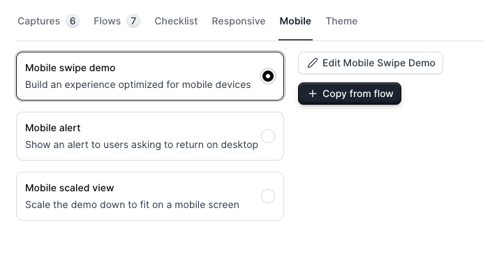
Set your Mobile Strategy
Try a demo
Conferences
- Mobile zoom (default) serves the desktop demo with pinch-to-zoom enabled
- Mobile swipe demo is used to engage your mobile visitors with a short and visual experience they can swipe through
- Mobile scaled view presents a scaled down version of your demo
- Mobile alert presents a message that asks the visitor to return on a larger device
Preview Demos
If possible, preview your demo across various devices beforehand. An extension like this mobile simulator can help simulate different device dimensions, even if you do not have access to the conference devices just yet.Here is how the Mobile swipe demo will appear on devices below 800px wide: