Build

Responsive

Navattic provides four different responsive strategies that determine how your Navattic demo appears on viewports of different sizes. Visit your Demo > Build > Responsive to adjust.

The two most common responsive strategies are Responsive and Fit width. We recommend trying both options to determine which one best suits your demo.

Responsive (default)

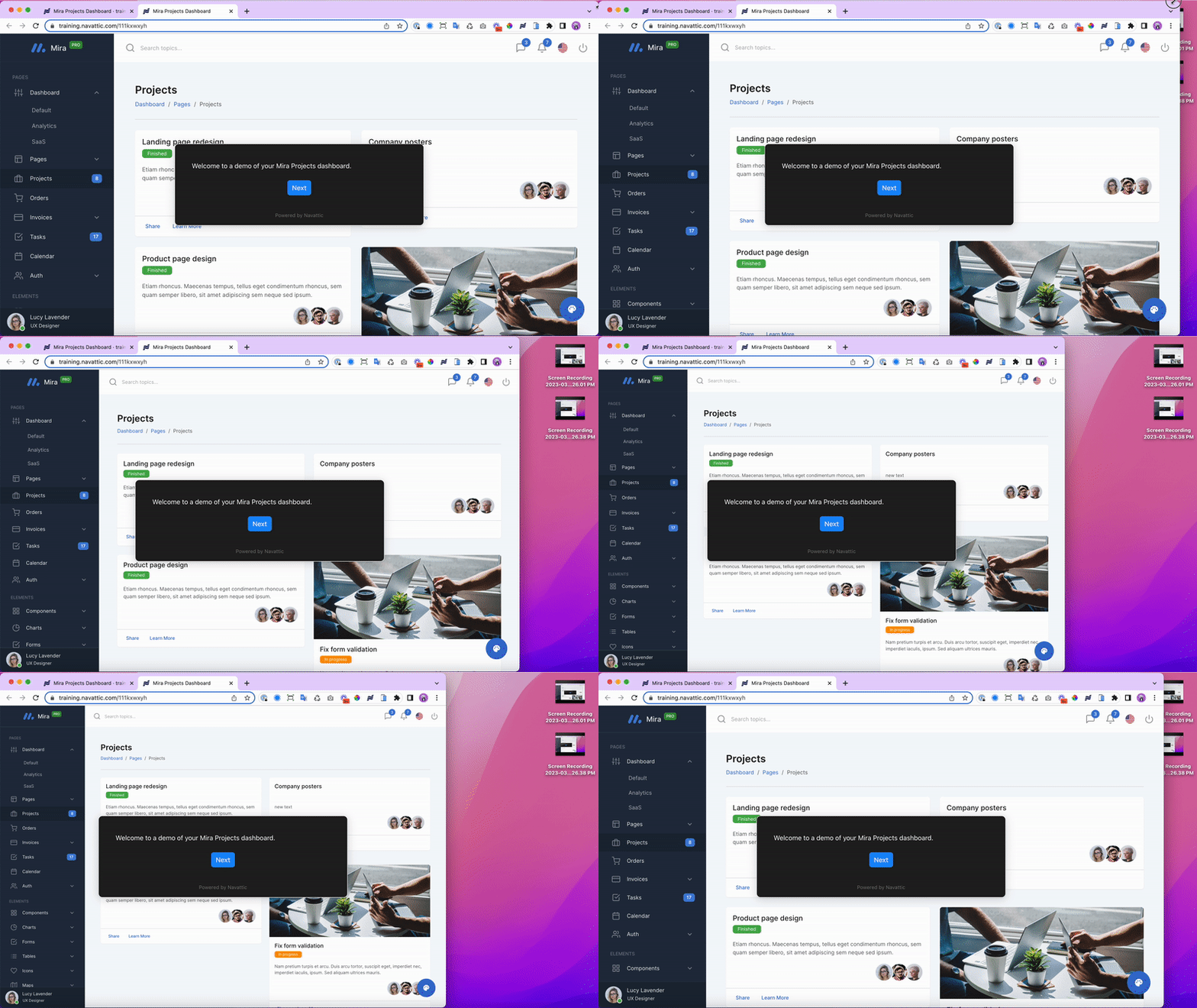
The default setting for new Product Demos, Responsive will apply your application's default styles for different viewports. This provides the most realistic look and feel for your demos and is recommended if you plan to share a Product Demo Link directly with end users.

"Responsive" behavior will rearrange elements onscreen per your application's styles


Scale width

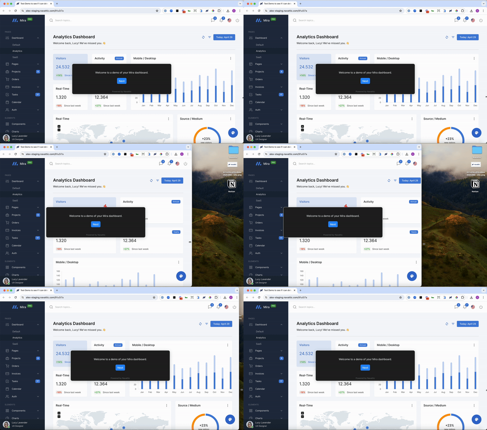
This option will fit the width of the capture to the width of the visitor’s screen. This is a good option if you are embedding a demo in a smaller iFrame or expect it to be viewed on a variety of devices.

Tip: Resize your window to 1440 x 900px or smaller when taking Captures, especially if you plan to use Fit Width. This will help onscreen elements remain legible on smaller viewports.

Fit Width will shrink or expand Captures based on width


Scale width and height

This option will fill the entire screen while maintaining the relative sizes of the original screen.

Document image


Fixed

A Fixed strategy presents Captures at their original dimensions, regardless of the end user's viewport dimensions. Visitors will scroll if there is overflow.

"Fixed" behavior will present Captures at their original dimensions