{quote}
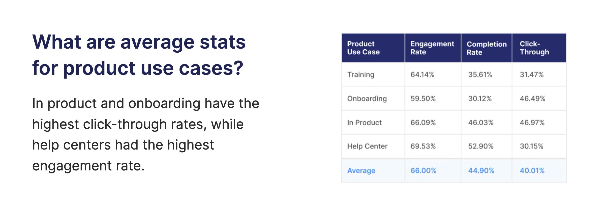 # Recommendations
For a Free Trial, Freemium, or newly onboarded audience, we recommend:
* Keep your flows short (5-8 steps) to ensure new users are not overwhelmed by your product.
* Showcase related areas of your product by using a checklist that connects multiple flows. The benefits of this strategy are two-fold: Users stay motivated by their progress as they check off items on the list and users know exactly where they paused their progress should their learning be disrupted.
* Remember to include the why behind your ‘how to’ steps. If users understand the process, they are more likely to fully adopt your recommendations.
* Include CTA buttons that direct users to additional resources like docs or give users the opportunity to book time with a Customer Success Manager if they need further assistance.
# Recommendations
For a Free Trial, Freemium, or newly onboarded audience, we recommend:
* Keep your flows short (5-8 steps) to ensure new users are not overwhelmed by your product.
* Showcase related areas of your product by using a checklist that connects multiple flows. The benefits of this strategy are two-fold: Users stay motivated by their progress as they check off items on the list and users know exactly where they paused their progress should their learning be disrupted.
* Remember to include the why behind your ‘how to’ steps. If users understand the process, they are more likely to fully adopt your recommendations.
* Include CTA buttons that direct users to additional resources like docs or give users the opportunity to book time with a Customer Success Manager if they need further assistance.
 **3. Matillion**
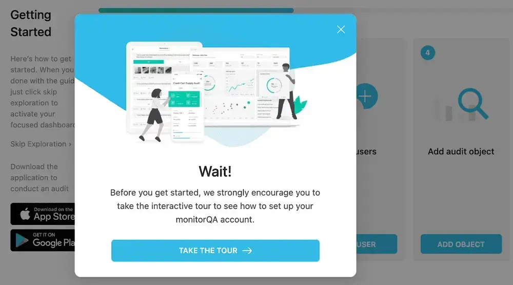
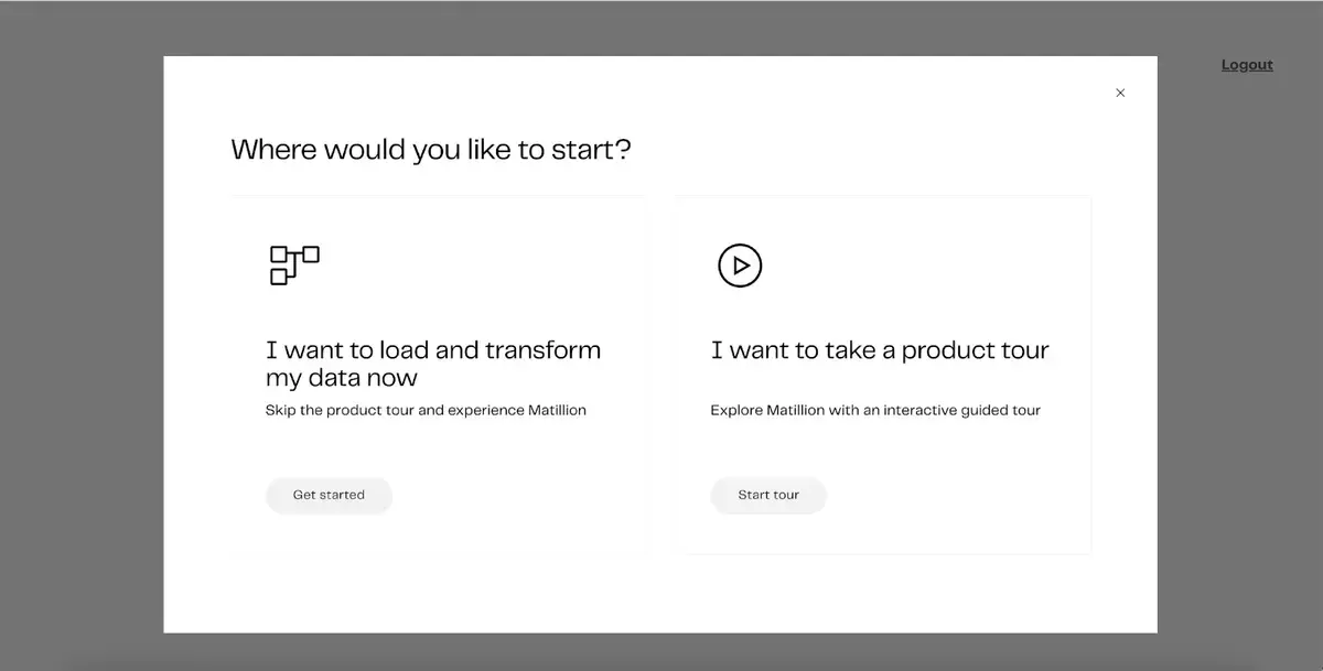
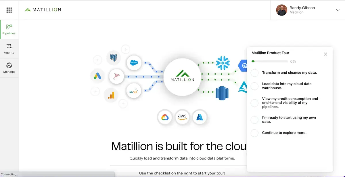
To enable new users who need extra guidance, the Matillion team offers their users a choice — go through a product tour or jump right into using the tool. They use a checklist to give users a ‘choose your own adventure’ experience where they can navigate through the tour chronologically or explore based on functionalities that most interest them.
**3. Matillion**
To enable new users who need extra guidance, the Matillion team offers their users a choice — go through a product tour or jump right into using the tool. They use a checklist to give users a ‘choose your own adventure’ experience where they can navigate through the tour chronologically or explore based on functionalities that most interest them.
 **4. Navattic**
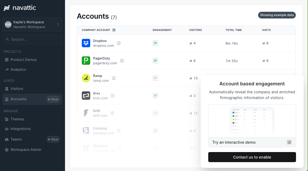
To increase awareness and adoption of our new Account based engagement feature, our team created an in-app pop up that links out to a [feature specific demo](https://navattic-website.navattic.com/il1vk0u1h). Anyone who clicks on our new ‘Accounts’ tab has the opportunity to learn more about the feature via the interactive demo.
**4. Navattic**
To increase awareness and adoption of our new Account based engagement feature, our team created an in-app pop up that links out to a [feature specific demo](https://navattic-website.navattic.com/il1vk0u1h). Anyone who clicks on our new ‘Accounts’ tab has the opportunity to learn more about the feature via the interactive demo.
 ***
# Implementation Guide
Follow the guidance below to start optimizing your activation rates with customizable demos. Demos built with these best practices deliver value early to users. Keep an eye on your demo analytics to track completion rates and consider revising any steps with significant drop off rates.
## 1. Content
**Bundle essential workflows with a checklist**: Include a checklist with flows that are chronological or focus on a shared product area. Add goal-oriented descriptions to each item on your checklist to help users find the content that is most relevant to them.
**Make it interactive**: Use tooltips, triggers, and beacons to let viewers experience using this feature or envision how to integrate it in their day-to-day
**Focus on a goal**: Activate users early on by presenting a value-driven **5-10 step flow** that help users achieve enablement milestones.
***
# Implementation Guide
Follow the guidance below to start optimizing your activation rates with customizable demos. Demos built with these best practices deliver value early to users. Keep an eye on your demo analytics to track completion rates and consider revising any steps with significant drop off rates.
## 1. Content
**Bundle essential workflows with a checklist**: Include a checklist with flows that are chronological or focus on a shared product area. Add goal-oriented descriptions to each item on your checklist to help users find the content that is most relevant to them.
**Make it interactive**: Use tooltips, triggers, and beacons to let viewers experience using this feature or envision how to integrate it in their day-to-day
**Focus on a goal**: Activate users early on by presenting a value-driven **5-10 step flow** that help users achieve enablement milestones.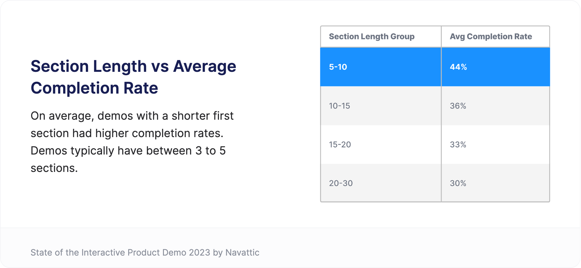 ## 2. CTAs
Keep your audience in mind and be strategic. Create CTAs that are specific to each part of the user or trial customer journey. For instance, consider linking to a:
* Call booking page for your sales or support team
* Knowledge base
* Webinar registration page
* Product feedback form
* Pricing page for additional features
## 3. Deployment
**Add product tours to email onboarding sequences (easy)**: Optimize your existing email sequences by including a Product Demo. Consider making multiple demos that highlight your most essential features to help new users experience aha moments early on.
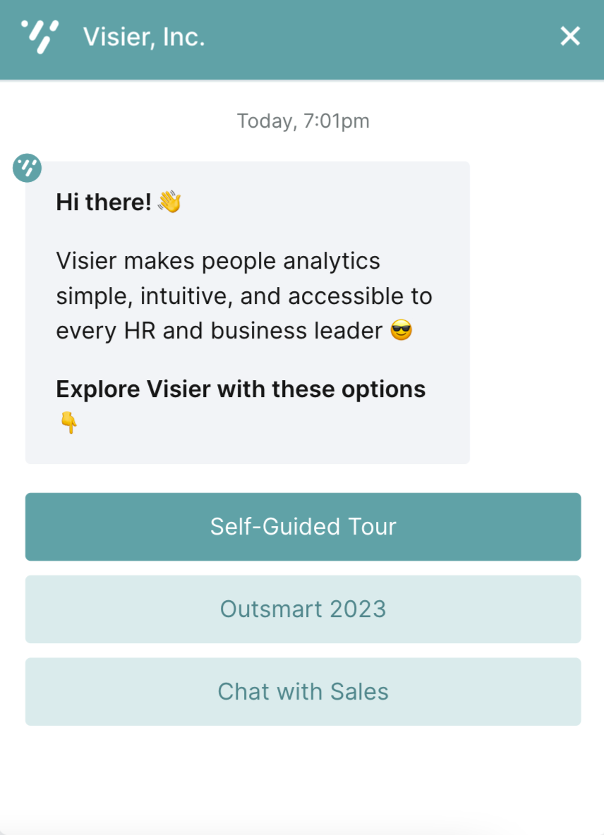
**Present demos through an in-app chat that is only accessible to users of your product (medium)**: Empower new users through a short demo in your FAQ snippets to resolve common mishaps while customers wait to chat with a representative.
## 2. CTAs
Keep your audience in mind and be strategic. Create CTAs that are specific to each part of the user or trial customer journey. For instance, consider linking to a:
* Call booking page for your sales or support team
* Knowledge base
* Webinar registration page
* Product feedback form
* Pricing page for additional features
## 3. Deployment
**Add product tours to email onboarding sequences (easy)**: Optimize your existing email sequences by including a Product Demo. Consider making multiple demos that highlight your most essential features to help new users experience aha moments early on.
**Present demos through an in-app chat that is only accessible to users of your product (medium)**: Empower new users through a short demo in your FAQ snippets to resolve common mishaps while customers wait to chat with a representative.
 **Add an interactive demo as an exit intent pop up (medium)**: Activate users who are unsure where to start by setting an exit intent pop up to appear after a certain amount of inactivity passes.
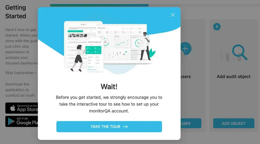 **Include demos in your product onboarding experience (advanced)**: Support all new users with in-product demos that users can choose to explore before they dive in to your product. We recommend using our [Navattic-Chameleon integration](https://www.chameleon.io/integrations/navattic) to show-case in-app interactive demos from any prebuilt Chameleon Experience.
 ## 4. Maintenance
Whether you embed your demo in app, share it via an exit intent pop-up, or send it via your onboarding sequences, you can easily sync updates to live demos. No need to re-record an onboarding video or revise your email templates every time this is a UI update in your product.
Whenever you need to revise your Product Demo, make your edits with the associated Captures, Flows, or Checklists and click “Publish”. This will automatically push the revised version out to all instances of your Product demo that have been shared or embedded.
Just need to replace a few captures? Easily do so without impacting the rest of your demo:
## 4. Maintenance
Whether you embed your demo in app, share it via an exit intent pop-up, or send it via your onboarding sequences, you can easily sync updates to live demos. No need to re-record an onboarding video or revise your email templates every time this is a UI update in your product.
Whenever you need to revise your Product Demo, make your edits with the associated Captures, Flows, or Checklists and click “Publish”. This will automatically push the revised version out to all instances of your Product demo that have been shared or embedded.
Just need to replace a few captures? Easily do so without impacting the rest of your demo: