> ## Documentation Index
> Fetch the complete documentation index at: https://docs.navattic.com/llms.txt
> Use this file to discover all available pages before exploring further.

# Outlook

> Create and share demos from within Outlook.

export const MediaCard = ({title = '', url, type = 'demo'}) => {
  const attributes = type === 'demo' ? {
    'data-navattic-open': url,
    'data-navattic-title': title
  } : {
    'data-video': url
  };
  return <div {...attributes} className="hidden md:inline-block w-auto cursor-pointer overflow-hidden rounded-lg border border-gray-200 dark:border-gray-700 shadow-sm">
<div className="flex items-center gap-3 bg-white dark:bg-gray-800 px-3 py-2">
<div className={`flex h-7 w-7 items-center justify-center rounded-md ${type === 'video' ? 'bg-blue-100 dark:bg-blue-900' : 'bg-orange-100 dark:bg-orange-900'}`} style={{
    backgroundColor: type === 'video' ? 'var(--video-bg)' : 'var(--demo-bg)'
  }}>
<Icon icon={type === 'video' ? 'circle-play' : 'square-mouse-pointer'} color={type === 'video' ? 'var(--video-icon)' : 'var(--demo-icon)'} />
</div>
<div>
<div className="text-sm font-medium text-gray-900 dark:text-gray-100">
{type === 'video' ? 'Watch video' : 'Try a demo'}
</div>
<div className="text-sm text-gray-500 dark:text-gray-400">{title}</div>
</div>
</div>
<style jsx>{`
  :root {
    --video-bg: #dbeafe;
    --video-icon: #2563eb;
    --demo-bg: #ffedd5;
    --demo-icon: #ea580c;
  }
  :global(.dark) {
    --video-bg: #1e3a8a;
    --video-icon: #60a5fa;
    --demo-bg: #7c2d12;
    --demo-icon: #fb923c;
  }
`}</style>
</div>;
};

<Frame>
  <img src="https://mintcdn.com/navattic-app/c6crWyX_VwcL814J/images/outlook-inbox.png?fit=max&auto=format&n=c6crWyX_VwcL814J&q=85&s=50a9e18561b82dcaa17550bcc10a7988" alt="Salesloft Inbox Navattic Integration" className="overflow-hidden rounded-xl border" width="1414" height="848" data-path="images/outlook-inbox.png" />
</Frame>

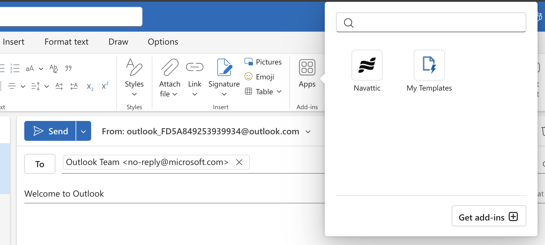
Sales reps can create and share demos from within <img src="https://mintcdn.com/navattic-app/c6crWyX_VwcL814J/images/outlook.png?fit=max&auto=format&n=c6crWyX_VwcL814J&q=85&s=25031c3e7d3c570ef0b056f50ac6909d" alt="Outlook Logo" className="h-4 w-4 inline-block m-0 -mt-px" width="826" height="769" data-path="images/outlook.png" /> **Outlook**.

To access the Outlook integration, please install the Navattic Outlook Add-in from the [AppSource store](https://appsource.microsoft.com/en-us/product/office/WA200009256).

<Panel>
  <Card href="https://appsource.microsoft.com/en-us/product/office/WA200009256" title="Install Navattic for Outlook" icon={<img src="/images/outlook.png" alt="Outlook Logo" className="h-6 w-6 inline-block m-0 -mt-px" /> }>
    Download from the Outlook AppSource store.
  </Card>
</Panel>

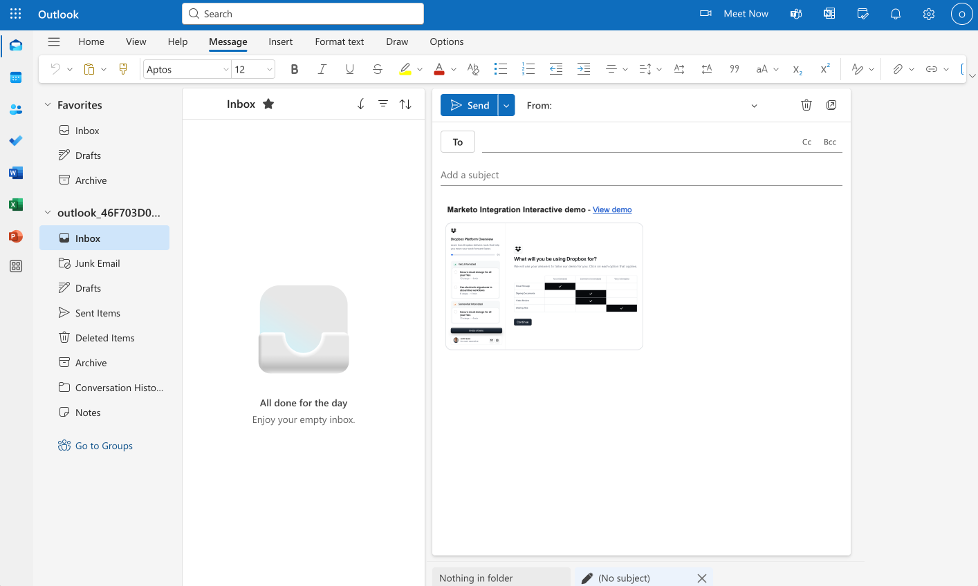
After installing the Add-in, reps will see the Add-in in their Outlook compose window.

<MediaCard url="https://navattic-docs.navattic.com/6xt9053t" type="demo" title="Outlook Setup" />

## How to send a demo in Outlook

<Steps>
  <Step title="Click the Apps icon in the compose window">
    <img src="https://mintcdn.com/navattic-app/ZCha297cPk0e9bDw/images/outlook-ribbon-classic.png?fit=max&auto=format&n=ZCha297cPk0e9bDw&q=85&s=5dd871269ec0159ceb92945d6c09382c" alt="" width="1752" height="790" data-path="images/outlook-ribbon-classic.png" />

    In the add-in window, click on the Navattic logo to launch the add-in.
  </Step>

  <Step title="Create a custom demo">
    Follow steps to create a custom demo.
  </Step>

  <Step title="Send the email">
    After creating the demo, the demo link and preview will be injected into the email body.
  </Step>
</Steps>

## Crafting emails with demos best practices

Read best practices for crafting emails based on use cases:

<CardGroup cols={2}>
  <Card horizontal title="Outbound" icon="mail-check" href="/launchpad/use-cases/outbound" />

  <Card horizontal title="Pre-call discovery" icon="package-check" href="/launchpad/use-cases/pre-call-discovery" />

  <Card horizontal title="Post-call followup" icon="user-round-check" href="/launchpad/use-cases/post-call" />
</CardGroup>