> ## Documentation Index
> Fetch the complete documentation index at: https://docs.navattic.com/llms.txt
> Use this file to discover all available pages before exploring further.

# Sandbox demos

> Learn how to quickly build a lightweight sandbox demo.

export const MediaCard = ({title = '', url, type = 'demo'}) => {
  const attributes = type === 'demo' ? {
    'data-navattic-open': url,
    'data-navattic-title': title
  } : {
    'data-video': url
  };
  return <div {...attributes} className="hidden md:inline-block w-auto cursor-pointer overflow-hidden rounded-lg border border-gray-200 dark:border-gray-700 shadow-sm">
<div className="flex items-center gap-3 bg-white dark:bg-gray-800 px-3 py-2">
<div className={`flex h-7 w-7 items-center justify-center rounded-md ${type === 'video' ? 'bg-blue-100 dark:bg-blue-900' : 'bg-orange-100 dark:bg-orange-900'}`} style={{
    backgroundColor: type === 'video' ? 'var(--video-bg)' : 'var(--demo-bg)'
  }}>
<Icon icon={type === 'video' ? 'circle-play' : 'square-mouse-pointer'} color={type === 'video' ? 'var(--video-icon)' : 'var(--demo-icon)'} />
</div>
<div>
<div className="text-sm font-medium text-gray-900 dark:text-gray-100">
{type === 'video' ? 'Watch video' : 'Try a demo'}
</div>
<div className="text-sm text-gray-500 dark:text-gray-400">{title}</div>
</div>
</div>
<style jsx>{`
  :root {
    --video-bg: #dbeafe;
    --video-icon: #2563eb;
    --demo-bg: #ffedd5;
    --demo-icon: #ea580c;
  }
  :global(.dark) {
    --video-bg: #1e3a8a;
    --video-icon: #60a5fa;
    --demo-bg: #7c2d12;
    --demo-icon: #fb923c;
  }
`}</style>
</div>;
};

<Info>
  Enabled in workspaces on the Growth plan and above through Launchpad.
</Info>

<Frame>
  <img className="overflow-hidden rounded-xl border" src="https://mintcdn.com/navattic-app/Wym34-C-snZlIePn/images/sandbox-builder.png?fit=max&auto=format&n=Wym34-C-snZlIePn&q=85&s=ff279683bfb1b06a7939c87cd30dcdf9" alt="Sandbox builder" width="2887" height="1738" data-path="images/sandbox-builder.png" />
</Frame>

<img src="https://mintcdn.com/navattic-app/CaLa6x42vs1NHRL9/images/icons/sandbox.svg?fit=max&auto=format&n=CaLa6x42vs1NHRL9&q=85&s=29b87a888356544b714dc1c0fcf44aeb" className="m-0 -mt-px inline-flex h-5 w-5" width="60" height="60" data-path="images/icons/sandbox.svg" />

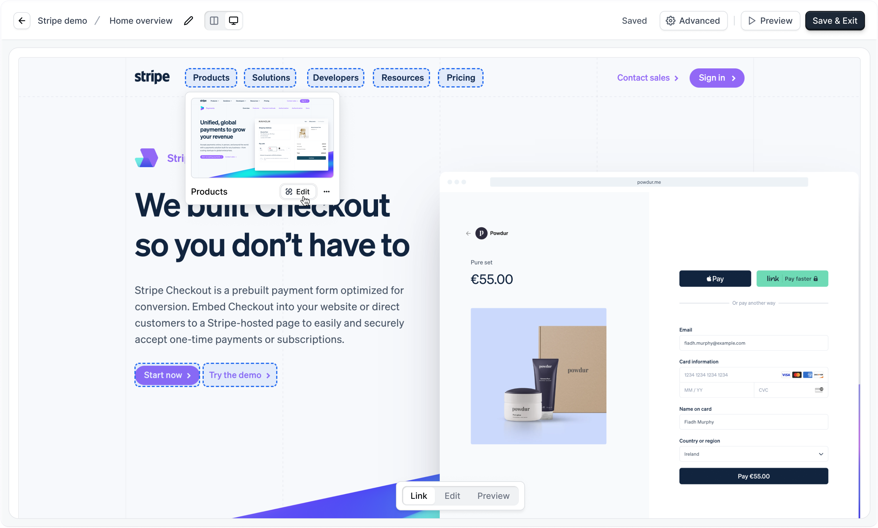
**Sandbox demos** are a way to quickly build lightweight sandbox demos of your application.

Unlike other guided product demos, sandbox demos uniquely allow you to click elements to navigate many different parts of your application.
<Info>
  Sandbox demos are intended for [presenting](/launchpad/share/present) by sales reps in Launchpad and are not for sharing publicly or embedding on your website.
</Info>

## Building a Sandbox demo

<Steps>
  <Step title="Generate a Sandbox Demo">
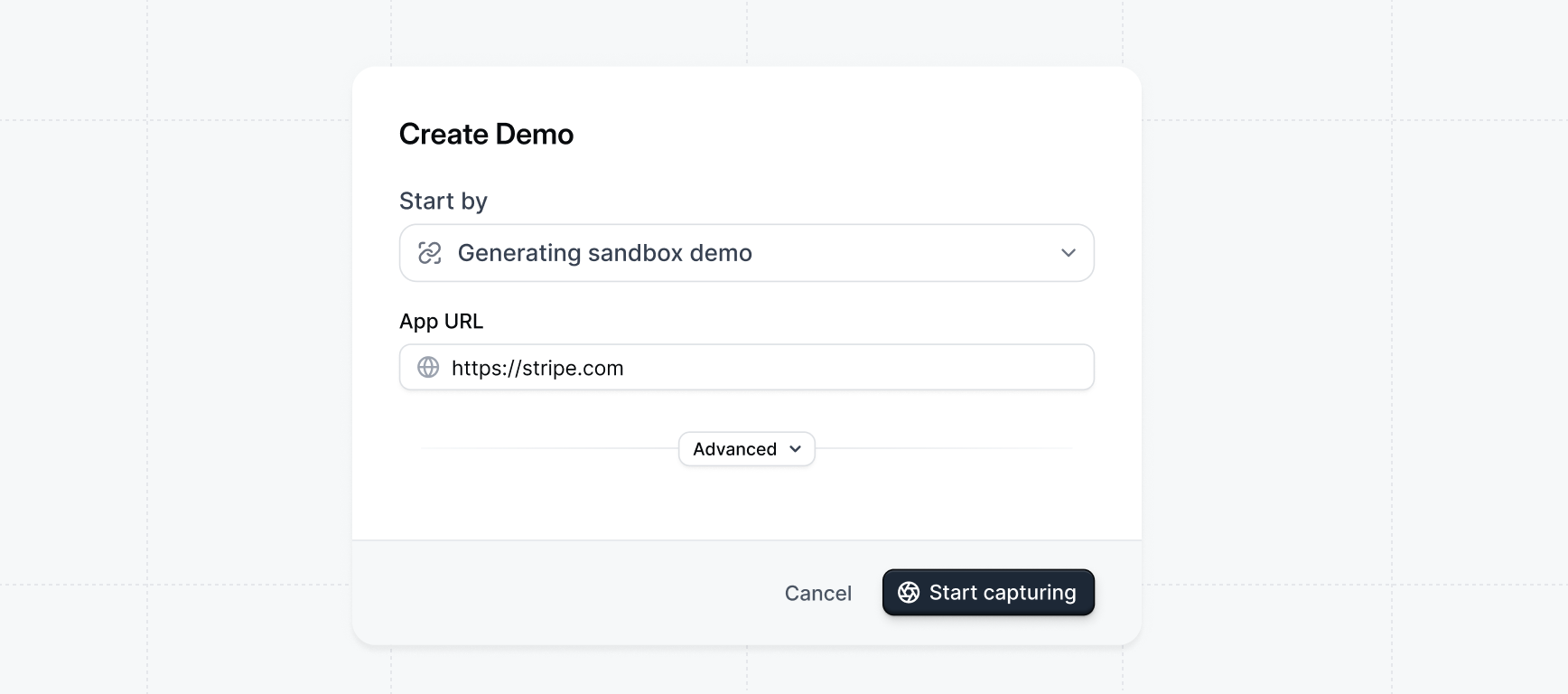
    From the <Icon icon="layout-grid" /> **Product demos** page click `+ Create demo`. For the `Start by` option, Select `Generating sandbox demo`.

    <Frame>
      <img src="https://mintcdn.com/navattic-app/eEo16-sBVsd0fYuf/images/generating-sandbox-modal.png?fit=max&auto=format&n=eEo16-sBVsd0fYuf&q=85&s=e5013ab4376a65e819a834b9b69eb65e" alt="Generating Sandbox Demo Modal" width="1736" height="768" data-path="images/generating-sandbox-modal.png" />
    </Frame>
  </Step>

  <Step title="Take captures with click to capture">
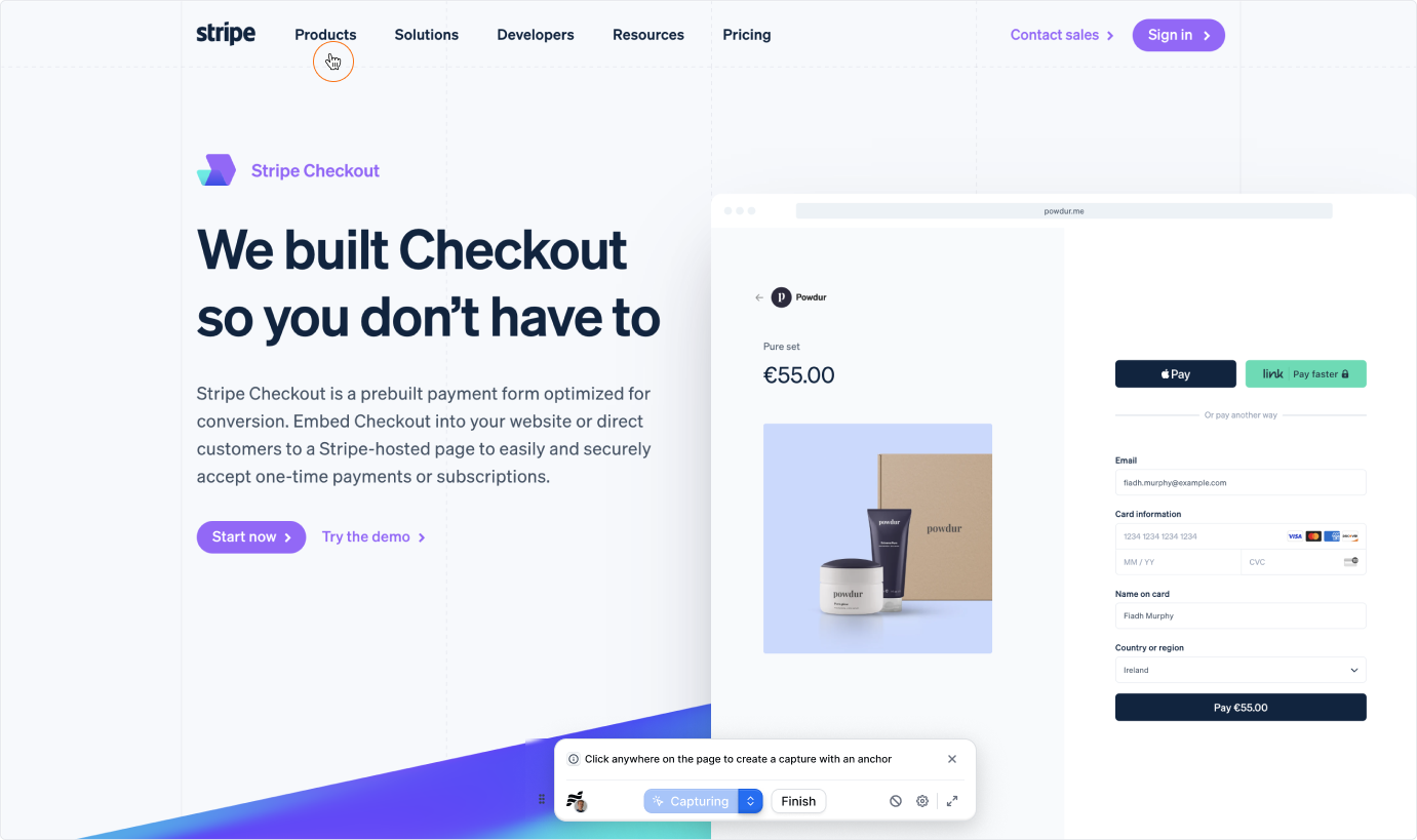
    Take captures as you normally would with `click to capture` by clicking through your application. Your clicks will be used as anchors to generate the links for your sandbox demo.

    <Frame>
      <img src="https://mintcdn.com/navattic-app/QNOHztjorxprHO7d/images/capturing-stripe.png?fit=max&auto=format&n=QNOHztjorxprHO7d&q=85&s=ea16e8437a9284078d45bdc75c68b02e" alt="Capturing Stripe" width="1381" height="819" data-path="images/capturing-stripe.png" />
    </Frame>
  </Step>

  <Step title="Click Finish">
    When you're done taking captures, click `Finish` to generate your sandbox demo and be taken to the **Sandbox builder**.
  </Step>

  <Step title="Add remaining links">
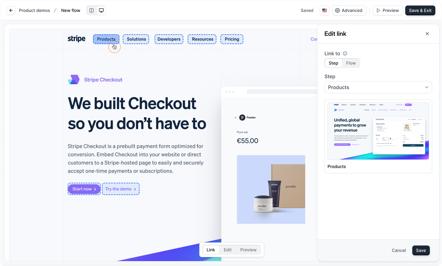
    You can add any remaining links to your demo by clicking on an element while in `Link` mode.

    We recommend organizing your sandbox into seperate flows based on core features of the product.

    For example, if your app's navigation looked like this, a seperate flow should be created for each sidebar item / feature name.

    <Frame>
      <img src="https://mintcdn.com/navattic-app/Wym34-C-snZlIePn/images/sandbox-navbar-example.png?fit=max&auto=format&n=Wym34-C-snZlIePn&q=85&s=3bcb5b53c3d1d8797e4fe0409e7fe63a" className="border rounded-xl" width="984" height="128" data-path="images/sandbox-navbar-example.png" />
    </Frame>

    Would be organized into the following flows and screens:

    ```txt Example flows and screens expandable {1} theme={null}
      Domains
        - Domains overview
        - Buy a domain
        - Add an existing domain
        - ...etc
      Usage
        - Usage overview
        - Usage invoices
        - Usage spend management
        - ...etc
      Observability
        - Observability overview
        - Notebooks
        - Middleware
        - ...etc
      Storage
       - Create database
       - Open database
       - Remove database
       - ...etc
      Flag
       - Feature flag overview
       - Create flag
       - Update flag
       - ...etc
      AI Gateway
       - Gateway overview
       - Quick start
       - Model list
       - ...etc
    ```

    We recommend keeping each sandbox relatively lightweight to \~50 screens to keep maintenance easy and help reps stay on course.
    <Frame>
      <img src="https://mintcdn.com/navattic-app/Wym34-C-snZlIePn/images/sandbox-edit-link.png?fit=max&auto=format&n=Wym34-C-snZlIePn&q=85&s=5ab56f2b3f9c1c27e2a34ee58048426f" alt="" width="1444" height="869" data-path="images/sandbox-edit-link.png" />
    </Frame>
  </Step>
</Steps>

<Icon icon="party-popper" /> **Congratulations** -- you've finished building your first <Icon icon="chart-no-axes-column" /> **Sandbox demo** and it's ready to present!

Sandbox demos are a powerful tool for sales teams to deliver a high-level overview of the platform to prospects.

They’re especially useful for showcasing **Ah-ha moments** in your product, making it easy to showcase value early in the sales cycle.

<MediaCard url="https://navattic-website.navattic.com/mzbx07v0" type="demo" title="Sandbox demos" />

<img src="https://mintcdn.com/navattic-app/CaLa6x42vs1NHRL9/images/icons/sandbox.svg?fit=max&auto=format&n=CaLa6x42vs1NHRL9&q=85&s=29b87a888356544b714dc1c0fcf44aeb" className="m-0 -mt-px inline-flex h-5 w-5" width="60" height="60" data-path="images/icons/sandbox.svg" />

**Sandbox demos** can be presented on live calls. Learn more about presenting demos:

<CardGroup cols={2}>
  <Card title="Present demos" icon="presentation" href="/launchpad/share/present" img="/images/present-1-1.png">
    Share and present Navattic demos during live calls
  </Card>

  <Card title="Sandbox Builder guide" icon="hammer" href="/demos/sandbox">
    Full guide to the Sandbox Builder, NavLinks, and settings
  </Card>
</CardGroup>
