> ## Documentation Index
> Fetch the complete documentation index at: https://docs.navattic.com/llms.txt
> Use this file to discover all available pages before exploring further.

# Customize your theme

> Learn how to customize your theme with your company brand.

export const MediaCard = ({title = '', url, type = 'demo'}) => {
  const attributes = type === 'demo' ? {
    'data-navattic-open': url,
    'data-navattic-title': title
  } : {
    'data-video': url
  };
  return <div {...attributes} className="hidden md:inline-block w-auto cursor-pointer overflow-hidden rounded-lg border border-gray-200 dark:border-gray-700 shadow-sm">
<div className="flex items-center gap-3 bg-white dark:bg-gray-800 px-3 py-2">
<div className={`flex h-7 w-7 items-center justify-center rounded-md ${type === 'video' ? 'bg-blue-100 dark:bg-blue-900' : 'bg-orange-100 dark:bg-orange-900'}`} style={{
    backgroundColor: type === 'video' ? 'var(--video-bg)' : 'var(--demo-bg)'
  }}>
<Icon icon={type === 'video' ? 'circle-play' : 'square-mouse-pointer'} color={type === 'video' ? 'var(--video-icon)' : 'var(--demo-icon)'} />
</div>
<div>
<div className="text-sm font-medium text-gray-900 dark:text-gray-100">
{type === 'video' ? 'Watch video' : 'Try a demo'}
</div>
<div className="text-sm text-gray-500 dark:text-gray-400">{title}</div>
</div>
</div>
<style jsx>{`
  :root {
    --video-bg: #dbeafe;
    --video-icon: #2563eb;
    --demo-bg: #ffedd5;
    --demo-icon: #ea580c;
  }
  :global(.dark) {
    --video-bg: #1e3a8a;
    --video-icon: #60a5fa;
    --demo-bg: #7c2d12;
    --demo-icon: #fb923c;
  }
`}</style>
</div>;
};

<Frame>
  <img className="block rounded-xl border" src="https://mintcdn.com/navattic-app/KyLVfu_TECs3vwBD/images/theme-card.png?fit=max&auto=format&n=KyLVfu_TECs3vwBD&q=85&s=f8e90e14d4b429861b8e643d688c5224" alt="Themes card" width="1736" height="768" data-path="images/theme-card.png" />
</Frame>

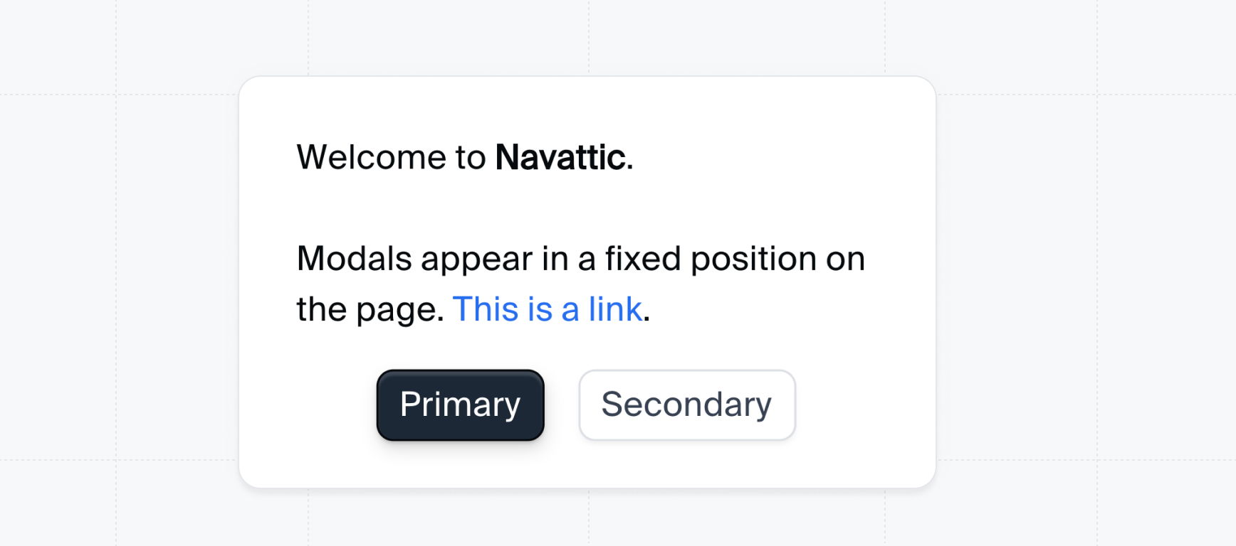
Themes allow you to customize your demo with your company brand.

<Note>
  The **Themes** section is only visible to members whose role has theme permission enabled. Workspace admins can manage theme permissions per role at **Settings** > **Roles**. Setting a theme as your workspace default requires the Admin role.
</Note>

<Expandable title="theme properties">
  **Themes allow you to:**

  * Change the font
  * Add a watermark
  * Add a progress bar
  * Update the Dialog border color and radius
  * Change the Modal width
  * Change the Tooltip width and pointer size
  * Edit Buttons
  * Edit Beacons
  * Change the Checklist checkmark color and task completion opacity
  * Change the Checklist launcher placement, padding, and color
  * Add a CTA banner
  * Change the backdrop border color
  * Change the Modal and Tooltip margins
  * Customize the Mobile Swipe Demo theme.
</Expandable>

<Steps>
  <Step title="Create a Theme">
    Navattic comes prepared with a Light Theme and a Dark Theme. You can duplicate an existing Theme to make edits, or select **+ Create theme** to start from scratch. Themes are available to all members of your Workspace. Once created, apply your Theme to any Flow or Checklist in order to view changes.
  </Step>

  <Step title="Apply a Theme">
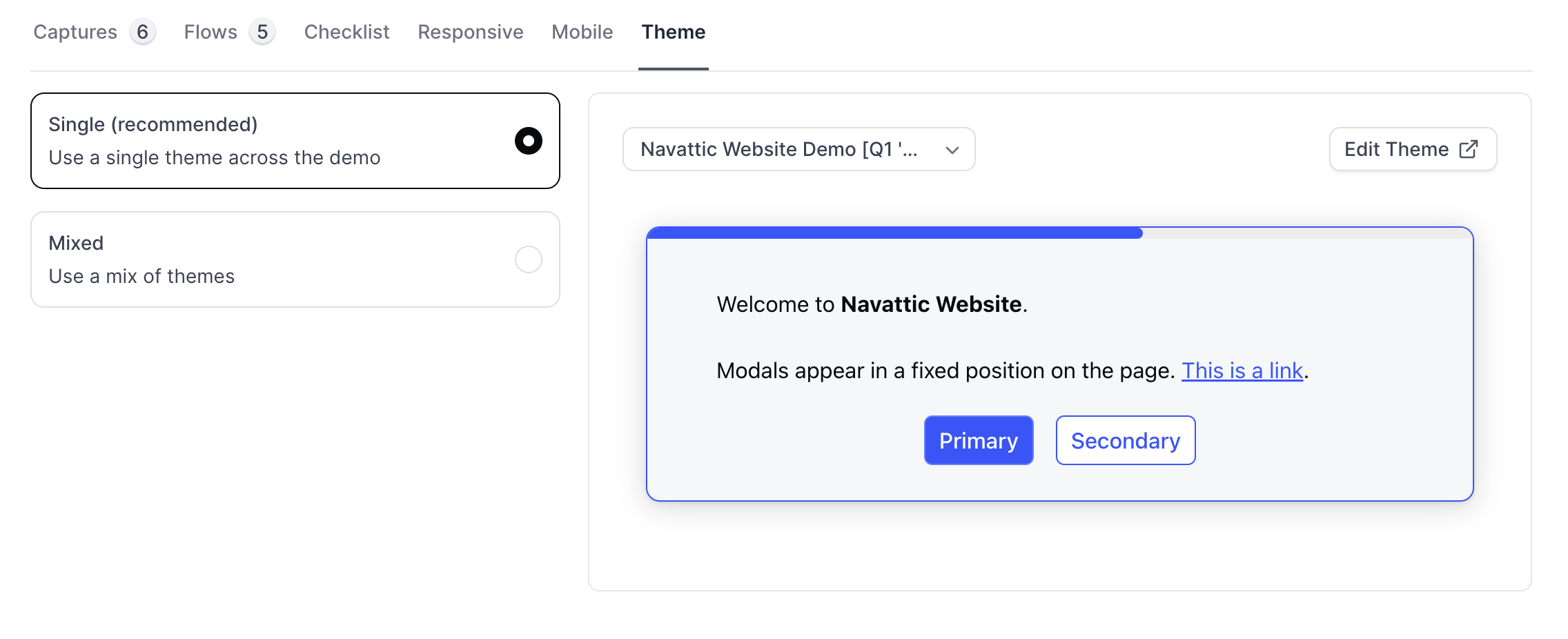
    To apply a Theme to your demo, navigate to a Product Demo > Build > Theme. Apply a single theme throughout your entire demo, or select a different theme for each flow.

    <Frame>
      <img src="https://mintcdn.com/navattic-app/eD69r1FtqxHvjQao/images/customize-your-theme-1.png?fit=max&auto=format&n=eD69r1FtqxHvjQao&q=85&s=832a5969bb4cf371478f41390c5c6197" alt="Apply a Theme" width="2272" height="926" data-path="images/customize-your-theme-1.png" />
    </Frame>
  </Step>
</Steps>

### FAQs

<AccordionGroup>
  <Accordion title="How can I autogenerate a Theme using my company colors?">
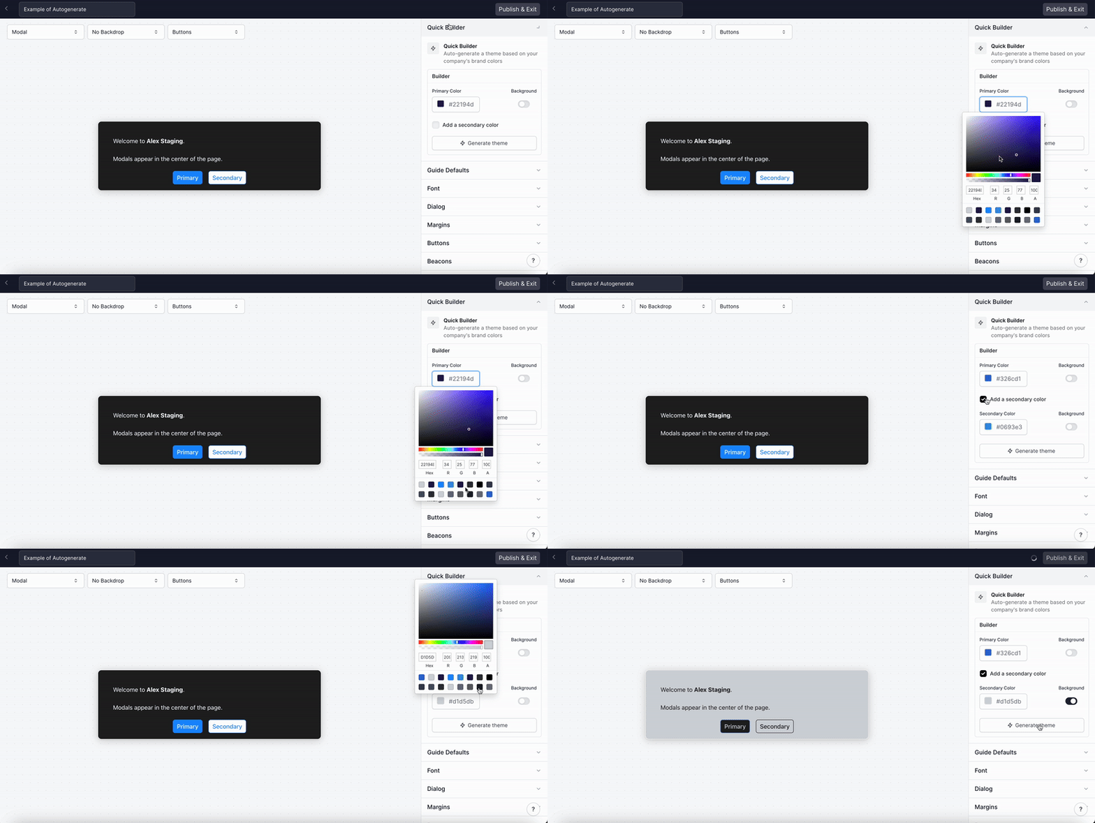
    To autogenerate a Theme, go to Themes > Quick Builder. From here, you can choose a primary color and a secondary color > Click "Generate theme". If you want one of the colors to be the default background color, toggle on "background".

    These colors will automatically apply to all of the elements in Themes including buttons, beacons, tooltips, etc.

    <img src="https://mintcdn.com/navattic-app/eD69r1FtqxHvjQao/images/customize-your-theme-2.gif?s=52a2b138239cd6c4ab50aaaf15e1222e" alt="" width="800" height="402" data-path="images/customize-your-theme-2.gif" />
  </Accordion>

  <Accordion title="How can I change the font?">
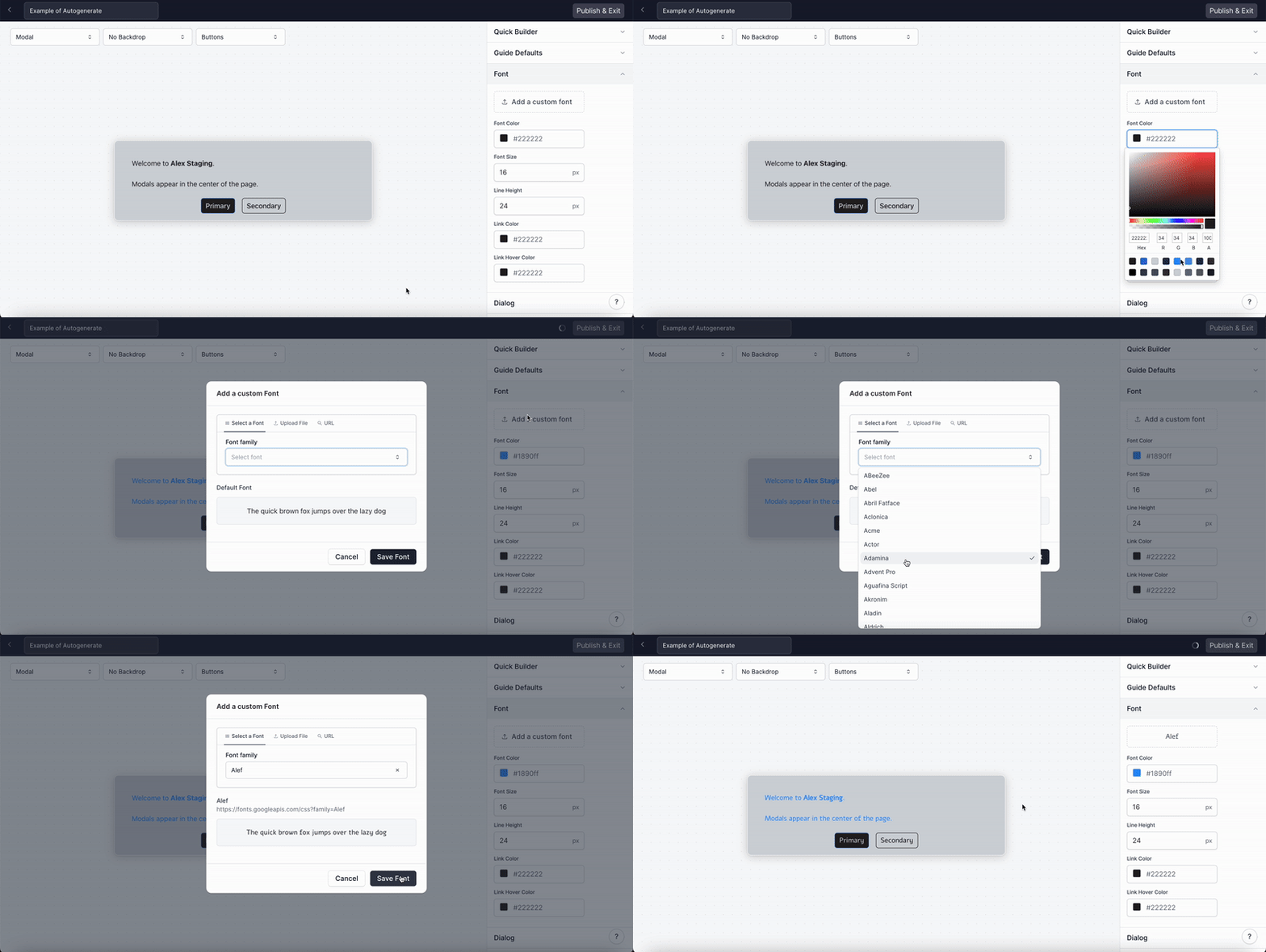
    To edit the font used in your demo, go to Themes > Font. You can edit the font color, size, line height, link color, and link hover color. You can also select a custom font.

    <img src="https://mintcdn.com/navattic-app/eD69r1FtqxHvjQao/images/customize-your-theme-3.gif?s=395a1d1256709b23cd1bd7c4b1cdd9ba" alt="" width="800" height="402" data-path="images/customize-your-theme-3.gif" />
  </Accordion>

  <Accordion title="How do I edit the Button color and size?">
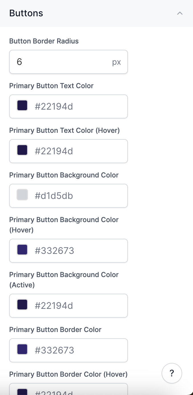
    To customize the Button, go to Themes > Select "Buttons" in the menu on the right. From here you can edit the Button border, text color, background color, font weight, and padding.

    <img src="https://mintcdn.com/navattic-app/eD69r1FtqxHvjQao/images/customize-your-theme-10.png?fit=max&auto=format&n=eD69r1FtqxHvjQao&q=85&s=4bef5cf097457526ae25e02c24508285" size="60" width="676" height="1380" position="center" caption="" data-path="images/customize-your-theme-10.png" />
  </Accordion>

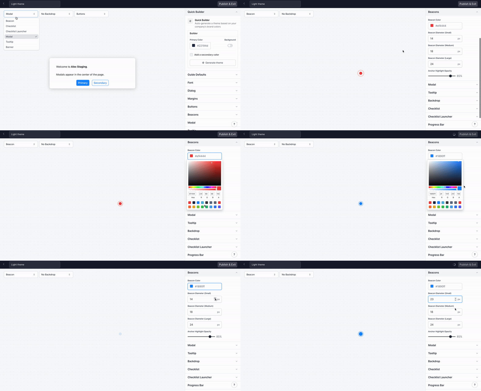
  <Accordion title="How do I edit the Beacon color and size?">
    To edit the color and size of the Beacon, go to Themes > Select "Beacons" in the menu on the right.

    <img src="https://mintcdn.com/navattic-app/eD69r1FtqxHvjQao/images/customize-your-theme-4.gif?s=d03c814bf69e62aa7166398aca4194f2" alt="" width="800" height="434" data-path="images/customize-your-theme-4.gif" />
  </Accordion>

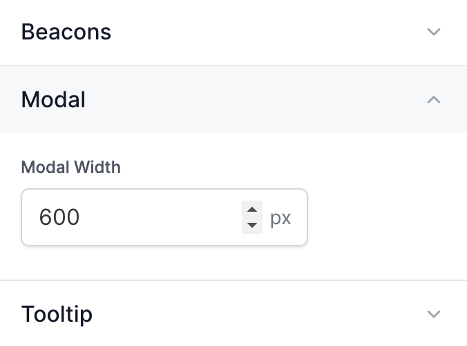
  <Accordion title="How can I change the modal width?">
    To edit the modal width, go to Themes > Select "Modal" in the menu on the right. Use the arrows to change the modal width. This will change the width off all modals in demos with this Theme.

    <img src="https://mintcdn.com/navattic-app/eD69r1FtqxHvjQao/images/customize-your-theme-11.png?fit=max&auto=format&n=eD69r1FtqxHvjQao&q=85&s=77b81e4235ff6679ae2bc4a8effd9d0a" size="50" width="676" height="500" position="center" caption="" data-path="images/customize-your-theme-11.png" />
  </Accordion>

  <Accordion title="How can I customize the width of my Tooltips?">
    To edit the Tooltip width, go to Themes > Tooltip. Use the arrows to change the Tooltip widths for
    Small, Medium, and Large. Check out{' '}
    [Customize Tooltip Width](/build#Np-Mf){' '}
    for more details.
  </Accordion>

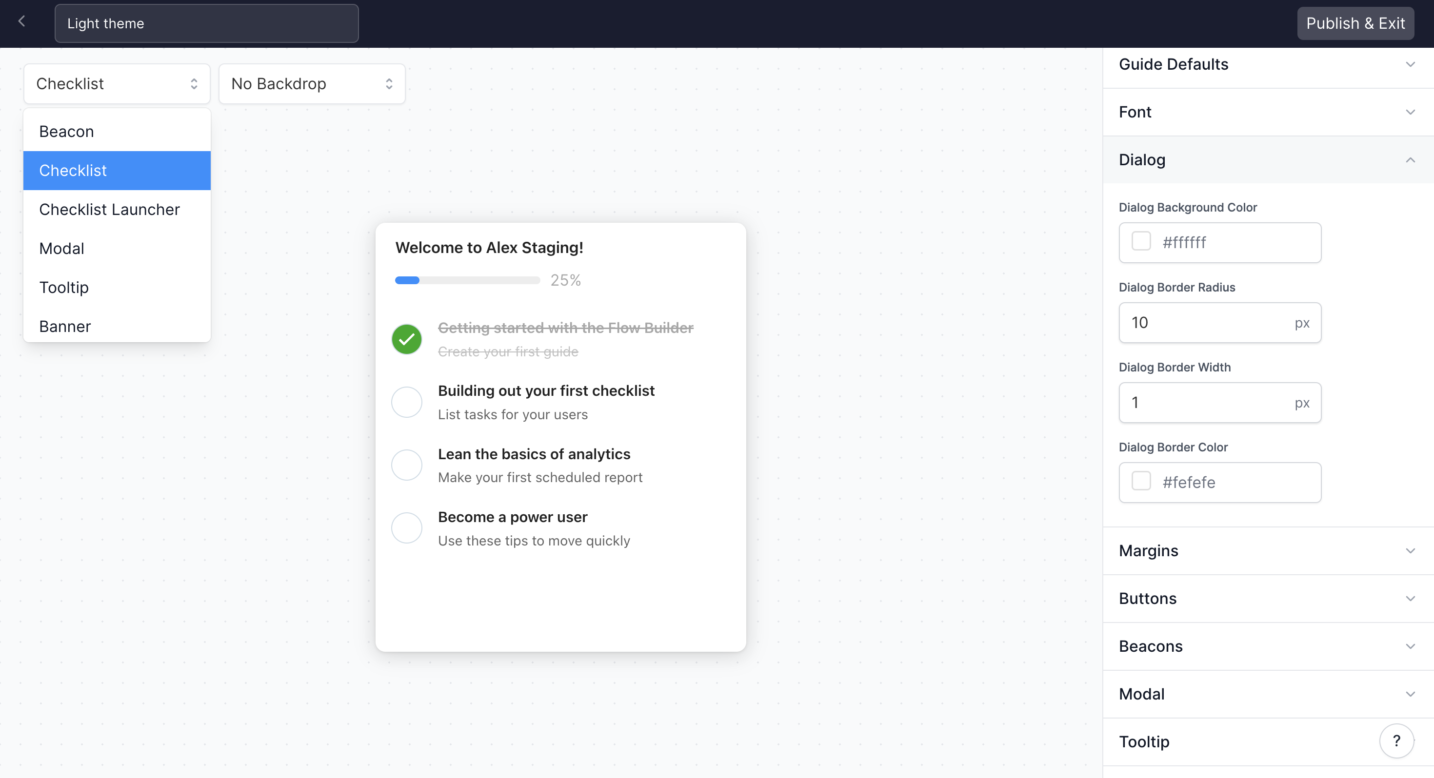
  <Accordion title="How do I edit the Checklist background color, border, and font?">
    To edit your Checklist background color and border, go to Themes > Use the drop down to select Checklist > Select Dialog.

    You can also edit the Font in your Checklist directly above Dialog. Make sure to Publish & Exit after making changes to your Checklist.

    <img src="https://mintcdn.com/navattic-app/eD69r1FtqxHvjQao/images/customize-your-theme-5.png?fit=max&auto=format&n=eD69r1FtqxHvjQao&q=85&s=cbf5855d0ca33e6fa054b6db9767e543" alt="" width="2940" height="1596" data-path="images/customize-your-theme-5.png" />
  </Accordion>

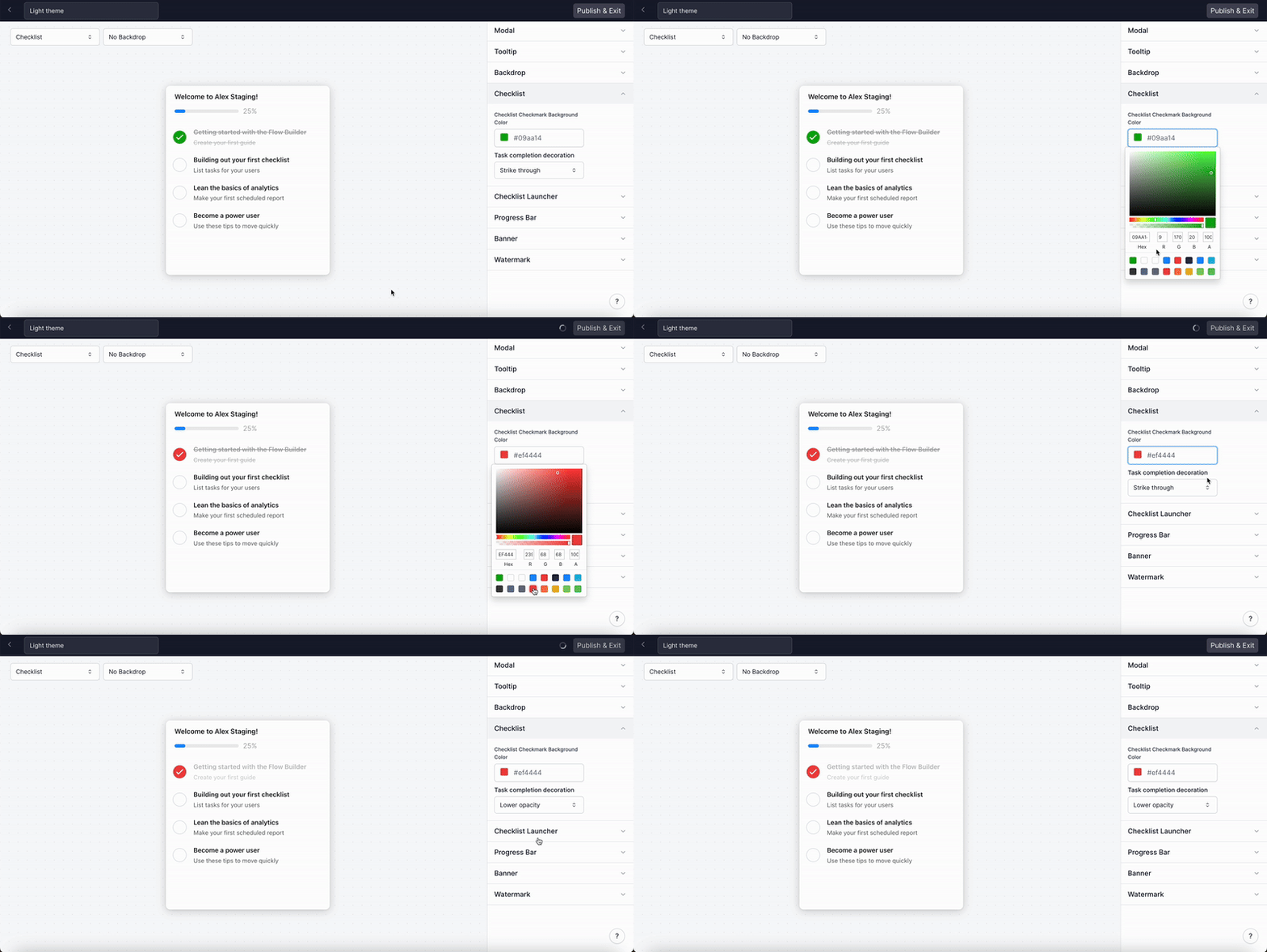
  <Accordion title="How do I edit the Checklist checkmark color and task completion decoration?">
    To edit the Checklist checkmark color visit Themes > Select Checklist in the righthand menu.

    <img src="https://mintcdn.com/navattic-app/eD69r1FtqxHvjQao/images/customize-your-theme-6.gif?s=75bc15cfa21bab71f154147bfceb6cd9" alt="" width="800" height="402" data-path="images/customize-your-theme-6.gif" />
  </Accordion>

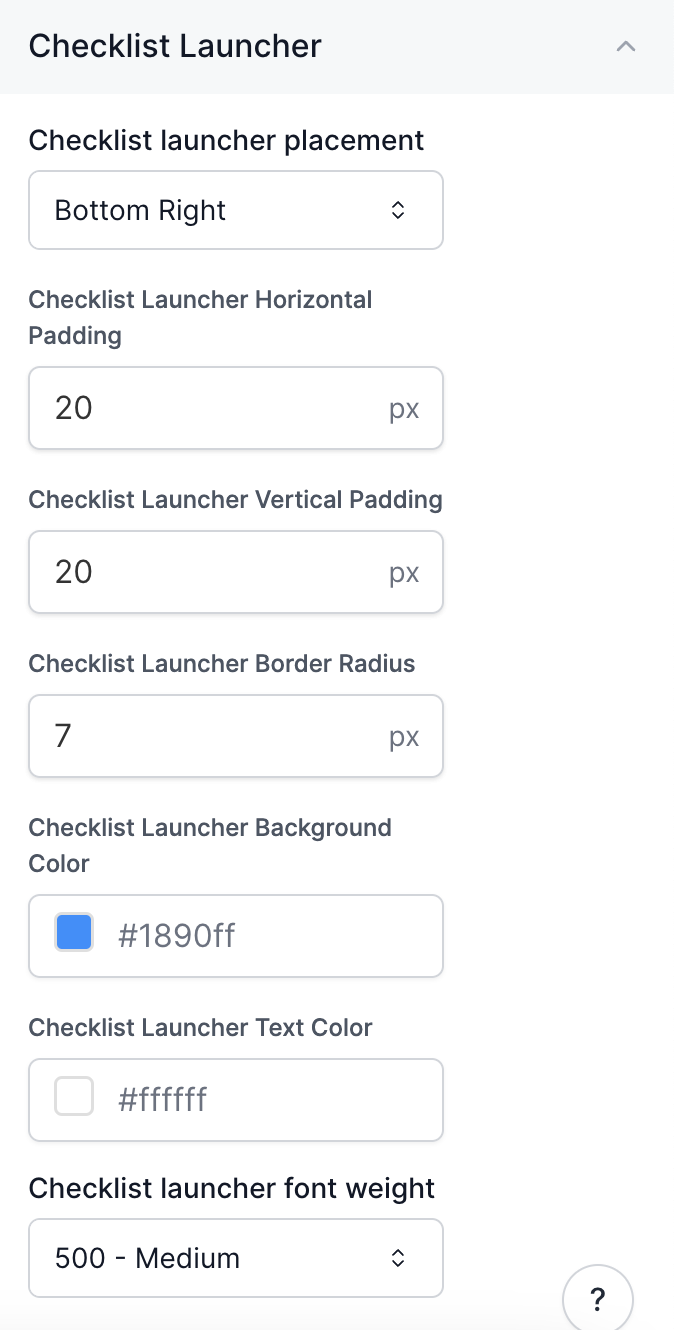
  <Accordion title="How do I edit the Checklist Launcher?">
    To edit the Checklist Launcher visit Themes > Select Checklist Launcher in the righthand menu.

    You can edit the placement, the horizontal and vertical padding, the border radius, the background color, the text color, and the font weight.

    <img src="https://mintcdn.com/navattic-app/eD69r1FtqxHvjQao/images/customize-your-theme-12.png?fit=max&auto=format&n=eD69r1FtqxHvjQao&q=85&s=15b11cefb186d55163d38a39d71eee11" size="60" width="674" height="1330" position="center" caption="" data-path="images/customize-your-theme-12.png" />
  </Accordion>

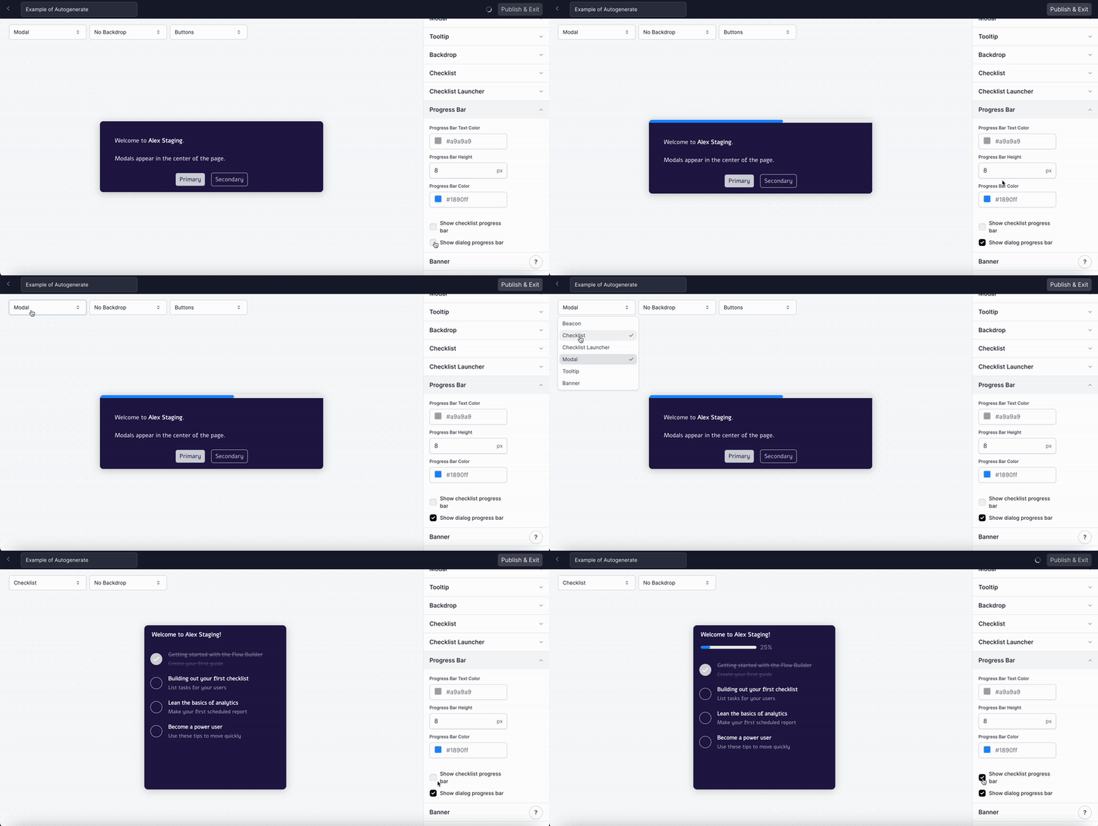
  <Accordion title="How do I edit the Progress Bar?">
    To edit the Progress Bar (for your Modals, Tooltips and Checklist), visit Themes > Select Progress Bar in the righthand menu. Select "Show checklist progress bar" to turn on the Progress Bar for Checklists or "Show dialog progress bar" to turn on the Progress Bar for Modals and Tooltips.

    <Note>
      To preview what the Progress Bar will look like for Modals, Tooltips, or the Checklist you can use
      the dropdown menu in the top lefthand corner.
    </Note>

    <img src="https://mintcdn.com/navattic-app/eD69r1FtqxHvjQao/images/customize-your-theme-7.gif?s=f340e5850c25a657f13d2dc6d21a6c3c" alt="" width="800" height="402" data-path="images/customize-your-theme-7.gif" />
  </Accordion>

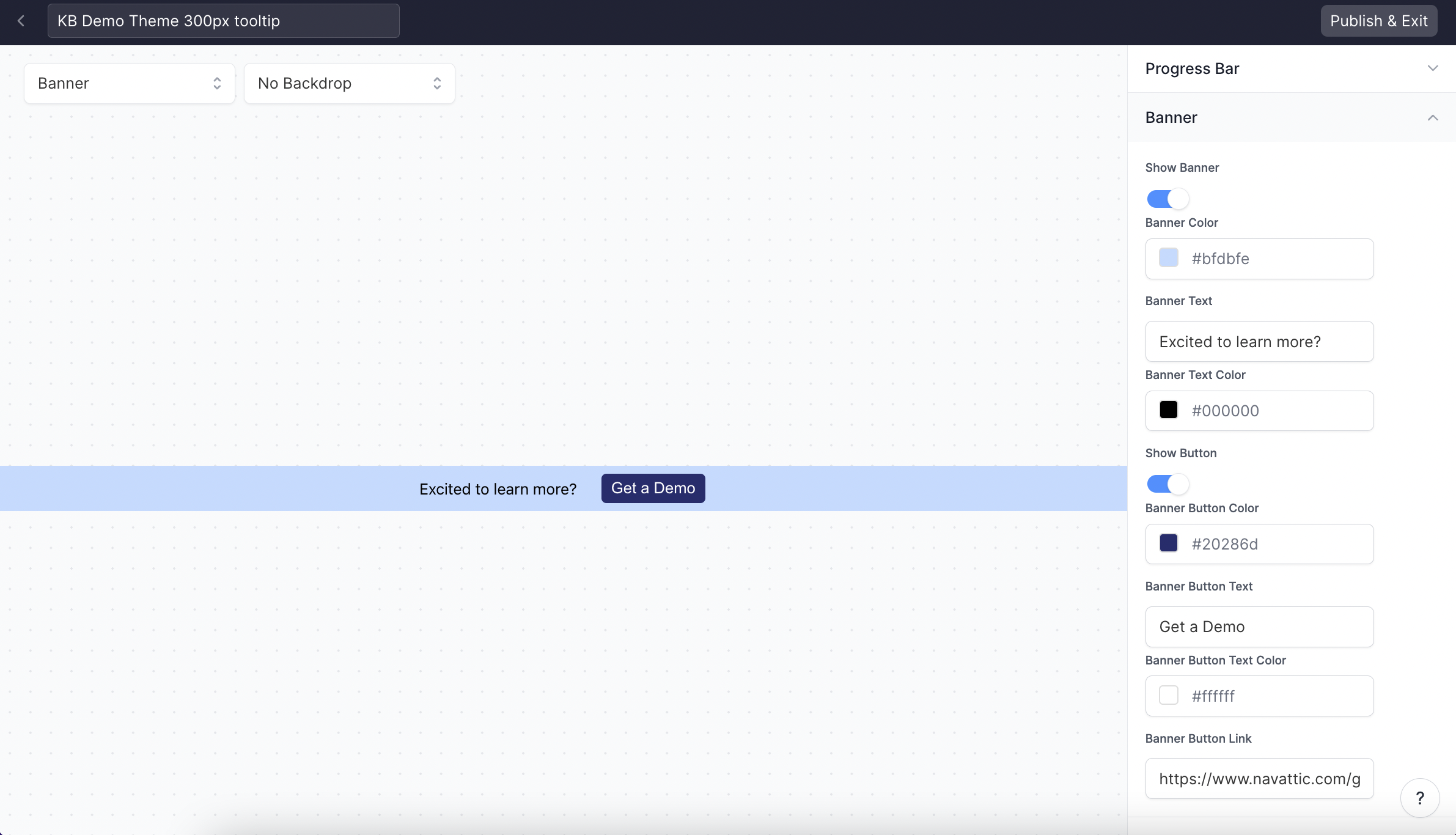
  <Accordion title="How can I add a CTA banner to my demo?">
    Visit Themes > Banner to create a custom CTA Banner for your demos. Customize the banner's colors, text, and linked resources. Publish & Exit to add your banner to existing projects.

    <img src="https://mintcdn.com/navattic-app/eD69r1FtqxHvjQao/images/customize-your-theme-8.png?fit=max&auto=format&n=eD69r1FtqxHvjQao&q=85&s=03a0a7cd8b7867ca54ed9c48761a3ced" alt="" width="2382" height="1366" data-path="images/customize-your-theme-8.png" />
  </Accordion>

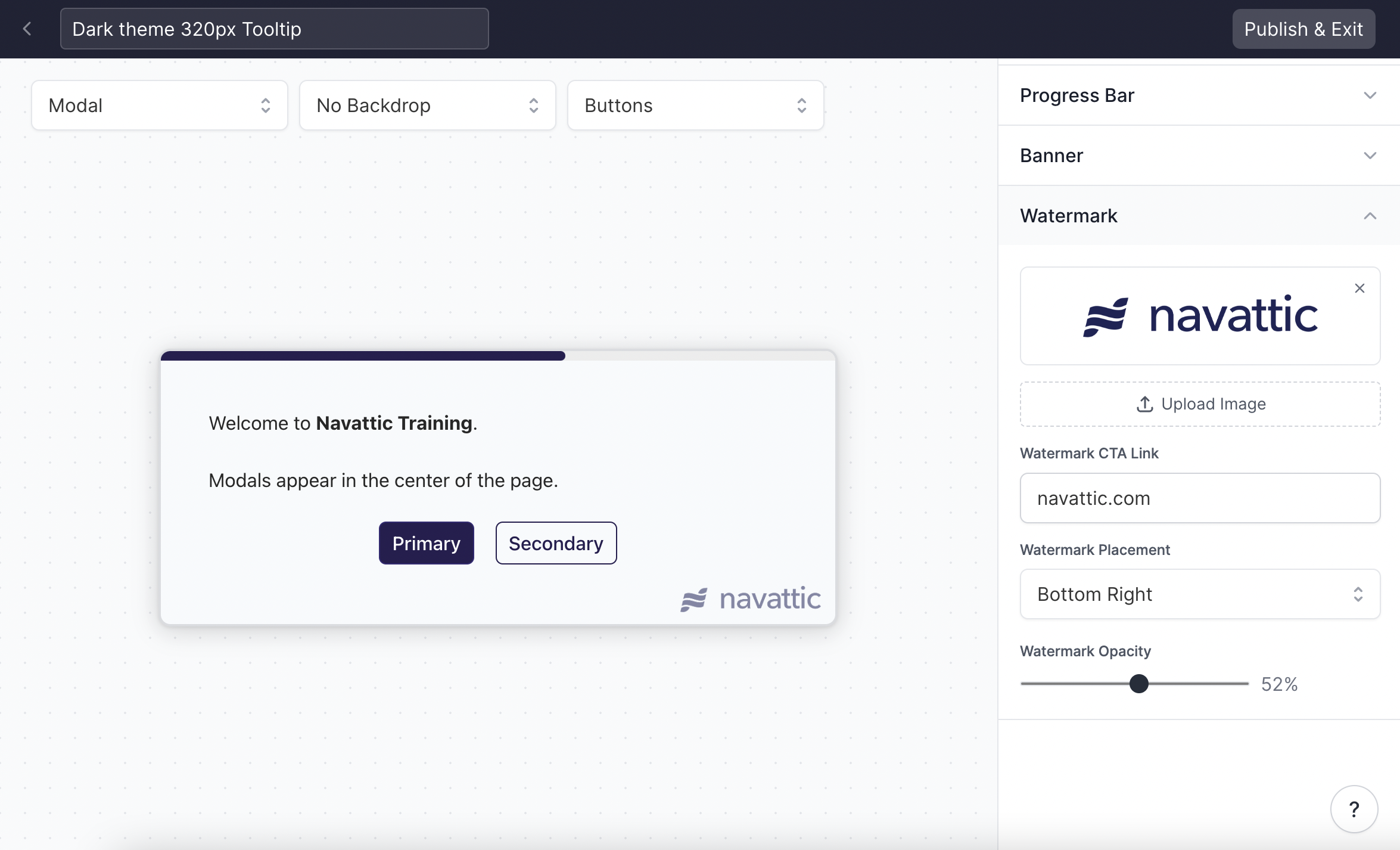
  <Accordion title="How can I add a custom watermark to Tooltips and Modals?">
    Visit Themes > Watermark to upload an image to be used in Modals and Tooltips, and set your watermark's position, CTA link, and opacity.

    <img src="https://mintcdn.com/navattic-app/eD69r1FtqxHvjQao/images/customize-your-theme-9.png?fit=max&auto=format&n=eD69r1FtqxHvjQao&q=85&s=6574964c99f238bd7f7360a18cde4b90" alt="" width="2350" height="1426" data-path="images/customize-your-theme-9.png" />
  </Accordion>

  <Accordion title="How can I change the Tooltip Border Color when paired with a Backdrop?">
    Visit Themes > Tooltip > Anchor backdrop highlight color to change the backdrop border color.
    Check out how to
    [add a backdrop to your Tooltip](/flows#OX0vQ).
  </Accordion>
</AccordionGroup>