> ## Documentation Index
> Fetch the complete documentation index at: https://docs.navattic.com/llms.txt
> Use this file to discover all available pages before exploring further.
# Responsive strategies
> Learn how to make your demos look great on every screen size.
Navattic provides four different responsive strategies that determine how your Navattic demo appears on viewports of different sizes. Visit your Demo > Build > Responsive to adjust.
This option will fit the width of the capture to the width of the visitor's screen. This is a good option if you are embedding a demo in a smaller iFrame or expect it to be viewed on a variety of devices.
**Tip**: Resize your window to **1440 x 900px or smaller** when taking Captures for a consistent
experience with Scale Width.
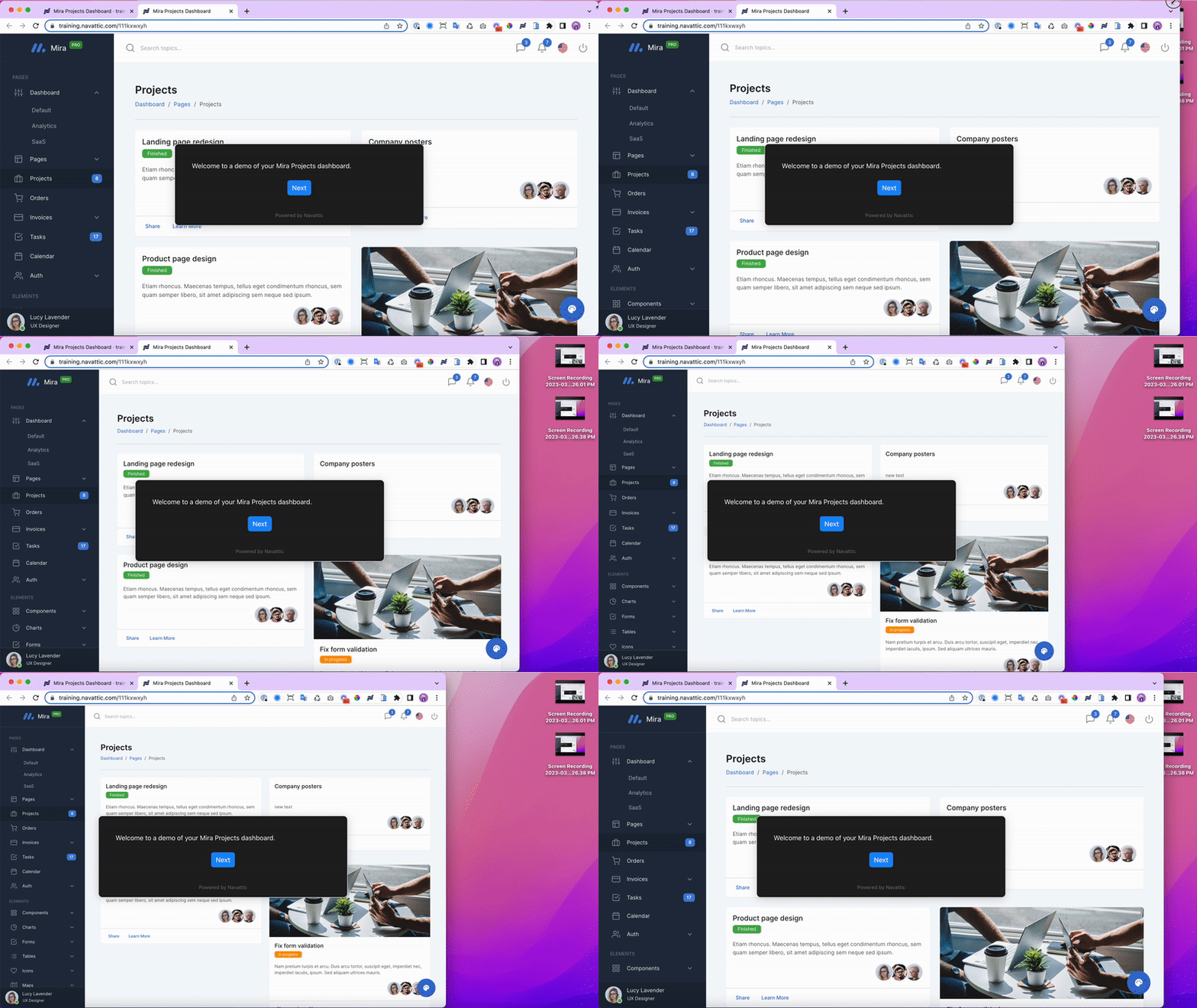 The default setting for new Product Demos, **Responsive** will apply your application's default styles for different viewports. This provides the most realistic look and feel for your demos and is recommended if you plan to share a Product Demo Link directly with end users.

This option will fill the entire screen while maintaining the relative sizes of the original screen.
The default setting for new Product Demos, **Responsive** will apply your application's default styles for different viewports. This provides the most realistic look and feel for your demos and is recommended if you plan to share a Product Demo Link directly with end users.

This option will fill the entire screen while maintaining the relative sizes of the original screen.
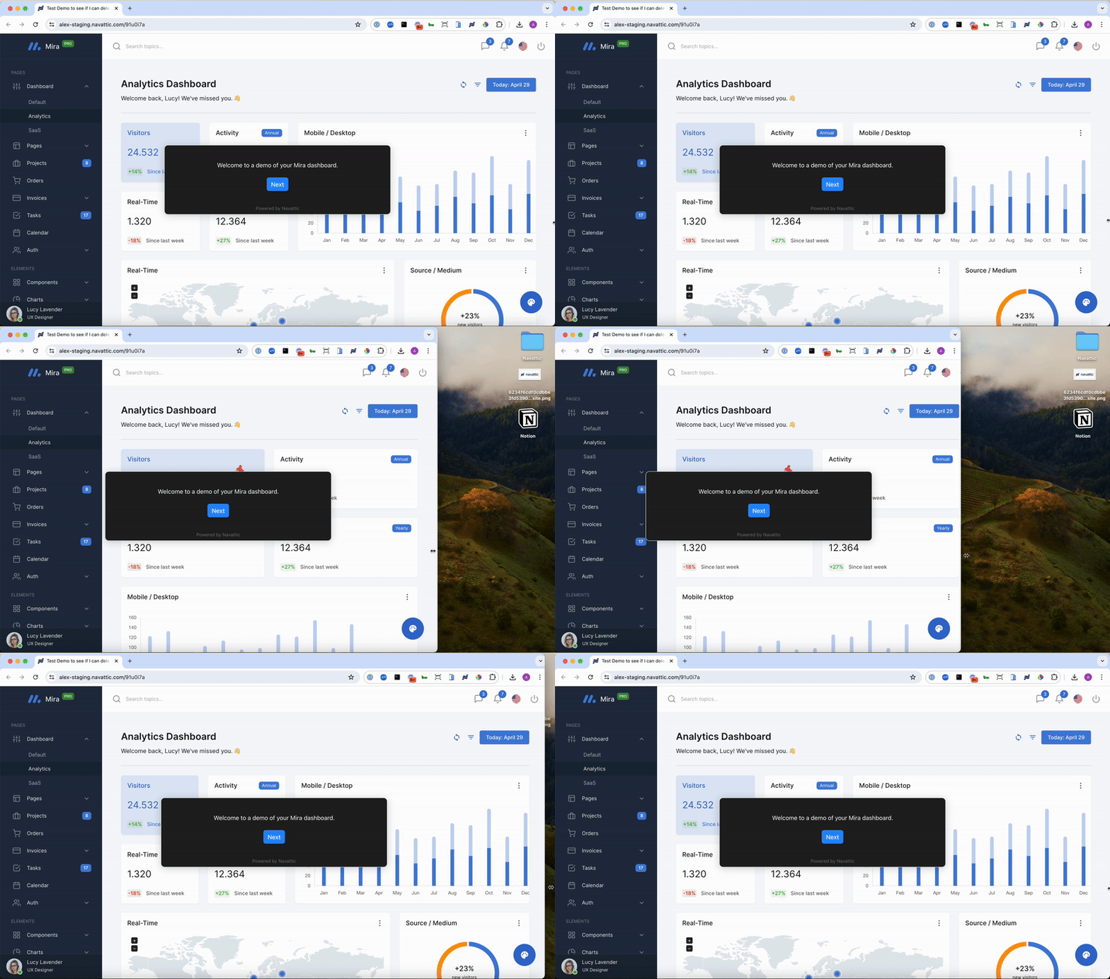 A Fixed strategy presents Captures at their original dimensions, regardless of the end user's viewport dimensions. Visitors will scroll if there is overflow.

The **Contain** strategy scales the capture to fit within the visitor's viewport while preserving the original aspect ratio. The entire capture is always visible — no cropping and no scrolling — but letterboxing (empty space on the sides or top/bottom) may appear on screens that don't match the capture's proportions.
Contain is a good choice when it's important that visitors always see the full capture, such as when using fixed-size screenshots or when your demo layout relies on precise positioning.
**Congratulations** -- you've learned how to make your demo
**Responsive** to different screen sizes.
Next, learn how to customize how your demo appears on mobile devices and smaller screens
Configure how your demos appear on mobile devices and smaller screens.
A Fixed strategy presents Captures at their original dimensions, regardless of the end user's viewport dimensions. Visitors will scroll if there is overflow.

The **Contain** strategy scales the capture to fit within the visitor's viewport while preserving the original aspect ratio. The entire capture is always visible — no cropping and no scrolling — but letterboxing (empty space on the sides or top/bottom) may appear on screens that don't match the capture's proportions.
Contain is a good choice when it's important that visitors always see the full capture, such as when using fixed-size screenshots or when your demo layout relies on precise positioning.
**Congratulations** -- you've learned how to make your demo
**Responsive** to different screen sizes.
Next, learn how to customize how your demo appears on mobile devices and smaller screens
Configure how your demos appear on mobile devices and smaller screens.