> ## Documentation Index
> Fetch the complete documentation index at: https://docs.navattic.com/llms.txt
> Use this file to discover all available pages before exploring further.
# Demos on mobile
> Configure how your demos appear on mobile devices and smaller screens.
export const MediaCard = ({title = '', url, type = 'demo'}) => {
const attributes = type === 'demo' ? {
'data-navattic-open': url,
'data-navattic-title': title
} : {
'data-video': url
};
return
{type === 'video' ? 'Watch video' : 'Try a demo'}
{title}
;
};
Navattic provides multiple options for viewing demos on devices smaller than 800px wide - this includes most smart phones and smaller tablets.
To configure your mobile setting, open the `Mobile` tab on the Product demo page.
## Mobile options
There are a few different options for viewing interactive demos on mobile devices:
The **Mobile zoom** option allows you to serve your standard desktop demo directly to users on mobile devices. When enabled, viewers can use familiar pinch-to-zoom gestures to enlarge, navigate, and interact with the product on their smaller screens. This provides a simple way to maintain your original layout while ensuring mobile visitors can comfortably explore your demo.
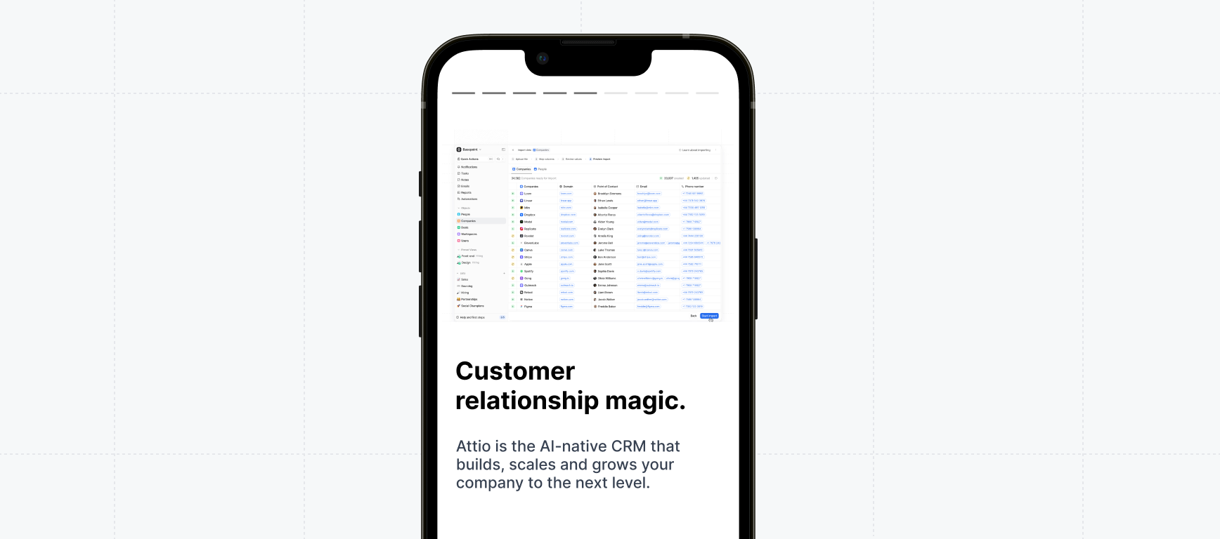
The Mobile swipe demo is used to engage your mobile visitors with a short and visual experience they can *swipe* through.
`+ Copy from Flow` allows you to reuse Captures and copy from your existing demo.
All Mobile swipe demos start with a Welcome and Farewell step. Click +Add to add steps in between. Each step contains an image, title, and description.
**Best Practices**
1. Include **no more than 8 steps.**
2. Upload an Image or existing Capture to the **Welcome step.**
3. If you are uploading your own image, use dimensions similar to height: `16rem` or `256px` and width: `24rem` or `384px`, allowing the image to cover a larger portion of the screen. Accepted file types include **.PNG**, **.GIF**, and **.JPEG**.
4. Keep the text minimal and clear and focus on short, impactful sentences. The **Description** should complement the **Title**, but keep it to a minimum since it’s often skimmed.
5. Edit the **Theme** of your Mobile swipe demo to match your brand. To do this, visit the **Theme** tab in your demo > **Edit Theme** > **Mobile Swipe**.
**Additional Mobile Swipe settings**
1. **Auto Progress**: Enabling **Auto Progress** for your Mobile Swipe Demo will automatically guide visitors through the demo by advancing to the next step after 4 seconds.
2. **Confetti**: Toggle on **Completion confetti** to allow visitors to celebrate once they complete their final step!
3. **Crop the Captures**: Crop the Captures or upload a new Image to ensure the images are colorful and eye-catching.
4. **CTA Button**: Toggle on the **CTA button** and use **Open in new tab** to ensure Visitors can easily access it throughout the mobile swipe demo.
The Mobile alert is a good option if you prefer not to present your demo to mobile viewers or do not expect heavy mobile traffic to your demo.
**Message, Custom Image, or Video**
You can either use the default mobile alert or create your own. The Mobile alert includes a title and description which can be edited in Build > Mobile > Mobile alert > Edit > **Message**.
If you'd prefer to upload a custom image, select **Custom Image**. You can then upload an image from your local storage. Alternatively, select **Video** to upload a video from your local storage.
With **Mobile scaled view** enabled, the Capture will appear on top of any dialog that is present on this step, while maintaining the proportions of your original app. We recommend taking Captures on a smaller window if you plan to use Mobile scaled view to ensure that elements remain legible on smaller devices.
Check out [Klue's Demo Arena](https://klue.com/demo-arena) in a window below 800px wide or use a mobile simulator like [this Chrome
extension](https://chromewebstore.google.com/detail/mobile-simulator-responsi/ckejmhbmlajgoklhgbapkiccekfoccmk)' ' to see examples of Mobile scaled view.
**Show desktop demo** is just what it sounds like -- a scaled-down version of your desktop demo will show on mobile devices.
#### Customer examples of mobile demos
Mobile swipe demo
Mobile swipe demo
Mobile swipe demo
Mobile zoom
View these examples in a window below 800px wide to activate the Mobile swipe view or use a mobile simulator like [this Chrome
extension](https://chromewebstore.google.com/detail/mobile-simulator-responsi/ckejmhbmlajgoklhgbapkiccekfoccmk) .
 Navattic provides multiple options for viewing demos on devices smaller than 800px wide - this includes most smart phones and smaller tablets.
To configure your mobile setting, open the `Mobile` tab on the Product demo page.
Navattic provides multiple options for viewing demos on devices smaller than 800px wide - this includes most smart phones and smaller tablets.
To configure your mobile setting, open the `Mobile` tab on the Product demo page.