> ## Documentation Index
> Fetch the complete documentation index at: https://docs.navattic.com/llms.txt
> Use this file to discover all available pages before exploring further.

# Creating flows

> Demos are composed of step-by-step flows.

export const MediaCard = ({title = '', url, type = 'demo'}) => {
  const attributes = type === 'demo' ? {
    'data-navattic-open': url,
    'data-navattic-title': title
  } : {
    'data-video': url
  };
  return <div {...attributes} className="hidden md:inline-block w-auto cursor-pointer overflow-hidden rounded-lg border border-gray-200 dark:border-gray-700 shadow-sm">
<div className="flex items-center gap-3 bg-white dark:bg-gray-800 px-3 py-2">
<div className={`flex h-7 w-7 items-center justify-center rounded-md ${type === 'video' ? 'bg-blue-100 dark:bg-blue-900' : 'bg-orange-100 dark:bg-orange-900'}`} style={{
    backgroundColor: type === 'video' ? 'var(--video-bg)' : 'var(--demo-bg)'
  }}>
<Icon icon={type === 'video' ? 'circle-play' : 'square-mouse-pointer'} color={type === 'video' ? 'var(--video-icon)' : 'var(--demo-icon)'} />
</div>
<div>
<div className="text-sm font-medium text-gray-900 dark:text-gray-100">
{type === 'video' ? 'Watch video' : 'Try a demo'}
</div>
<div className="text-sm text-gray-500 dark:text-gray-400">{title}</div>
</div>
</div>
<style jsx>{`
  :root {
    --video-bg: #dbeafe;
    --video-icon: #2563eb;
    --demo-bg: #ffedd5;
    --demo-icon: #ea580c;
  }
  :global(.dark) {
    --video-bg: #1e3a8a;
    --video-icon: #60a5fa;
    --demo-bg: #7c2d12;
    --demo-icon: #fb923c;
  }
`}</style>
</div>;
};

<Frame>
  <img className="overflow-hidden rounded-xl border" src="https://mintcdn.com/navattic-app/nBcURPbxfeqKXMDI/images/demo-builder.png?fit=max&auto=format&n=nBcURPbxfeqKXMDI&q=85&s=ab478b1172a68319120400615e0b2a52" alt="Demo builder" width="2912" height="1600" data-path="images/demo-builder.png" />
</Frame>

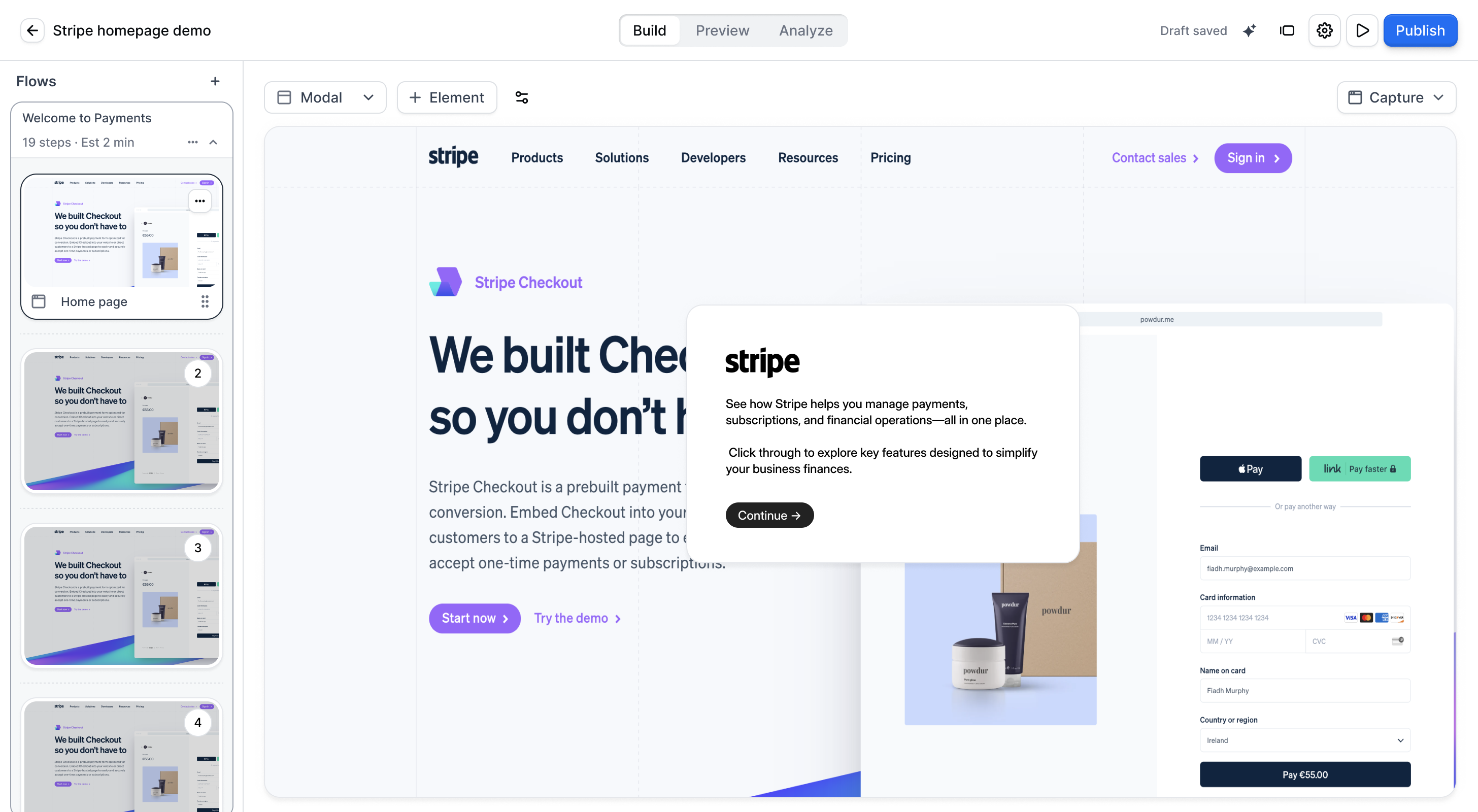
Flows are step-by-step demos that a user progresses through at their own pace. Top-performing Flows are concise (8-15 steps) and include one or more conversion opportunities. Consider:

1. Is your goal to create a high-level overview or to showcase a detailed portion of your product?
2. How do you want users to interact with your product during the demo? (ex. Click a button, type a string of text, explore a dashboard)
3. This [storyboard template](https://docs.google.com/spreadsheets/d/1-TUqe5KsVgxMtUxopdXq-2r6bwhLix2TxwF0t3sKtmg/copy) may help plan the steps for your Flow.

## Step Appearance

The Flow Builder contains different step types to help create an engaging demo. To change step types, click the description on your desired step and select an option from the right-hand menu that appears.
<Tabs>
  <Tab title="Modal">
    Best used for welcome or closing messages, a Modal is a dialog box that appears on top of your Capture. Modals include a button to help viewers move to the next step. Modals can be positioned in the center or corners of the screen and encourage the end user to explore on their own.

    **Custom Modal Position**

    To change the positioning of your Modal, select **Modal** > **Custom position**. You can then select where you would like the modal to appear on the screen.
  </Tab>

  <Tab title="Tooltip">
    Best used to promote interactivity with your product, a Tooltip is small dialog box that anchors to a specific onscreen element. Clicking the selected element will automatically advance users to the next step.

    Tooltips can be positioned Above/Below/Right/Left of the selected element and combined with a backdrop (e.g., a light shadow on unselected elements) to best highlight your selected element.

    ### Anchor your Tooltip

    After adding the capture to your step, click **Select element** > Use your mouse to select an element > Use arrows to span element > **Save anchor.**

    ### Custom Tooltip Position

    To change the positioning of your Tooltip, open the position dropdown in the step toolbar. Select where the Tooltip should appear (Above, Below, Left, or Right) and use the fit-mode options in the same dropdown to control placement behavior when space is limited.

    <Tip>
      Use the fit-mode options to control how the Tooltip behaves when its selected position doesn't have enough space:

      * **Best-fit** — Default. The Tooltip tries all other sides (top, bottom, left, right) to find the best available space and stay on screen.
      * **Don't Flip** — Prevents the Tooltip from moving from its selected position, even if it is cut off at the screen edge.
    </Tip>

    ### Add a Backdrop with your Tooltip

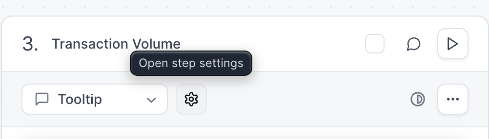
    Adding a backdrop with your Tooltip can help highlight important elements, even on a smaller mobile screen. To add a backdrop open the **Step Settings** > **Tooltip**> toggle on **Backdrop** > select **Light, Medium** or **Heavy**

    <img src="https://mintcdn.com/navattic-app/eD69r1FtqxHvjQao/images/creating-flows-3.png?fit=max&auto=format&n=eD69r1FtqxHvjQao&q=85&s=cacf7d76da2326a50a27dc70daba961b" alt="" width="1002" height="286" data-path="images/creating-flows-3.png" />

    ### Customize Tooltip Width

    To customize the tooltip width, you can resize the tooltip directly in the flow builder by clicking and dragging the edges of the tooltip.

    You can also set default widths by going to **Themes** > Select **Theme** > **Tooltip** > Use the arrows to set the Width for **Small**, **Medium** and **Large** Tooltips. You can also edit the tooltip pointer size here.

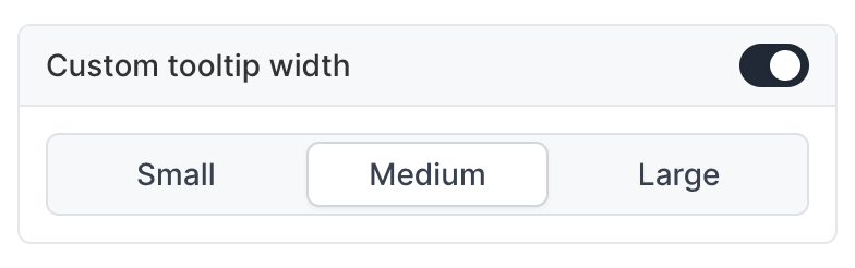
    Once you have set your custom tooltip widths, go to your Product Demo > open the **Step Settings** > toggle on **Custom dimensions** > Select **Small**, **Medium**, or **Large.**
    <img src="https://mintcdn.com/navattic-app/eD69r1FtqxHvjQao/images/creating-flows-13.png?fit=max&auto=format&n=eD69r1FtqxHvjQao&q=85&s=fd7c26c152ba5cb688651a1e09596854" size="60" width="784" height="246" position="center" caption="Set Custom tooltip width in demo" alt={true} data-path="images/creating-flows-13.png" />

    ### Customize Tooltip Height

    To set a custom height for your Tooltip, open the **Step Settings** > toggle on **Custom dimensions** > Select **Set specific height.**

    ### Show Tooltip on Hover

    To make the Tooltip hidden by default and show it only when the Visitor hovers over the anchor element, open **Step Settings** > toggle on **Show on hover**.
  </Tab>

  <Tab title="Invisible Step">
    **Invisible** steps are used when you don't want any dialog boxes present on a particular step. These are combined with Triggers or Beacons to support the [live presentation / sales enablement use case](/use-cases/sales-enablement), but rarely used for marketing demos.

    *Demos with invisible steps are not recommended for sharing directly with viewers as they are a mostly unguided experience.*
  </Tab>

  <Tab title="Form">
    <CardGroup cols={2}>
      <Card title="Navattic Forms" icon="file-text" horizontal href="/tracking/forms">
        Capture and track visitor information through forms in your demos.
      </Card>
    </CardGroup>
  </Tab>

  <Tab title="Embed">
    <CardGroup cols={2}>
      <Card title="Embedded forms" icon="square-code" horizontal href="/tracking/forms/embedded">
        Integrate third-party forms and scheduling tools directly in your demo.
      </Card>
    </CardGroup>
  </Tab>

  <Tab title="Video">
    The **Video Step** feature lets you incorporate videos into your demo experiences. Teams use this to showcase customer case studies, highlight key use cases, and present branded content.

    To add a video step, select **Video** from the Step type dropdown in the Flow Builder. Once you've added a Video step, you can click **+ Select video** and select how you want to add your video:

    * **Upload**: Upload a video file directly from your computer.
    * **Insert Link**: Add a video from an external platform by pasting its URL. We support links from YouTube, Vimeo, Loom, Wistia, Vidyard, and Highspot.
    * **Record**: Create a new video right from Navattic using your webcam.
    * **Recently Used**: Quickly find and reuse a video you've already added to another demo.

    Uploaded videos, as well as videos from YouTube, Vimeo, or Wistia, use our themeable video player that includes playback analytics. This new player is on by default for uploaded videos and can be enabled for other providers under **Advanced** settings in the Video step. Once your demo is published, you can see playback analytics for your videos on the [demo analyze tab](/analyze#product-demo-analyze-tab).
  </Tab>
</Tabs>

## Interactive Elements

Interactive elements provide additional ways for users to interact with your product. By default, engaging with these elements will send the user to the next step (this is a "click action"). You can adjust the click action to be one or more of the following:

<Tabs>
  <Tab title="Beacon">
    A Beacon is a small pulsing dot next to an element within your Capture. A step may contain multiple Beacons.

    To add a Beacon, navigate to the bottom of your desired step and click **Add element** > **Beacon.** Select the onscreen element you would like to highlight. Clicking the purple "Beacon" bar to open the Beacon settings menu will let you assign a default position, custom size (set at the Theme) as well as one or more click actions for the Beacon.

    Anchor highlights (a pulsing element border visual) can also be enabled from the Beacon settings menu. Anchor highlights can be used with or without Beacons. Anchor highlight opacity can be set at the Theme.
  </Tab>

  <Tab title="Input Trigger">
    **Text input** - this will require users to enter a string of text to progress. This is applicable to Web Captures with HTML text input fields (ex. a search bar) and contenteditable elements.

    To add a Trigger, locate your desired step and click **Add element.** Select your Trigger Condition and Click Action(s).

    <Note>
      Tip: By default, Tooltips include a "progress on click" click action. This advances to the next step when the element is clicked. When using an Input Trigger and Tooltip on the same step, **deactivate** the Tooltip's **Progress on click** action by clicking \*\*Advanced \*\*under the Tooltip anchor > toggle off **Progress on click**.
    </Note>
  </Tab>

  <Tab title="Timer Trigger">
    **Timer trigger** - this will automatically trigger the click action after a specified amount of time.

    To add a Trigger, locate your desired step and click **Add element.** Select your Trigger Condition and Click Action(s).
  </Tab>

  <Tab title="Element Trigger">
    **Element trigger** - this will wait until an element has been clicked to progress. This can be used on any Capture or step type.

    To add a Trigger, locate your desired step and click **Add element.** Select your Trigger Condition and Click Action(s).
  </Tab>

  <Tab title="Voiceover">
    Enhance your demos with dynamic narration through various options, including reading from the individual steps, custom text-to-speech, or uploaded audio.

    To add voiceover to specific steps in your demo, in the Flow Builder click **Add element** > **Voiceover**. From here, use the dropdown to select the option you want to use:

    1. **Read from text**: Add in custom text to read from (tip: use this with an [*Invisible step*](/flows#0KIKW))
    2. **Read from step**: Read directly from the text in the Modal or Tooltip
    3. **Upload audio**: Upload audio files from your local storage. Supported formats include MP3, M4A, WAV, and MIDI files.

    <Note>
      If you select **Read from text** or **Read from step**, use the dropdown to select your preferred Voice.
    </Note>
  </Tab>

  <Tab title="Avatar">
    Avatars can be added to your demos to provide a personalized touch. Configure avatars in your demo settings to display a virtual guide throughout the experience.

    Once you add an Avatar to a step follow these instructions:

    1. Choose your preferred method to create the video:
       * **AI Avatar**: Generate a video from text.
       * **Recording**: Record a new video of yourself directly in Navattic.
       * **Upload**: Select a pre-existing video.
    2. Customize the avatar's appearance and behavior:
       * **Position**: Place the bubble in various locations on the screen (e.g., bottom-left).
       * **Avatar Size**: Adjust the size of the bubble.
       * **Autoplay**: Have the video play automatically when the step loads.
       * **When video finishes**: Configure actions that trigger after the video completes, such as automatically advancing to the next step.
  </Tab>
</Tabs>

<Expandable title="Actions">
  | **ClickAction**   | **Description**                                                                                                                                                                                                                                    |
  | :---------------- | :------------------------------------------------------------------------------------------------------------------------------------------------------------------------------------------------------------------------------------------------- |
  | Continue          | Takes the end user to the next step in this Flow. If it is the last step, it will use the 'Last step continue behavior' that is set in the Flow Settings.                                                                                          |
  | Go back a step    | Takes the end user to the previous step in this Flow                                                                                                                                                                                               |
  | Jump to a step    | Allows visitors to skip forwards or backward within this Flow                                                                                                                                                                                      |
  | Start a Flow      | Begins a new Flow. Select from any Flows within your workspace.                                                                                                                                                                                    |
  | Open Checklist    | Prompts a Checklist to open at a specific point in the demo.                                                                                                                                                                                       |
  | Complete Flow     | Launches a Checklist if a Checklist is present in the Project                                                                                                                                                                                      |
  | Navigate to URL   | Takes the end user to an external link (e.g., a Book Demo page)                                                                                                                                                                                    |
  | Mark as Converted | For reporting purposes (i.e., not visible to the end user), this indicates that an end user has engaged with a specific CTA within your demo. Automatically added to CTA buttons within [Escape View](https://navattic-docs.navattic.com/cov09e1). |
</Expandable>

## Editing Rich Text

The **Rich Text** editor allows you to format the content inside of the Dialog. You can add headings, lists, links, and use **Copilot** to improve writing, fix grammar, or adjust length.

<Tabs>
  <Tab title="Button">
    Add additional buttons to your Dialog to present additional options such as a CTA or an option to continue the demo.

    If you'd like to enable `Next` and `Back` buttons to every step, you can enable this within settings.
  </Tab>

  <Tab title="Image">
    Add images to your Dialog to provide visual context or to illustrate a point.
  </Tab>

  <Tab title="Video">
    Add videos inline in your Dialog.
  </Tab>

  <Tab title="Personalization">
    <CardGroup cols={2}>
      <Card title="Personalized demos" icon="user-pen" horizontal>
        Make demos personalized by adding user and account properties.
      </Card>
    </CardGroup>
  </Tab>
</Tabs>

## Flow Settings

From the Flow Builder, click **Settings** to customize your demo further. Here you can:

<Tabs>
  <Tab title="Next + Back buttons">
    Add a `Next` and `Back` button to each step to allow the user to navigate through the demo.
  </Tab>

  <Tab title="Escape view">
    Allow the user to exit at any step and present a CTA step.
  </Tab>

  <Tab title="Keyboard navigation">
    Use your keyboard arrows `<- ->` to navigate through the demo.
  </Tab>

  <Tab title="Continue behavior">
    On the last step of a flow, configure whether to open a checklist or continue to the next flow.
  </Tab>
</Tabs>

## FAQs

<AccordionGroup>
  <Accordion title="How do I add additional media files to a Flow?">
    You can add images, videos, and audio clips in Modals and Tooltips. From the Flow Builder, navigate to your desired step > click the dialog box > click "+" in the dialog header that appears > select and upload your media.

    Images and audio recordings will be uploaded directly from your device. Videos will require a link to a public video on Youtube, Vimeo, Loom, Wistia or Vidyard. We recommend keeping media attachments short to encourage users to explore your product on their own.
  </Accordion>

  <Accordion title="How should I end my Flow?">
    We recommend adding dual CTAs to the last step of your Flow. You may click "+" to add a Button to the Modal or Tooltip, or [hide Navigation Buttons](https://www.loom.com/share/dde828c52d4e4e4e820ddf64b2db5550) on the last step if needed. This will make it clear to your end user that they have completed the demo and encourage them to convert!
  </Accordion>

  <Accordion title="How do I use Navigation Buttons and CTA Buttons together?">
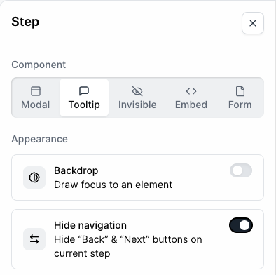
    To hide Navigation Buttons, click your step heading (ex. "Modal" or "Tooltip") > toggle on **Hide navigation** in the right-hand menu. Now that the navigation buttons aren't visible on this step, click the + button in the step and select **Button**. If you want to add more than one button, repeat this step.

    <img src="https://mintcdn.com/navattic-app/eD69r1FtqxHvjQao/images/creating-flows-20.png?fit=max&auto=format&n=eD69r1FtqxHvjQao&q=85&s=fe69070413fe3b17dc46a2f92519feac" size="50" width="394" height="392" position="center" caption="Hide navigation for one step" alt={true} data-path="images/creating-flows-20.png" />
  </Accordion>

  <Accordion title="How can I highlight multiple elements in a single step?">
    While each step can only include one Tooltip or Modal, **Beacons** can be used to highlight multiple elements at once ( [example](https://app.navattic.com/preview/flow/cls25ldm4006f0fjwfa1x9ky0?s=10) ). To do this, find your Step in the Flow Builder and simply [add Beacons](/flows#YRzY6) . We recommend including a Tooltip on this Step to communicate the intended workflow with users.
  </Accordion>

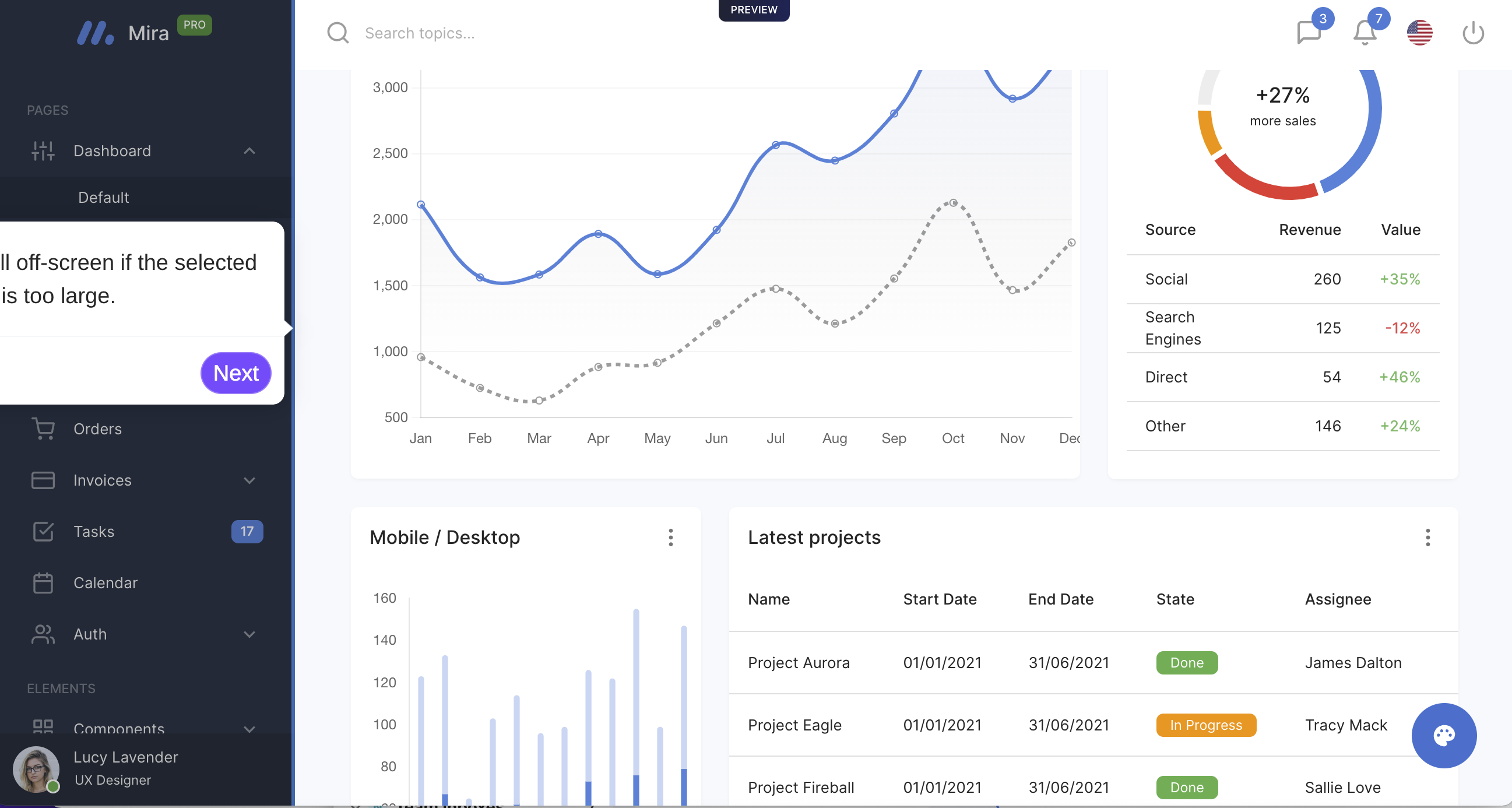
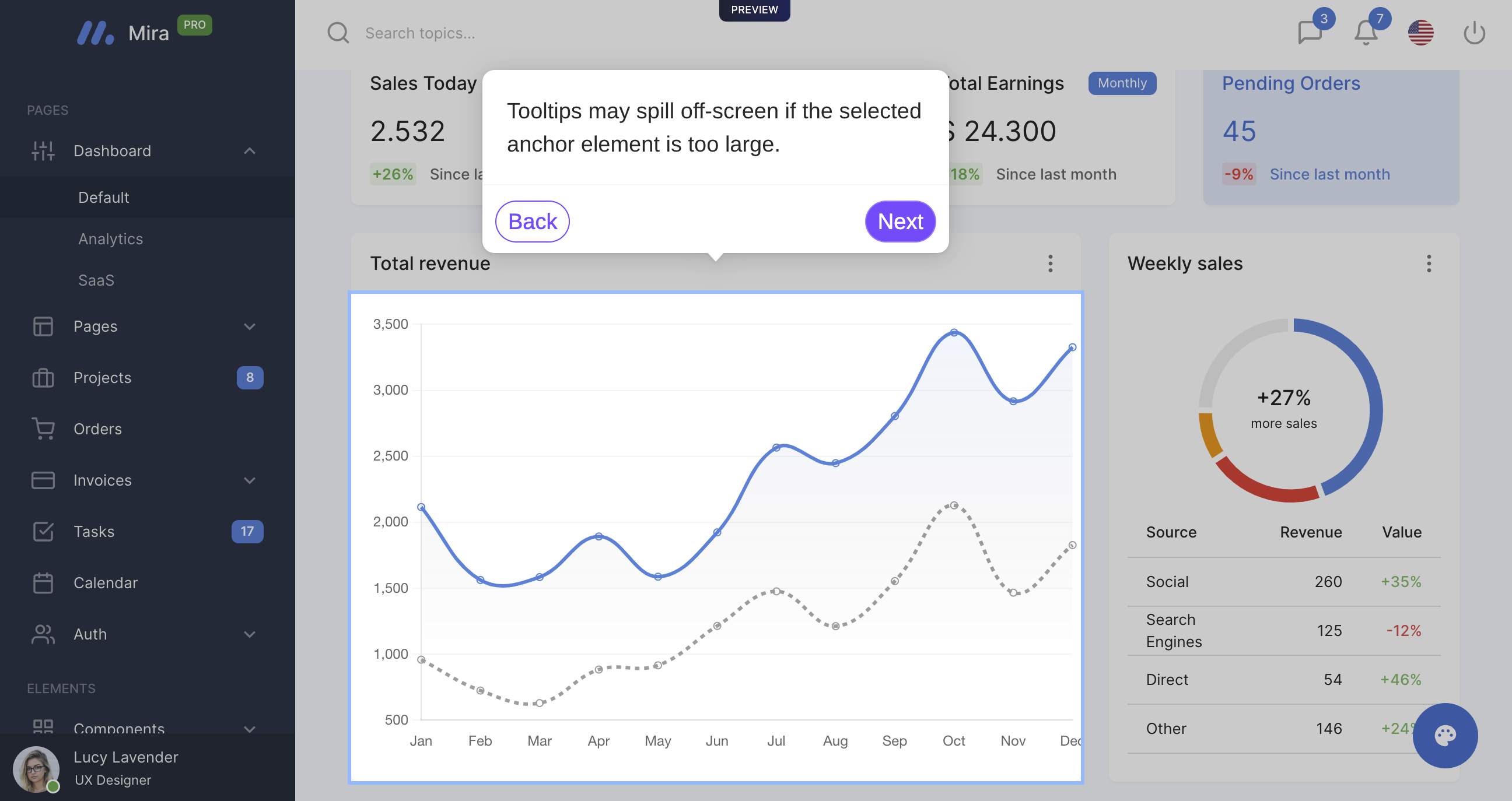
  <Accordion title="How do I fix a Tooltip that appears to run offscreen?">
    Tooltips may run off screen if the selected anchor element is too large and does not leave enough room to display the Tooltip fully. You can [change the tooltip position](/flows#2WZL5), [edit the tooltip height](/flows#AASb1) and/or [edit the tooltip width](/flows#_T4ZM) to try and get the Tooltip to fit.

    If these edits do not solve the problem, please select a smaller anchor element for this step.

    <img src="https://mintcdn.com/navattic-app/eD69r1FtqxHvjQao/images/creating-flows-9.png?fit=max&auto=format&n=eD69r1FtqxHvjQao&q=85&s=4661e929058f84f31bb9b215df89169e" alt="" width="2594" height="1386" data-path="images/creating-flows-9.png" />

    <img src="https://mintcdn.com/navattic-app/QNOHztjorxprHO7d/images/creating-flows-10.png?fit=max&auto=format&n=QNOHztjorxprHO7d&q=85&s=ceab08e7594a27b6b585bacf20725ec5" alt="" width="2592" height="1374" data-path="images/creating-flows-10.png" />
  </Accordion>

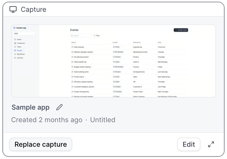
  <Accordion title="How do I replace Captures within a Flow?">
    From the Flow Builder, locate the step where you want to switch the Capture and click on **Replace Capture**. This will open a dropdown menu where you can select a Capture from the current Collection, Add to the Collection, or select Captures from a different Collection in your workspace. If the new Capture has similar elements to the old Capture, the anchor element will automatically be updated.

    <img src="https://mintcdn.com/navattic-app/eD69r1FtqxHvjQao/images/creating-flows-21.png?fit=max&auto=format&n=eD69r1FtqxHvjQao&q=85&s=495d1d1ba5b44016bb0eca7cff2e6ded" size="62" width="940" height="660" position="center" caption={true} data-path="images/creating-flows-21.png" />
  </Accordion>

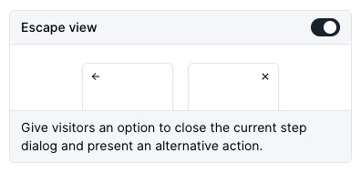
  <Accordion title="How will the Escape View appear in a Flow?">
    Escape View will match the Escape step that can be found at the end of your flow builder. To turn on [Escape view](https://navattic-docs.navattic.com/cov09e1), click settings > toggle on Escape view.

    <img src="https://mintcdn.com/navattic-app/eD69r1FtqxHvjQao/images/creating-flows-22.png?fit=max&auto=format&n=eD69r1FtqxHvjQao&q=85&s=c1aad6d076d72e7af36a90fc2e480eec" size="50" width="396" height="190" position="center" caption={true} data-path="images/creating-flows-22.png" />
  </Accordion>

  <Accordion title="When should I include a Form in my demo?">
    Forms are used to gather user information such as name, email, company, and more. If the goal of your demo is to directly generate leads, a Form may be helpful for gathering information. Typically, about 20% of demo Visitors will fill out a Form on the first step.

    If using a Form, we recommend introducing this early in your demo and keeping it brief (**1-2 fields if possible**). Remember, your demo likely also includes other CTAs and conversion points that help high-intent viewers make their interest known.
  </Accordion>

  <Accordion title="I am unable to select elements within the Flow builder.">
    The [Navattic Chrome Extension](https://chrome.google.com/webstore/detail/navattic/lbecioncobbndebbfdopnpinnibemoon) is required in order to select elements within the Flow builder. Be sure to install this extension first. If it is already installed, please remove and re-add it to update it.
  </Accordion>

  <Accordion title="How do I enable a text input trigger?">
    [Text input has value condition](/flows#JJQON) can be used to have viewers engage with the capture by adding a text string to a text input field. If a text input condition is used in conjunction with a tooltip on the same step, you will also want to toggle off the **Progress on click** option on the step (found by clicking on the Anchor > Advnaced) so that the demo does not move to the next step when the element is clicked.
  </Accordion>

  <Accordion title="Can I highlight elements without using Tooltips?">
    While most Navattic demos benefit from dialog boxes that tell a story about your product,' ' [Beacons](/flows#YRzY6) can be used to highlight standalone elements in your Captures. From your Flow > add a Beacon. By default, a Beacon is a blinking dot next to an element.
  </Accordion>

  <Accordion title="Can I make edits across multiple steps at once?">
    With the Bulk Editor, you can apply edits across multiple steps at once. Bulk edits include:

    * Updating all beacons to triggers
    * Turning multiple modals into tooltips
    * Changing all beacons to have a highlight appearance instead of pulse
    * Deleting multiple beacons or triggers at the same time
    * Copying or Moving Steps to other Flows within your demo or to other Demos
    * Deleting multiple steps at the same time
    * and more!
  </Accordion>

  <Accordion title="Can I copy or move steps into another Flow?">
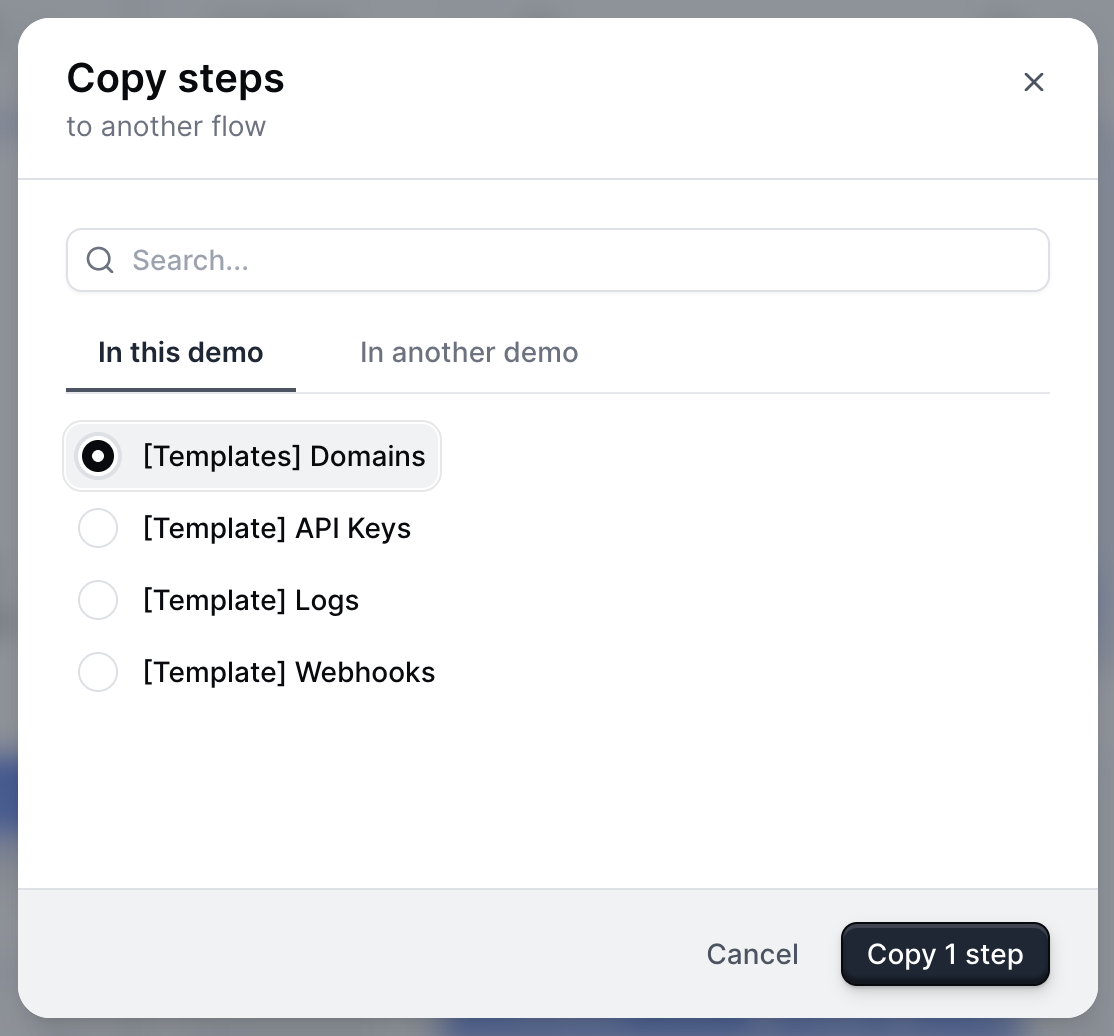
    With the Bulk Editor, you can copy or move steps into another Flow within the same demo or to another Demo in your Workspace.

    To do this, check off the steps you want to move or copy and then select the **Copy to...** or **Move to...** icon at the bottom of your screen. From here, you'll be prompted to select whether you want to copy the steps into a Flow within this demo or in another demo. Once you select the Flow you want to move it to, click **Copy # step.**

    [View a 2-minute tutorial here](https://www.loom.com/share/b844f27c6f444054afa5790c65adfa7c?sid=b4e95e64-3e59-47cd-9d2b-3083d04ef645) .

    <img src="https://mintcdn.com/navattic-app/eD69r1FtqxHvjQao/images/creating-flows-23.png?fit=max&auto=format&n=eD69r1FtqxHvjQao&q=85&s=abb2cb4157671f4e5670cb7f723c41a1" size="52" width="1114" height="1036" position="center" caption="Copy steps to another flow" alt={true} data-path="images/creating-flows-23.png" />
  </Accordion>

  <Accordion title="How do I copy or move a flow to another Demo?">
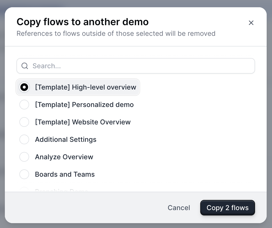
    With Product Demos, you can copy over Flows from existing Product Demos. To do this, visit **Flows** > **+ Create Flow** > **Copy**. Select the target Product Demo and desired Flow to copy into your new Product Demo.

    You can also copy or move multiple Flows at once by selecting the Flows you want to Copy and then selecting the **Copy to...** or **Move to...** icon at the bottom of the screen. From here, you'll be prompted to select which Demo you want to add the Flows to.

    [View a 2-minute tutorial here](https://www.loom.com/share/b844f27c6f444054afa5790c65adfa7c?sid=b4e95e64-3e59-47cd-9d2b-3083d04ef645) .

    <img src="https://mintcdn.com/navattic-app/eD69r1FtqxHvjQao/images/creating-flows-24.png?fit=max&auto=format&n=eD69r1FtqxHvjQao&q=85&s=2f73295be585a0065d0272df9d4e7bcc" size="50" width="1122" height="942" position="center" caption={true} data-path="images/creating-flows-24.png" />

    ### Can I add navigation buttons to my demo without using a Modal or Tooltip?

    Yes, you can add navigation buttons without using a modal or tooltip by creating a Theme with a transparent dialog box and border.

    To create a Theme, visit **Themes** > **+ Create theme**. From here, select **Dialog** > **Dialog Background Color** > use the opacity slider under the color picker to make the dialog box transparent. Repeat this step with the **Dialog border color**.

    Learn more about [Themes](/build/themes).
  </Accordion>

  <Accordion title="Can I add navigation buttons to my demo without using a Modal or Tooltip?">
    Yes, you can add navigation buttons without using a modal or tooltip by creating a Theme with a transparent dialog box and border.

    To create a Theme, visit **Themes** > **+ Create theme**. From here, select **Dialog** > **Dialog Background Color** > use the opacity slider under the color picker to make the dialog box transparent. Repeat this step with the **Dialog border color**.

    Learn more about [Themes](/build/themes).
  </Accordion>

  <Accordion title="Can I include superscript formatting in a Modal or Tooltip?">
    Yes, to add superscript formatting to a Modal or Tooltip follow the instructions below:

    1. Use [https://lingojam.com/SuperscriptGenerator](https://lingojam.com/SuperscriptGenerator) to generate the superscript.
    2. Copy/paste it into the Tooltip or Modal directly. No additional formatting is needed.
  </Accordion>
</AccordionGroup>