
> ## Documentation Index
> Fetch the complete documentation index at: https://docs.navattic.com/llms.txt
> Use this file to discover all available pages before exploring further.

# Build your first demo

> Learn how to build your first demo with Navattic.

export const MediaCard = ({title = '', url, type = 'demo'}) => {
  const attributes = type === 'demo' ? {
    'data-navattic-open': url,
    'data-navattic-title': title
  } : {
    'data-video': url
  };
  return <div {...attributes} className="hidden md:inline-block w-auto cursor-pointer overflow-hidden rounded-lg border border-gray-200 dark:border-gray-700 shadow-sm">
<div className="flex items-center gap-3 bg-white dark:bg-gray-800 px-3 py-2">
<div className={`flex h-7 w-7 items-center justify-center rounded-md ${type === 'video' ? 'bg-blue-100 dark:bg-blue-900' : 'bg-orange-100 dark:bg-orange-900'}`} style={{
    backgroundColor: type === 'video' ? 'var(--video-bg)' : 'var(--demo-bg)'
  }}>
<Icon icon={type === 'video' ? 'circle-play' : 'square-mouse-pointer'} color={type === 'video' ? 'var(--video-icon)' : 'var(--demo-icon)'} />
</div>
<div>
<div className="text-sm font-medium text-gray-900 dark:text-gray-100">
{type === 'video' ? 'Watch video' : 'Try a demo'}
</div>
<div className="text-sm text-gray-500 dark:text-gray-400">{title}</div>
</div>
</div>
<style jsx>{`
  :root {
    --video-bg: #dbeafe;
    --video-icon: #2563eb;
    --demo-bg: #ffedd5;
    --demo-icon: #ea580c;
  }
  :global(.dark) {
    --video-bg: #1e3a8a;
    --video-icon: #60a5fa;
    --demo-bg: #7c2d12;
    --demo-icon: #fb923c;
  }
`}</style>
</div>;
};

<Frame>
  <img className="overflow-hidden rounded-xl border" src="https://mintcdn.com/navattic-app/eD69r1FtqxHvjQao/images/demos-page.png?fit=max&auto=format&n=eD69r1FtqxHvjQao&q=85&s=1f390b71356befa200f24337ac68a2e4" alt="Demo page" width="1760" height="978" data-path="images/demos-page.png" />
</Frame>

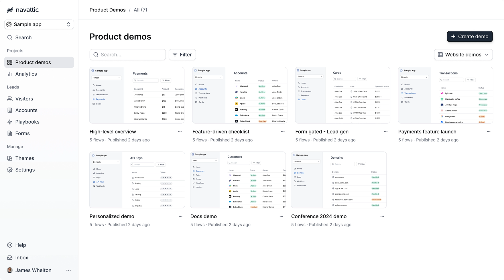
Empower your teams to share and deliver top-performing demos with confidence. To do that, first create and organize your best demos so that your team knows what to look for. Follow the video or the steps below to prepare the demos in your workspace:

<MediaCard url="https://www.loom.com/share/f488cf7ad0a144f984c3a7cf12afcd3d" type="video" title="Build a demo" />

<Steps>
  <Step title="Create a demo">
    Click `+ Create demo` on the <Icon icon="layout-grid" /> [Product demos page](https://app.navattic.com/w/product-demos).

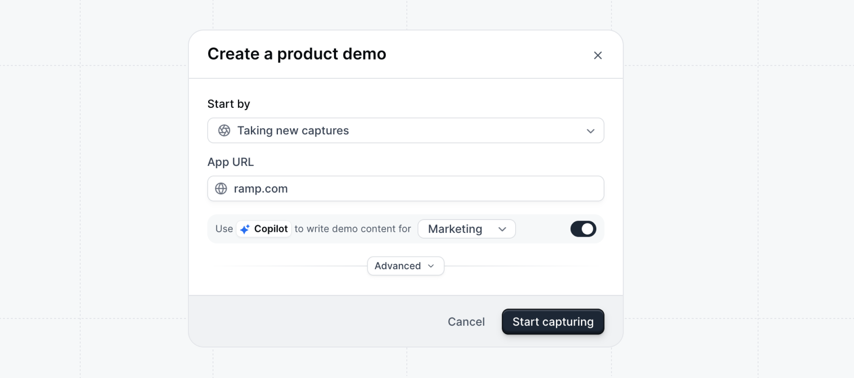
    Enter the **URL** of the app that you'd like to demo - you'll be taking captures of it next.

    Enable <Icon icon="sparkle" /> **Copilot** to have your demo be generated from the captures that you take.

    <img className="overflow-hidden rounded-xl border" src="https://mintcdn.com/navattic-app/QNOHztjorxprHO7d/images/create-demo.png?fit=max&auto=format&n=QNOHztjorxprHO7d&q=85&s=42359149f74fc0cbee0291ebbebdb422" alt="Create demo" width="1736" height="768" data-path="images/create-demo.png" />
  </Step>

  <Step title="Take captures">
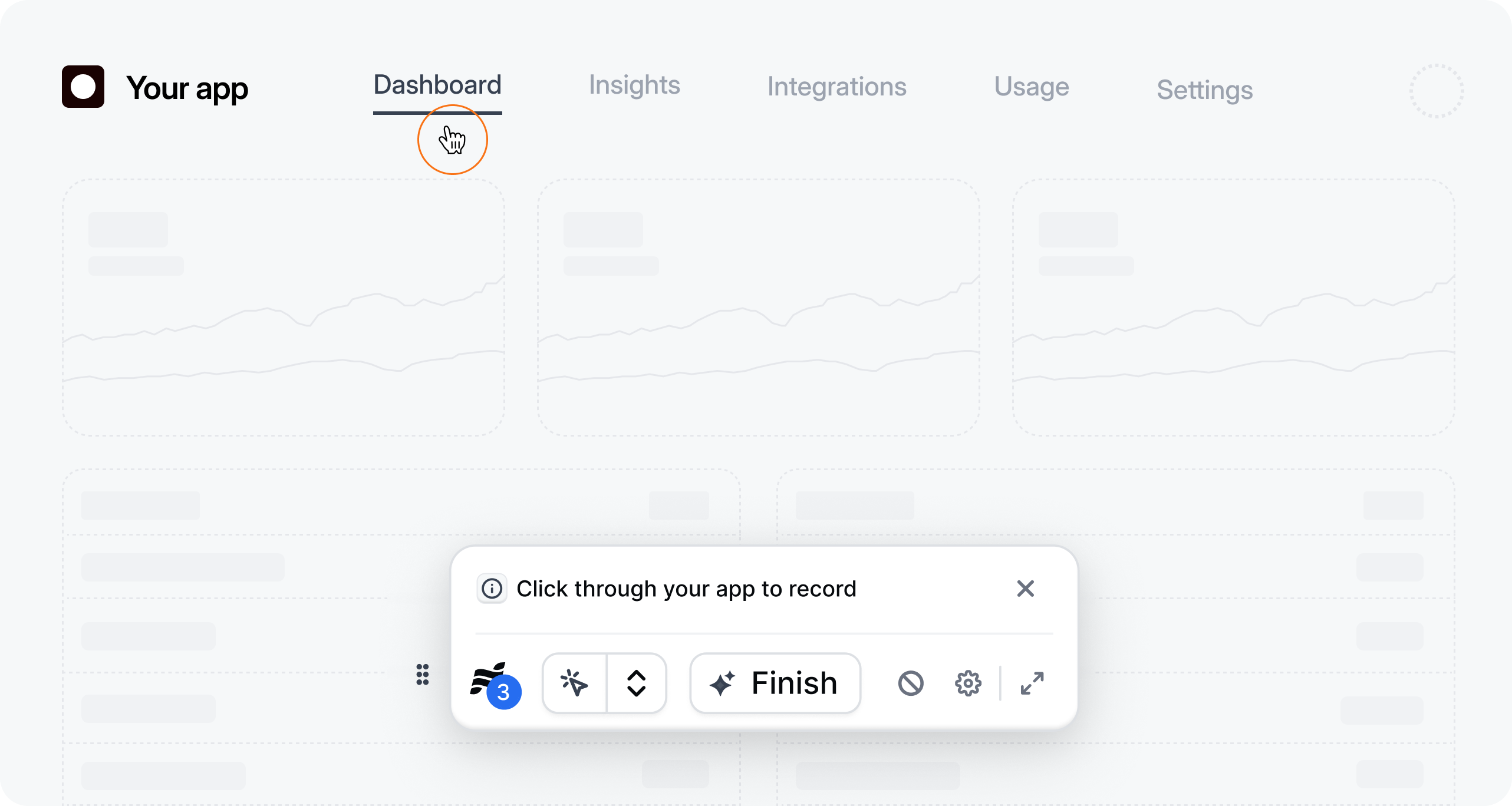
    Your app will open in a new tab. Click through your key pages of your app to take captures. Captures are interactive copies of your application.

    Learn more about <Icon icon="app-window" /> [Captures](/build/captures/web).

    <img className="overflow-hidden rounded-xl border" src="https://mintcdn.com/navattic-app/V8lxP8WymXcsG6Oa/images/capture-app.png?fit=max&auto=format&n=V8lxP8WymXcsG6Oa&q=85&s=a37f99cea12a95826a8cc5cc8a3c058a" alt="Capture app" width="2565" height="1368" data-path="images/capture-app.png" />

    <Tip>
      We recommend taking **10-15 captures** for your first demo. Focus on showing off key aha-moments of your app.
    </Tip>
  </Step>

  <Step title="Generate a demo">
    Click the `Finish` button on the floating Capture bar when you are done taking 10-15 captures.

    If you selected Copilot, your demo will be automatically generated from your captures.

    <img src="https://mintcdn.com/navattic-app/QNOHztjorxprHO7d/images/copilot-generating.png?fit=max&auto=format&n=QNOHztjorxprHO7d&q=85&s=0ad2dd7ed05d9e2fb1371d51e416c2e3" alt="Copilot generating" width="2652" height="516" data-path="images/copilot-generating.png" />

    Once your demo is generated, you can click through the steps to preview it - it's ready for review!
  </Step>

  <Step title="Make edits">
    Click on the `Edit` button in the top right corner to make any adjustments to the demo.

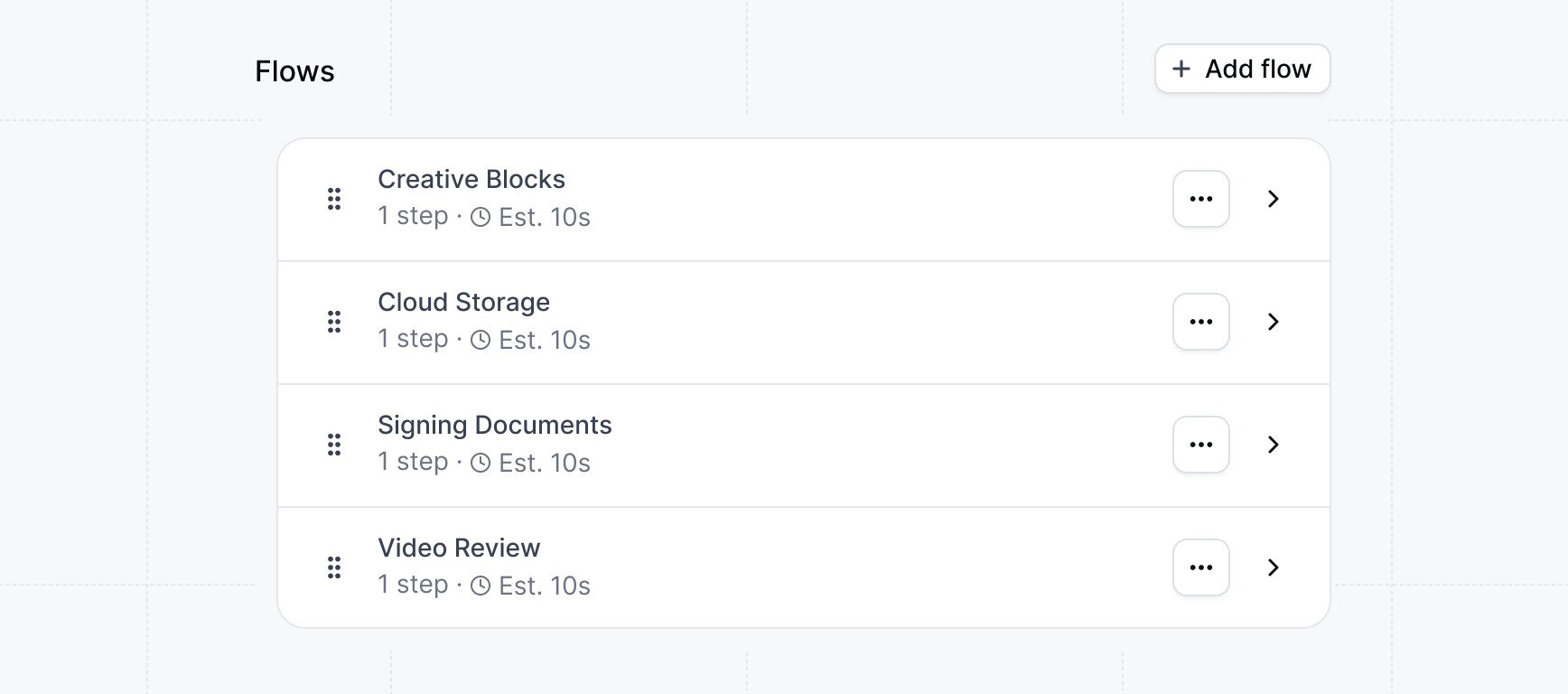
    Clicking on Edit will take you to the **Build** tab. Click on any of the generated flows to open the Flow builder and make copy or style changes to the demo. Learn more about [building flows](/build/flows).

    <img className="overflow-hidden rounded-xl border" src="https://mintcdn.com/navattic-app/eEo16-sBVsd0fYuf/images/flows-list.png?fit=max&auto=format&n=eEo16-sBVsd0fYuf&q=85&s=96a116166ff2c95af7994737fcd98d97" alt="Create demo" width="1736" height="768" data-path="images/flows-list.png" />
  </Step>

  <Step title="Publish your demo">
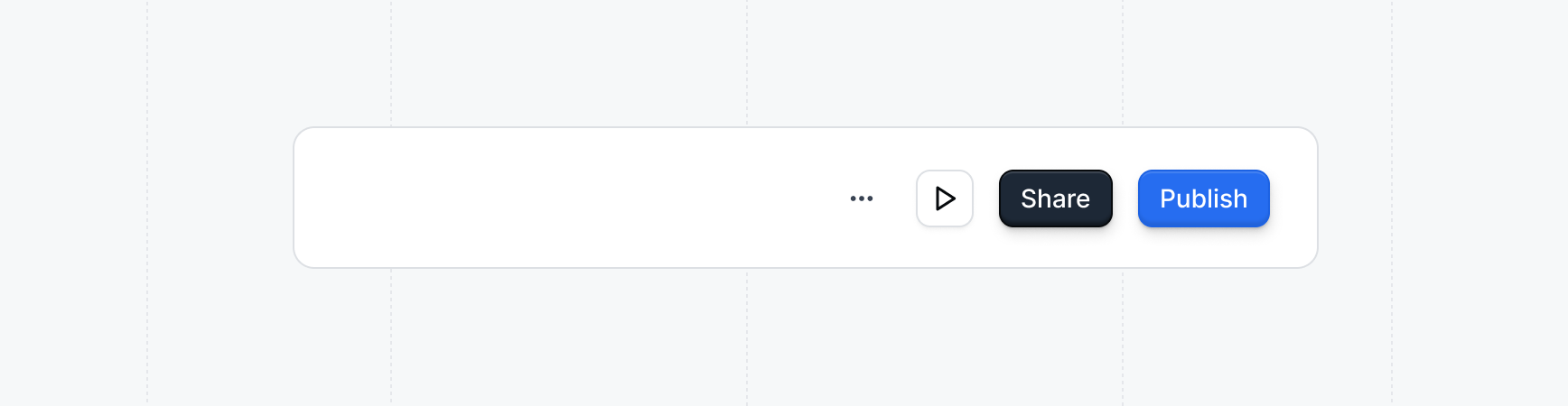
    After you're done making edits, click the `Publish` button in the top right corner to publish your changes. Click publish anytime that you want your changes to be live on the public version.

    <img className="overflow-hidden rounded-xl border" src="https://mintcdn.com/navattic-app/Wym34-C-snZlIePn/images/publish-button.png?fit=max&auto=format&n=Wym34-C-snZlIePn&q=85&s=bfc57b144d7a7ccca1aea618066fe7cc" alt="Publish button" width="1736" height="450" data-path="images/publish-button.png" />
  </Step>
</Steps>

<Icon icon="party-popper" /> **Congratulations** -- you've finished building your first
<Icon icon="layout-grid" /> **product demo** and it's ready to share! Follow the steps below to
learn how and where to use your new demo.

## Next steps

### Sharing your demo

Use cases can help you decide when and where to share a demo in your customer journey. Reviewing common patterns can make it easier to tailor your approach for different teams or workflows.

Embedding demos makes it easy for visitors to interact with your product directly on your marketing website. Follow the steps below to add a demo onto your website.

<CardGroup cols={2}>
  <Card icon="building-2" title="Use cases" href="/use-cases">
    Tips and best practices for sharing demos.
  </Card>

  <Card title="Embed your demo" icon="panels-top-left" href="/share/embed">
    Embed your demo on your marketing website or product.
  </Card>
</CardGroup>

### Building advanced demos

Take your demos to the next level by building purpose-built demos for each use case.

<CardGroup cols={2}>
  <Card title="Personalized demos" icon="user-pen" href="/demos/personalized">
    Make demos personalized by adding user and account variables
  </Card>

  <Card title="Mobile demos" icon="tablet-smartphone" href="/build/mobile">
    Showcase your mobile app in a demo.
  </Card>

  <Card title="Multilingual demos" icon="languages" href="/demos/multilingual">
    Support multiple languages in your demos.
  </Card>

  <Card title="Interest demos" icon="square-check-big" href="/demos/interest">
    Unlock a powerful insight - what features prospects are interested in seeing.
  </Card>

  <Card title="Offline demos" icon="wifi-off" href="/demos/offline">
    Use your demos offline at tradeshows and conferences.
  </Card>
</CardGroup>