> ## Documentation Index
> Fetch the complete documentation index at: https://docs.navattic.com/llms.txt
> Use this file to discover all available pages before exploring further.

# Demo builder

> Create and edit interactive demos in the Demo builder.

export const MediaCard = ({title = '', url, type = 'demo'}) => {
  const attributes = type === 'demo' ? {
    'data-navattic-open': url,
    'data-navattic-title': title
  } : {
    'data-video': url
  };
  return <div {...attributes} className="hidden md:inline-block w-auto cursor-pointer overflow-hidden rounded-lg border border-gray-200 dark:border-gray-700 shadow-sm">
<div className="flex items-center gap-3 bg-white dark:bg-gray-800 px-3 py-2">
<div className={`flex h-7 w-7 items-center justify-center rounded-md ${type === 'video' ? 'bg-blue-100 dark:bg-blue-900' : 'bg-orange-100 dark:bg-orange-900'}`} style={{
    backgroundColor: type === 'video' ? 'var(--video-bg)' : 'var(--demo-bg)'
  }}>
<Icon icon={type === 'video' ? 'circle-play' : 'square-mouse-pointer'} color={type === 'video' ? 'var(--video-icon)' : 'var(--demo-icon)'} />
</div>
<div>
<div className="text-sm font-medium text-gray-900 dark:text-gray-100">
{type === 'video' ? 'Watch video' : 'Try a demo'}
</div>
<div className="text-sm text-gray-500 dark:text-gray-400">{title}</div>
</div>
</div>
<style jsx>{`
  :root {
    --video-bg: #dbeafe;
    --video-icon: #2563eb;
    --demo-bg: #ffedd5;
    --demo-icon: #ea580c;
  }
  :global(.dark) {
    --video-bg: #1e3a8a;
    --video-icon: #60a5fa;
    --demo-bg: #7c2d12;
    --demo-icon: #fb923c;
  }
`}</style>
</div>;
};

<Note>
  If you don't have access, email [success@navattic.com](mailto:success@navattic.com) to enable the Demo builder in your workspace.
</Note>

<Frame>
  <img src="https://mintcdn.com/navattic-app/nBcURPbxfeqKXMDI/images/demo-builder.png?fit=max&auto=format&n=nBcURPbxfeqKXMDI&q=85&s=ab478b1172a68319120400615e0b2a52" alt="Demo Builder interface" width="2912" height="1600" data-path="images/demo-builder.png" />
</Frame>

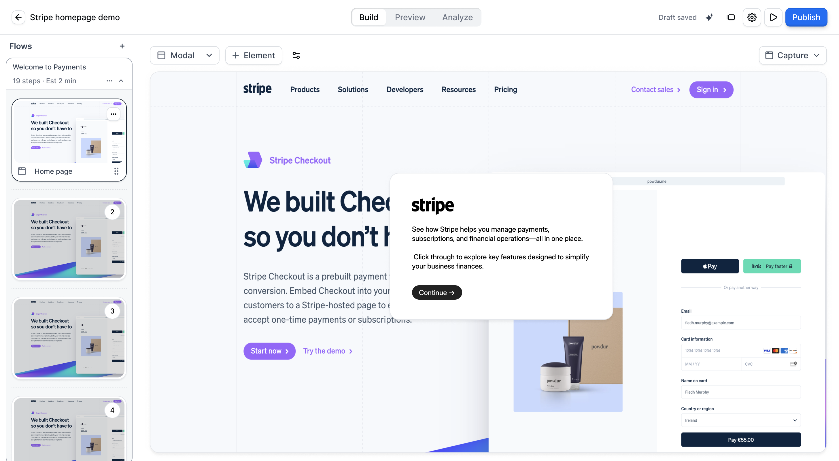
The Demo builder is a single interface for editing, managing, and analyzing your demos.
<MediaCard url="https://navattic-docs.navattic.com/m1860spg" type="demo" title="Explore the Demo builder" />

<MediaCard url="https://www.loom.com/share/40283697fa7149d59f421559a2a22a7b" type="video" title="Demo builder walkthrough" />

## Understanding the layout

When you open the Demo builder, there are four main areas:

### Main navigation tabs

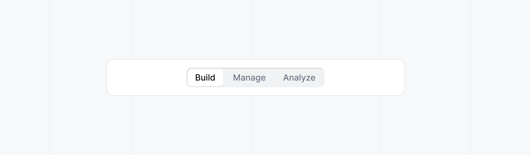
At the top of the page, you can switch between three tabs:

<Frame>
  <img src="https://mintcdn.com/navattic-app/c6OlwiFTV3AhnMmR/images/build-manage-analyze.png?fit=max&auto=format&n=c6OlwiFTV3AhnMmR&q=85&s=49dc4a9ee925dece374cc5631036aaf6" alt="Build, Manage, and Analyze tabs" width="1736" height="508" data-path="images/build-manage-analyze.png" />
</Frame>

* **Build** - Design your interactive demo with steps, tooltips, and media
* **Manage** - Configure sharing settings, organize flows, and publish your demo
* **Analyze** - Track visitor engagement, completion rates, and performance

### Flows list sidebar

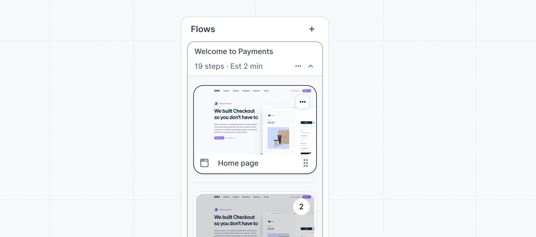
On the left side of the Build tab, you'll find a list of all the Flows and steps in your demo. Click on any step in any Flow to edit it in the main canvas.
<Frame>
  <img src="https://mintcdn.com/navattic-app/KjomeDS2qc1v-WgP/images/flows-sidebar.png?fit=max&auto=format&n=KjomeDS2qc1v-WgP&q=85&s=3888e129e3b3f5f01def28423f745dda" alt="Flows list sidebar" width="1736" height="768" data-path="images/flows-sidebar.png" />
</Frame>

### Step editor

The central area where you edit the content, appearance, and behavior of a selected step.

### Theme panel

On the right, you can adjust the look and feel of your demo by applying and customizing themes. Changes here apply across your entire demo.

### Preview

Switch to the Preview tab at any time to see how your demo will appear to viewers. Your latest changes are always reflected in the preview.

## Switch builder layout

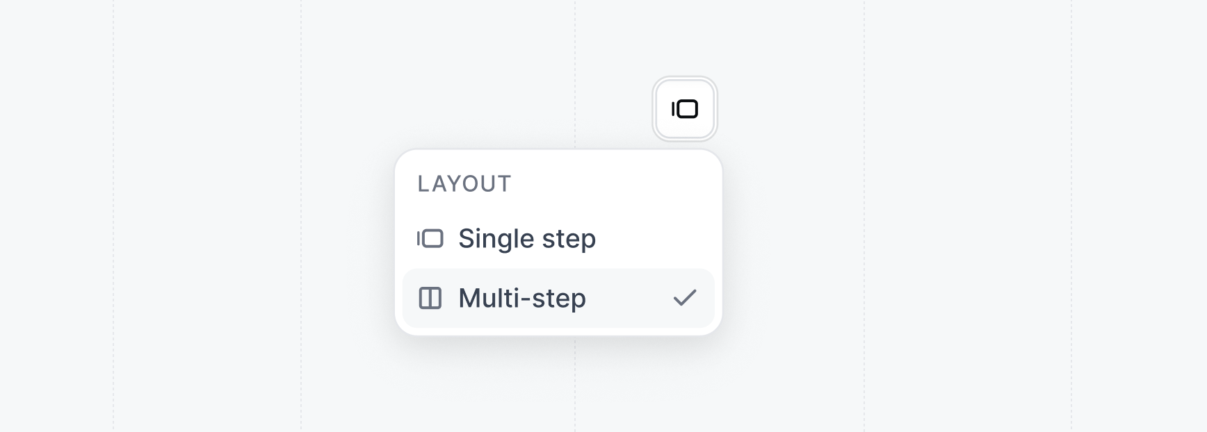
The Demo builder offers two layouts for editing. You can switch between them using the toggle in the top navigation.
<Frame>
  <img src="https://mintcdn.com/navattic-app/gAIo1UUloPoEQaTx/images/demo-builder-layout.png?fit=max&auto=format&n=gAIo1UUloPoEQaTx&q=85&s=839f66adbb74bde532a07bdbd27d5a7c" alt="Demo builder layout" width="1736" height="622" data-path="images/demo-builder-layout.png" />
</Frame>

<Tabs>
  <Tab title="Single step view">
    The default view, designed for editing one step at a time. It works with the Flows list sidebar, so you can focus on a single step while navigating to any other step in your demo.

    **When to use single step view:**

    * You want to focus on individual steps
    * You need to jump between steps across different Flows
    * You're making detailed edits to specific elements

    <Tip>
      Single step view is ideal for making quick edits across your demo. Use the Flows list sidebar to navigate between steps.
    </Tip>
  </Tab>

  <Tab title="Multi-step view">
    The classic Flow builder layout, available as multi-step view. This mode shows the entire sequence of a single Flow at once, making it easier to understand the narrative arc of your demo.

    **When to use multi-step view:**

    * You want to see the full story of a Flow from start to finish
    * You're reordering or reorganizing steps within a Flow
    * You prefer the classic Flow builder experience

    <Note>
      Multi-step view focuses on one Flow at a time. To edit steps in different Flows, you'll need to switch between them.
    </Note>
  </Tab>
</Tabs>

## What you can edit

The Demo builder provides a unified experience for building Flows. You can edit the following directly in the **Build** tab:

* <Icon icon="list-checks" /> Checklist builder
* <Icon icon="move-diagonal" /> Responsiveness settings
* <Icon icon="languages" /> Language and tracking settings
* <Icon icon="git-branch" /> Versions
* <Icon icon="palette" /> Themes

## Reordering buttons

In the Build tab, you can change the order of buttons within a step by dragging them. Click and hold the drag handle to the left of any button, then move it up or down to reposition it. The new order is saved automatically.

## Deleting a demo

Once archived, to permanently delete a demo, open the demo in the Demo builder and select **Delete demo** from the options menu in the top navigation bar.

<Warning>
  Deleting a demo is permanent and cannot be undone. All flows, captures, share links, and analytics data associated with the demo will be removed.
</Warning>

## FAQs

<AccordionGroup>
  <Accordion title="What is the main difference between single step and multi-step view?">
    Single step view is designed for editing one step at a time and works with the Flows list sidebar, making it easy to navigate across your entire demo. Multi-step view shows the entire sequence of a single Flow, which is helpful for understanding the story and reordering steps within that Flow.

    Both views offer the same editing capabilities — the difference is in how you navigate and view your content.
  </Accordion>

  <Accordion title="Can I still use the classic Flow builder?">
    Yes. The classic Flow builder is available as multi-step view. Use the toggle control to switch from single step view to multi-step view.
  </Accordion>

  <Accordion title="How do I switch between different Flows?">
    In single step view, use the Flows list sidebar on the left to see all your Flows and click on any step to edit it. In multi-step view, use the Flow dropdown to switch between different Flows.
  </Accordion>

  <Accordion title="Will my existing demos work in the Demo builder?">
    Yes. All your existing demos work in the Demo builder. You can edit them using either single step or multi-step view.
  </Accordion>
</AccordionGroup>

## Next steps

<CardGroup cols={2}>
  <Card title="Creating flows" icon="workflow" href="/build/flows">
    Learn how to create engaging step-by-step flows in your demos.
  </Card>

  <Card title="Themes" icon="palette" href="/build/themes">
    Customize the look and feel of your demos with themes.
  </Card>
</CardGroup>
