> ## Documentation Index
> Fetch the complete documentation index at: https://docs.navattic.com/llms.txt
> Use this file to discover all available pages before exploring further.

# Web captures

> Interactive copies of your application.

export const MediaCard = ({title = '', url, type = 'demo'}) => {
  const attributes = type === 'demo' ? {
    'data-navattic-open': url,
    'data-navattic-title': title
  } : {
    'data-video': url
  };
  return <div {...attributes} className="hidden w-auto cursor-pointer overflow-hidden rounded-lg border border-gray-200 shadow-sm md:inline-block dark:border-gray-700">
  <div className="flex items-center gap-3 bg-white px-3 py-2 dark:bg-gray-800">
    <div className={`flex h-7 w-7 items-center justify-center rounded-md ${type === 'video' ? 'bg-blue-100 dark:bg-blue-900' : 'bg-orange-100 dark:bg-orange-900'}`} style={{
    backgroundColor: type === 'video' ? 'var(--video-bg)' : 'var(--demo-bg)'
  }}>
      <Icon icon={type === 'video' ? 'circle-play' : 'square-mouse-pointer'} color={type === 'video' ? 'var(--video-icon)' : 'var(--demo-icon)'} />
    </div>
    <div>
      <div className="text-sm font-medium text-gray-900 dark:text-gray-100">
        {type === 'video' ? 'Watch video' : 'Try a demo'}
      </div>
      <div className="text-sm text-gray-500 dark:text-gray-400">{title}</div>
    </div>
  </div>
  <style jsx>{`
    :root {
      --video-bg: #dbeafe;
      --video-icon: #2563eb;
      --demo-bg: #ffedd5;
      --demo-icon: #ea580c;
    }
    :global(.dark) {
      --video-bg: #1e3a8a;
      --video-icon: #60a5fa;
      --demo-bg: #7c2d12;
      --demo-icon: #fb923c;
    }
  `}</style>
</div>;
};

<img src="https://mintcdn.com/navattic-app/V8lxP8WymXcsG6Oa/images/captures-1.png?fit=max&auto=format&n=V8lxP8WymXcsG6Oa&q=85&s=72b1fd97fbdccf3dcf7c435d14733b7c" alt="" width="1600" height="900" data-path="images/captures-1.png" />

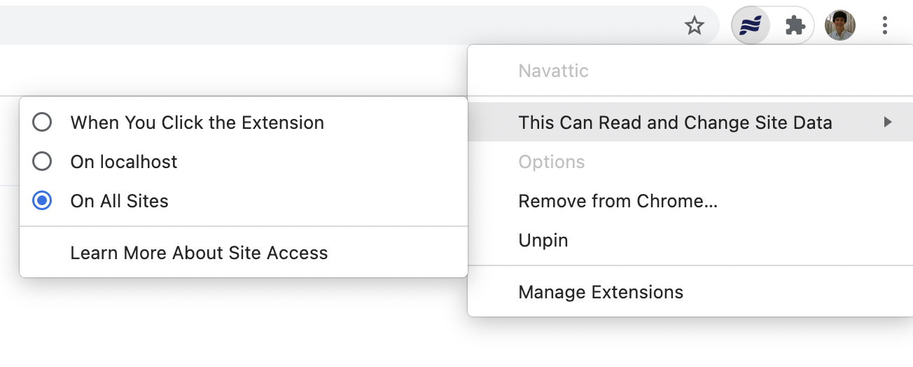
Web Captures are interactive HTML-based copies of any application accessed in a browser, including scrolling, hover states, and other native behaviors. Web Captures can be edited directly in Navattic's no-code editor. For Mobile or Desktop native apps, use [Media Captures](/build/captures/media) instead: images, GIFs, or videos.

<MediaCard url="https://training.navattic.com/tp2e0vbm" title="Web and Media Captures example" />

<MediaCard url="https://www.youtube.com/watch?v=8RYOpkJrKyA" type="video" title="Capture Tutorial" />

<Steps>
  <Step title="Take Captures">
    Follow the in-app prompt to [install the Navattic Chrome extension](https://chromewebstore.google.com/detail/navattic/lbecioncobbndebbfdopnpinnibemoon) if needed. Visit **Product Demos** > **Create demo**. Select **Creating new captures** and enter your **App URL**. Click **Start Capturing**.

    This opens a new tab with your application and the Navattic extension active.

    Navattic supports two ways to take captures:

    * **Click to Capture** (recommended for most demos): Navattic automatically captures the screen when you click an element. Best for demos using Tooltips, Beacons, or Triggers.
    * **Manual Capture**: Click **Capture** in the extension bar to save the current screen. Use this when you need precise control over when each capture is taken.

    Take captures using these three steps:

    1. Take a capture (click an element with Click to Capture, or click **Capture** in the extension bar for Manual Capture)
    2. Once the capture finishes loading, navigate to the next page and repeat
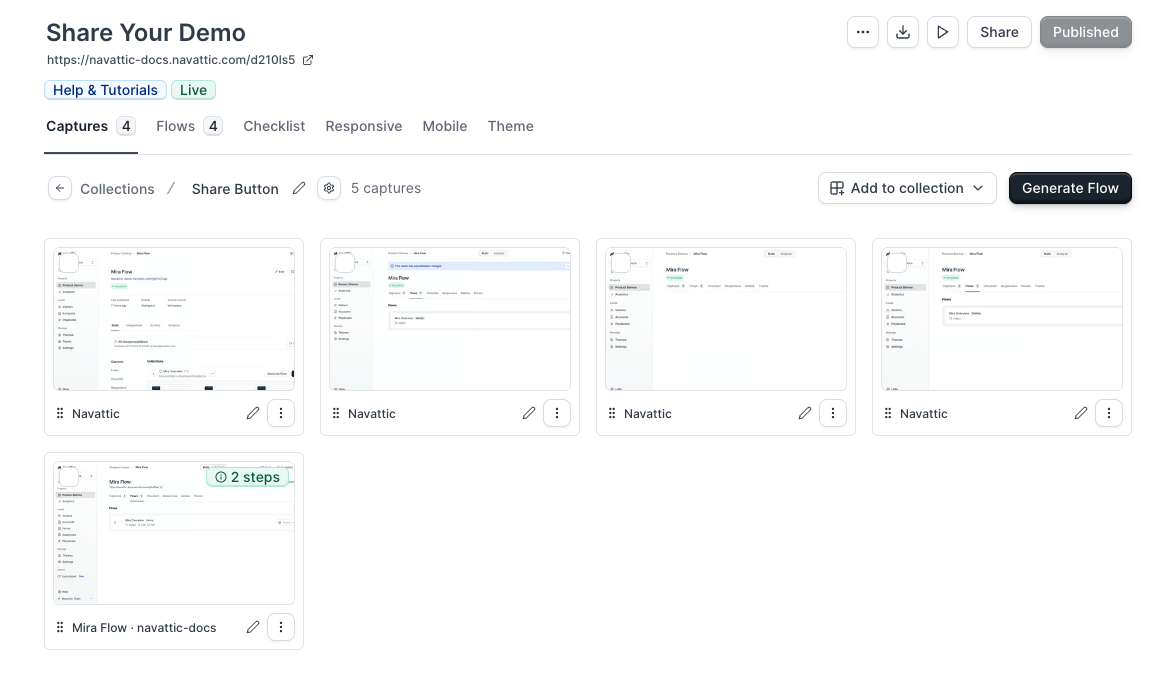
    3. Click **Finish** > **Begin building demo** to return to your completed Capture Collection

    ### Adding captures to an existing demo or collection

    You don't need to start from scratch to add more captures. From any existing demo, go to the **Captures** tab, then choose one of two paths:

    * **Add to an existing collection**: select the collection you want to extend > click **Add captures** > the extension opens on the app URL you started with, and new captures are appended to the end of the collection.
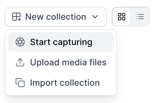
    * **Start a new collection in this demo**: click **New Collection** > enter a name for the collection and your App URL > click **Start capturing**.

    Either way, capturing works the same as described above. Click to Capture and Manual Capture both behave identically whether you're starting fresh or adding to a collection that already exists.

    <img src="https://mintcdn.com/navattic-app/V8lxP8WymXcsG6Oa/images/captures-12.png?fit=max&auto=format&n=V8lxP8WymXcsG6Oa&q=85&s=ff78c4d97de5e46c6f24847a00f820a5" size="36" width="300" height="334" position="center" caption={true} className="mx-auto" style={{ width:"64%" }} data-path="images/captures-12.png" />

    **Keeping captures consistent when adding to an existing collection**

    When you add captures to an existing collection, Navattic checks whether your browser viewport matches the collection's saved dimensions. If they don't match, a **"Resize to match collection?"** prompt appears in the capture bar. Click **Resize** to auto-adjust your window; the tooltip shows the exact change, for example `1325x819 → 1512x288`. This prompt shows once per session and dismisses after your first capture.

    You can also set a collection's default dimensions manually: open the collection, click **Edit collection details**, and enter your preferred **Width** and **Height**. A **Collection** preset button then appears in the viewport sizing panel during future capture sessions for that collection.
  </Step>

  <Step title="Add Captures to a Flow">
    Flows combine captures with dialog boxes to tell a story about your product. From your Capture collection, click **Generate flow** to automatically arrange captures in the order they were taken.

    <Note>
      If Copilot is enabled in your workspace, a flow is generated automatically when you complete the capture session. You'll land directly in the flow builder with your captures already arranged.
    </Note>

    This video demonstrates how to create a flow and the different step types within the flow builder.

    <MediaCard url="https://www.loom.com/share/8bc441b4963a431e89a94eb845fa5c29?sid=c7b8b3ac-2c49-42e9-9e09-0fa9bcb1b7ec" title="Captures" type="video" />
  </Step>

  <Step title="Edit Captures (optional)">
    <Warning>
      The Capture Editor is an effective way to change the visual appearance of captures, but avoid capturing sensitive information in the first place.
    </Warning>

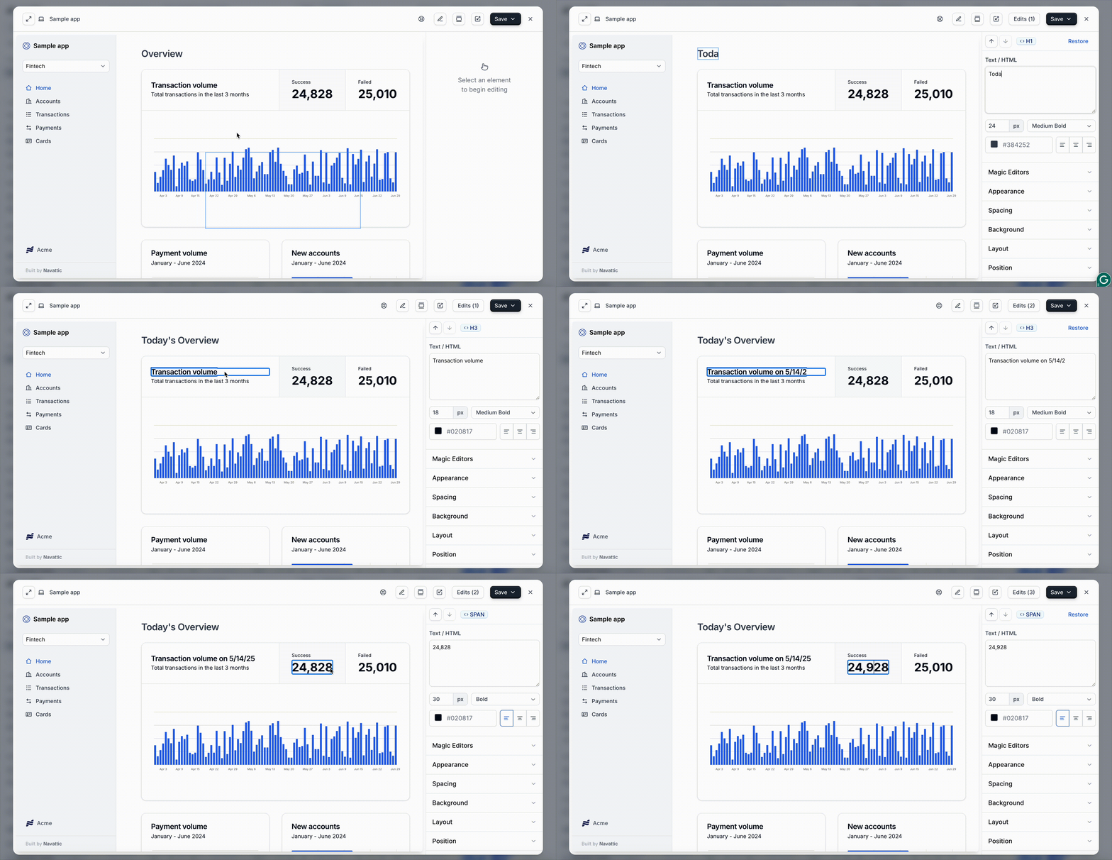
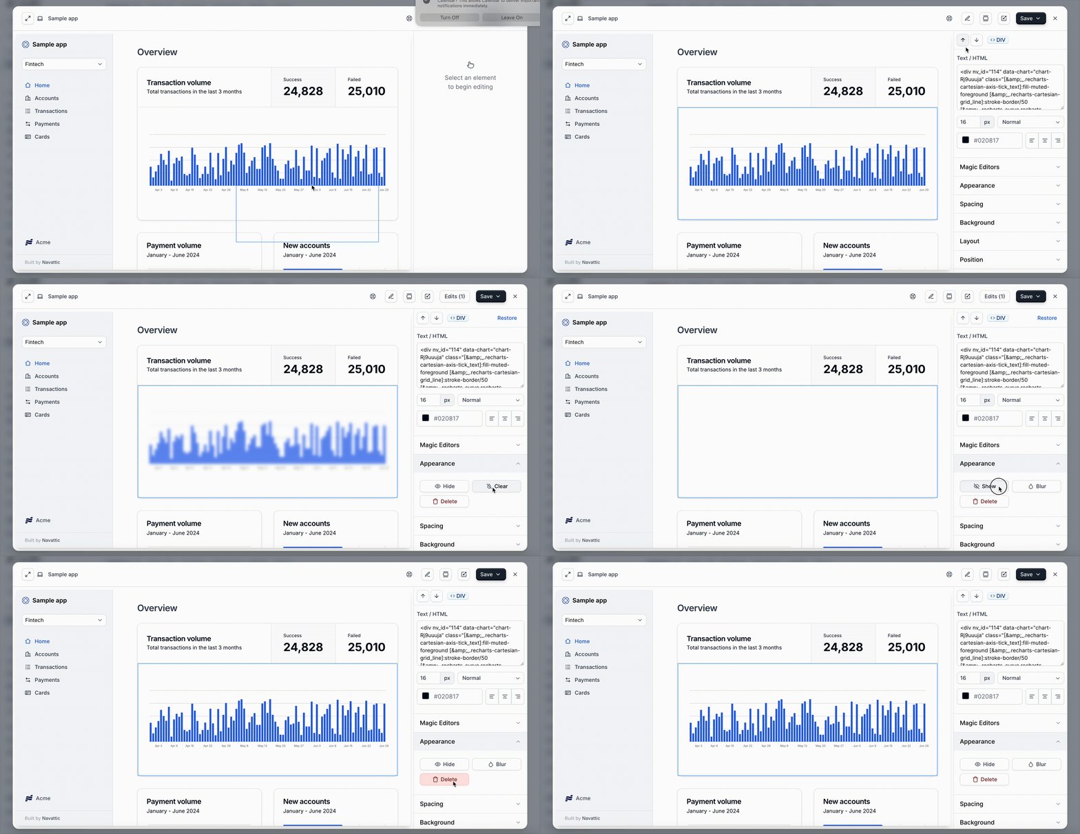
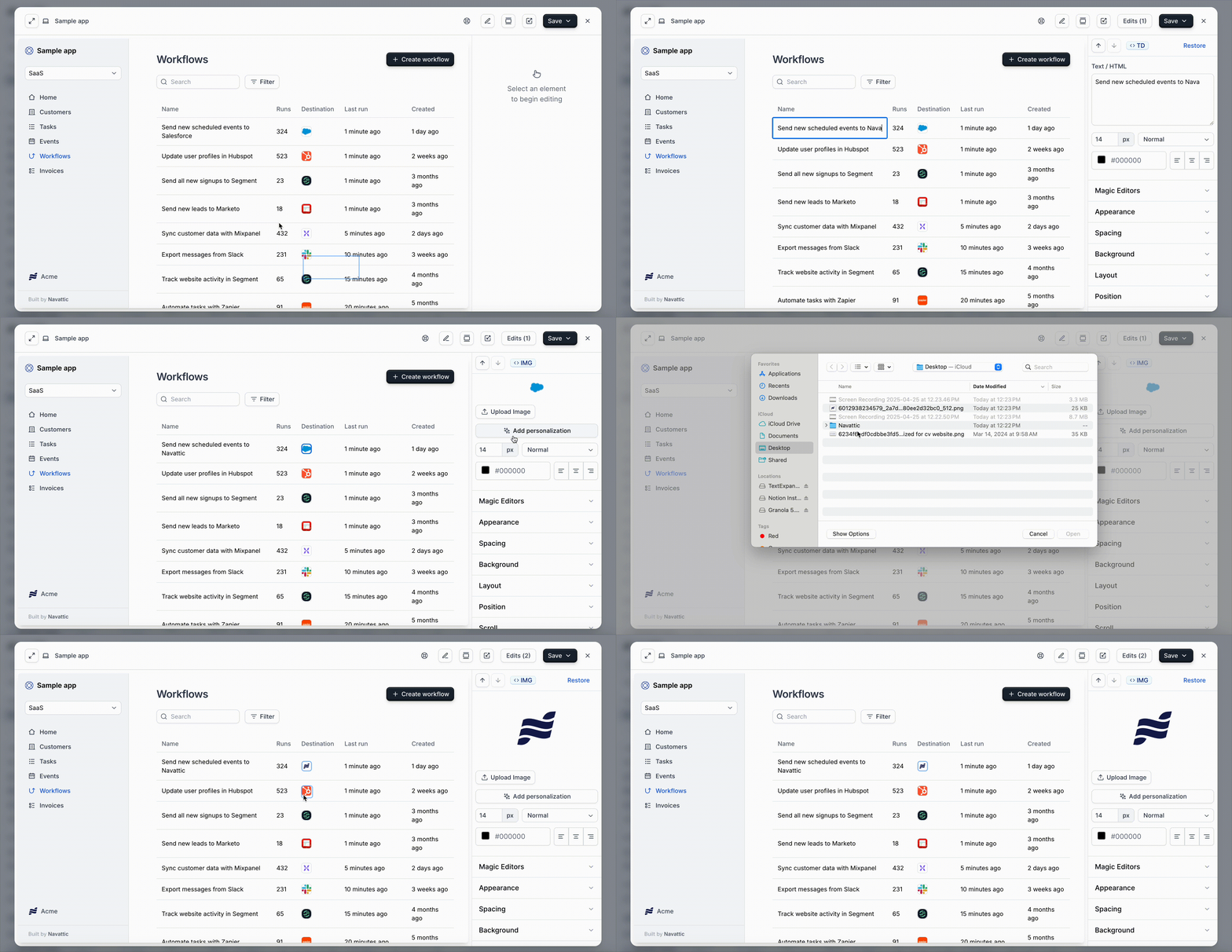
    Click **Edit** on the Capture (top right in Single Step view, bottom right in Multi Step view), then select any element on a capture to open its editing toolbar. Text, appearance, and advanced edits all happen in place, without leaving the capture.

    Before you select anything, a hint follows your cursor reading **"Click to edit an element"**. Use the **element traversal arrows** at the end of the toolbar to select elements with precision.

    <MediaCard url="https://navattic-website.navattic.com/tar0rkt" type="demo" title="Inline Capture Editor + Copilot Capture Edits" />

    ### The element toolbar

    | Icon   | Name                  | What it does                                                                                                             |
    | ------ | --------------------- | ------------------------------------------------------------------------------------------------------------------------ |
    | T      | **Edit text**         | Replace or reformat the selected text field.                                                                             |
    | Robot  | **Edit with Copilot** | Modify the element using AI prompts.                                                                                     |
    | Wand   | **Advanced edit**     | Opens dynamic, no-code tools: personalization, tethering, overlays, and more. See [Advanced edit](#advanced-edit) below. |
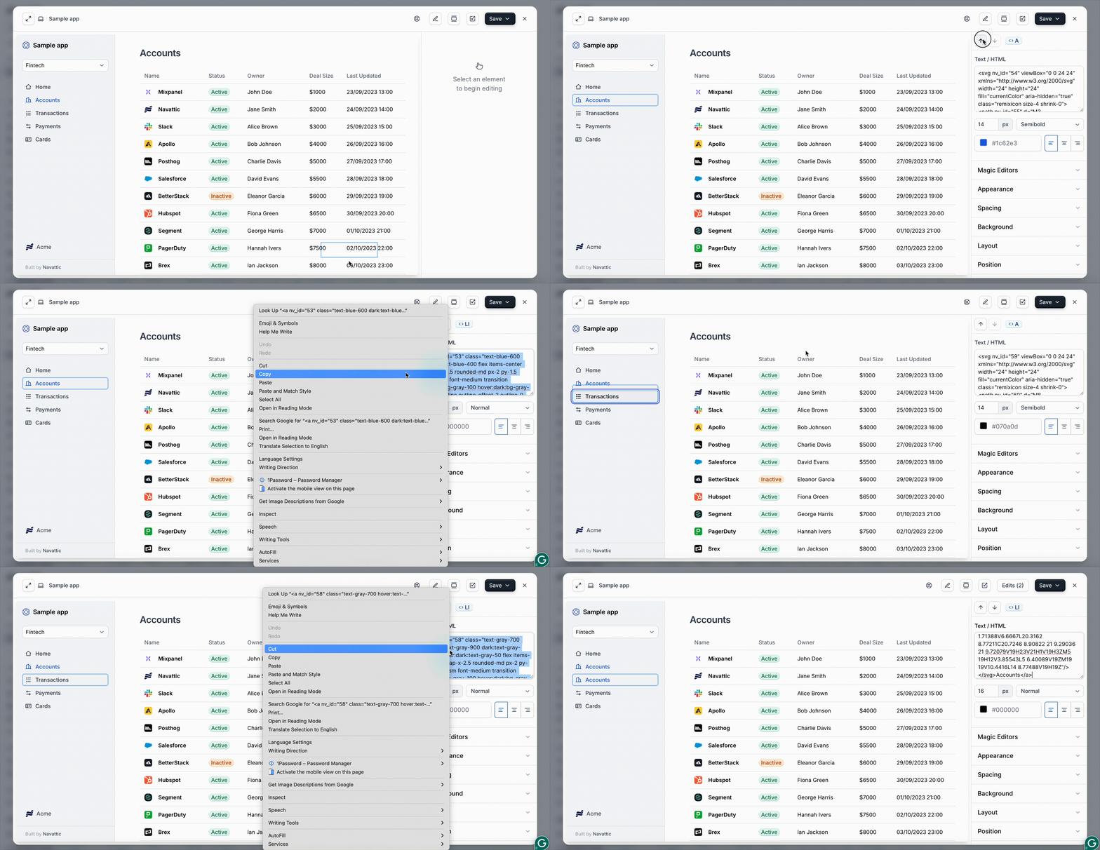
    | `</>`  | **Edit HTML**         | Edit the element's underlying HTML and CSS directly.                                                                     |
    | Person | **Personalization**   | Insert user attributes, like a name or company, that dynamically populate for each visitor.                              |
    | `...`  | **More options**      | Hide, Blur, Duplicate, Background, Scroll settings, or Delete the element. See [More options](#more-options) below.      |
    | `⌃⌄`   | **Traversal arrows**  | Step to the parent or child element for precise selection.                                                               |

    <Note>
      When you select an image, the first button becomes **Replace image** instead of **Edit text**, and Personalization moves inside the Replace image popover.
    </Note>

    ### Edit text

    Select any text field and type directly in the capture. The toolbar swaps to text formatting controls: font size, **Bold**, *Italic*, Underline, text color, background color, and a shortcut into **Edit HTML**. Click **Done** to return to the main toolbar.

    ### Edit with Copilot

    Describe the change you want in plain language and Copilot applies it to the selected element. Click the robot icon, type your request into the **"Describe an edit…"** field, and press Enter.

    Copilot can rewrite text, adjust styling, hide or blur elements, regenerate image content (including SVG charts and icons), and insert personalization variables.

    While it works, a status chip appears next to the element with a **Stop** button if you want to cancel. When it finishes, a confirmation reads **"Copilot applied N edits"** with two choices:

    * **Keep**: accept the change.
    * **Undo**: revert it.

    You need to Keep or Undo a result before running another Copilot edit on the same element.

    <Note>
      Copilot capture editing requires a plan that includes Copilot. If it's greyed out in your toolbar, the tooltip reads "Copilot editing is not included in your plan. Upgrade to unlock it."
    </Note>

    ### Edit HTML

    Click the `</>` icon to open a panel with the element's raw markup and styles. It has two tabs:

    * **HTML**: edit the element's HTML content and attributes in a syntax-highlighted editor. Type `{{` to insert a personalization variable using `{{variable | fallback}}` syntax, where the fallback shows when the variable has no value. For input and textarea elements, you also get **Placeholder** and **Read-only** controls.
    * **Style**: add, search, edit, or remove individual CSS properties on the element.

    Click **Expand editor** for a fullscreen view when you're working with a lot of markup.

    <Warning>
      Changes apply live as you type. **Discard** closes the panel but does not revert what you've already typed. Use undo (Cmd+Z / Ctrl+Z) or the [Versions](#versions) drawer to roll back an HTML edit.
    </Warning>

    ### Personalization

    Insert user attributes, like a name or company, that dynamically populate for each visitor. Learn more about [identifying Visitors](/tracking/identify/visitors).

    ### More options

    <Expandable title="Hide">
      Remove the element from view without deleting it. The menu item reads **Show** once hidden, so you can bring it back.
    </Expandable>

    <Expandable title="Blur">
      Obscure sensitive or distracting content. A slider sets the blur amount up to 30px.
    </Expandable>

    <Expandable title="Duplicate">
      Copy the element within the same capture.
    </Expandable>

    <Expandable title="Background">
      Replace a background image, or add one to a non-image element.
    </Expandable>

    <Expandable title="Scroll settings">
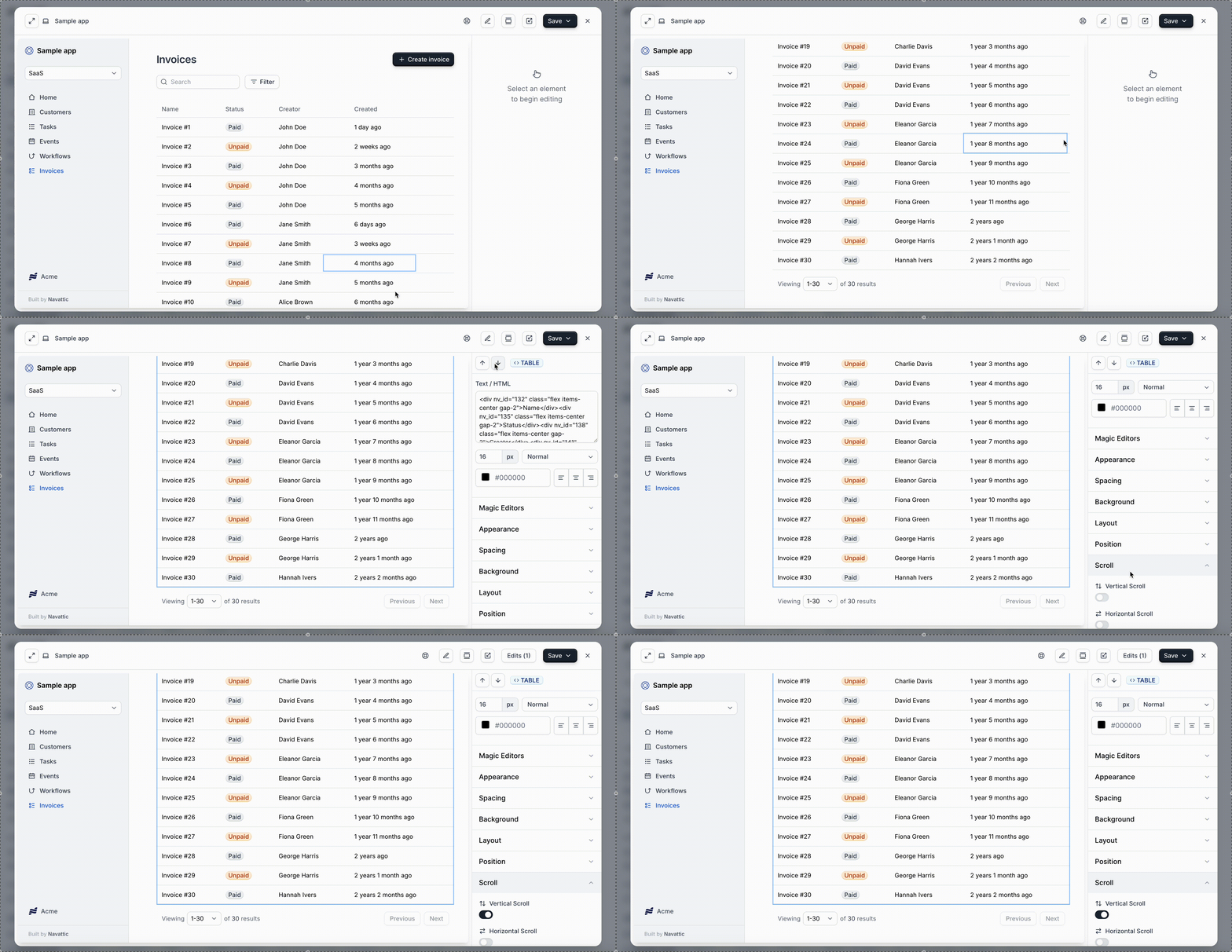
      Lock an element's vertical or horizontal scroll. This is distinct from **Sync element scroll** under [Advanced edit](#advanced-edit), which links two scrollable elements together.
    </Expandable>

    <Expandable title="Delete element">
      Remove the element entirely.
    </Expandable>

    ### Traversal arrows

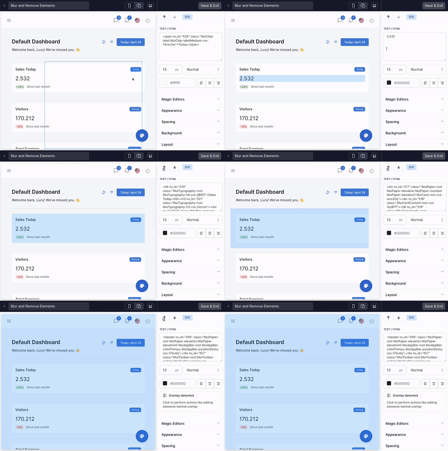
    Use **Select parent** (up) and **Select child** (down) to step through the element tree when the element you want is nested or overlapping behind another. The arrows grey out when there's nothing further to select in that direction.

    ### Collection edits

    Apply a change made to one capture across all matching captures in the same collection, without repeating the edit manually.

    When you save changes in the capture editor, **Save** offers two options:

    * **Save**: apply changes to this capture only.
    * **Save and review collection edit**: save this capture, then review which other captures in the collection match your changes before applying them.

    Choosing **Save and review** opens a confirmation screen showing how many other captures match. Click **Review changes** to see each matching capture side by side, toggle individual captures on or off, then click **Apply to N captures**. If no other captures match, the screen notes the edit applies only to the current capture.
  </Step>
</Steps>

## Advanced edit

Select an element, then click the wand icon (**Advanced edit**) for dynamic tools that go beyond basic text and appearance changes. No code required.

<Expandable title="Animate text">
  Creates a "typing" animation for any text element. Only enabled when a text element is selected; otherwise the tooltip reads "This element cannot be animated."
</Expandable>

<Expandable title="Find and replace">
  Replace all instances of text, images, or colors across an entire capture at once. The panel header reads **Find & Replace**.
</Expandable>

<Expandable title="Up-to-date">
  Automatically finds dates in your Capture and keeps them fresh relative to the current day.
</Expandable>

<Expandable title="Table AI">
  Write a prompt describing the changes you want, and AI updates the content within your tables. Available in workspaces with Copilot enabled.
</Expandable>

<Expandable title="Force hover state">
  Keeps hover-triggered UI such as dropdowns and tooltips visible by locking them in a hover state.
  Use this when editing content that would otherwise disappear as soon as you move your cursor away.
  The panel header reads **Force Hover**.
</Expandable>

<Expandable title="Tether position">
  Locks the position of one element relative to another. Useful for dropdowns or pop-ups that should move with their parent element on scroll. The panel header reads **Tether**.
</Expandable>

<Expandable title="Sync element scroll">
  Links two scrollable elements together, so scrolling one scrolls the other. Ideal for side-by-side
  panels or tables that need to stay aligned. The panel header reads **Scroll Sync**. This is
  distinct from **Scroll settings** under [More options](#more-options), which locks a single
  element's own scroll.
</Expandable>

<Expandable title="Overlay drilling">
  See and edit content hidden behind an overlay, such as a pop-up modal or dropdown menu. The panel header reads **Overlay**.
</Expandable>

<Expandable title="Dynamic embed">
  Insert an iframe into your capture that fetches and displays content from an external source.
</Expandable>

<Tip>
  If you click an element and see a **"This element is likely an overlay"** message, click **Open
  overlay editor** in that message to jump straight to Overlay drilling.
</Tip>

## Recapturing

When your product's UI changes, use **Recapture** to refresh an existing Capture or an entire Collection without rebuilding your demo from scratch.

In the capture editor, click the dropdown arrow next to **Edit capture** to find:

* **Reselect capture**: swap this step to a different capture you've already taken. This opens the capture picker, where you choose a collection and then a capture from it. It does not launch the extension or take a new capture.
* **Recapture**: retake the screen at its original URL.

### How recapture works

Choosing **Recapture** opens a dialog pre-filled with the capture's original **App URL**, which you can edit if the page has moved. Click **Recapture** to open the extension and retake the screen.

Before the new capture replaces the old one, you get a **Compare captures** view with a slider between the old and new versions. From there:

* **Retake capture**: try again.
* **Replace capture**: continue to confirmation, then click **Confirm recapture**.

Recapture creates a new version of the capture rather than overwriting it. Every step using that capture updates automatically, and you can revert from the [Versions](#versions) drawer at any time.

Recapture also re-matches anchors from the original Capture, so tooltips, beacons, and triggers generally stay attached to the same elements. Anchors whose elements no longer exist on the new page are removed, so it's worth previewing your flow afterward.

<Note>
  If your Collection is a shared **Workspace Collection**, recapturing updates it once and the
  change propagates to every demo using that collection. You don't need to repeat the recapture in
  each demo. Re-check your anchors in each demo afterward, since anchor re-matching doesn't run
  automatically for shared collections.
</Note>

## Capturing multiple flows in one session

Record screens for multiple flows without stopping and restarting, so you can build every flow for a demo in one pass.

**Starting a new flow:** while capturing, click **New flow** in the capture bar, name the flow, and continue capturing. A badge on the capture list marks the active flow, and a notification appears each time a new flow starts.

<Note>
  Keep each flow focused on a single topic or user journey. A notification appears in the capture
  bar if a flow has too many captures. Split into a new flow to keep demos easy to follow.
</Note>

**Reviewing and finishing:** click **Complete session** when done. A review screen shows every flow recorded. Rename any flow before finalizing, then click **Create** to save all flows and return to the demo builder.

<Note>
  For Navattic Agent environments, multi-flow capture is always on. Every session creates flows that
  feed directly into the environment's flow list.
</Note>

## Capture settings

Three demo-wide settings are also reachable directly from a capture. Click the **...** menu next to **Edit capture** to find a **Capture** group with **Versions**, **Responsiveness**, and **Device frame**.

### Device frames

Device frames wrap a capture in a realistic Mobile, Tablet, or Desktop border. They work on Web Captures as well as Media Captures.

Open **... > Device frame** in the capture editor and turn on **Use device frame**. Then:

1. Pick **Mobile**, **Desktop**, or **Tablet**.
2. Choose a specific device from the **Device Frame** dropdown (iPhone 16 Pro, Pixel 9, iPad Pro 11, MacBook Pro, and more). Selecting **None** gives you a plain shadow outline instead of a hardware frame.
3. For Mobile and Tablet, toggle **Use landscape frame** if you want a horizontal orientation. Desktop frames have no landscape option.
4. Optionally add a **Background image** (set to Cover or Contain) and a **Background color** behind the frame.

Your live, interactive capture renders inside the frame (it isn't flattened to a screenshot). Tooltips, beacons, and triggers position themselves against the framed viewport.

Click **Apply across collection** to use the same frame and background color for every existing and new capture in the collection. Background images and custom sizes aren't carried over by this button.

Applying a device frame publishes a new capture version, so the change appears in **Versions** and you can revert it.

### Versions

Every time you publish a demo, Navattic creates a new **version**. A version is a snapshot of the whole demo at that moment, independent of any single capture or collection. Open **Versions** from the demo header menu, or from **... > Versions** in the capture editor, to:

* **Restore**: revert your current draft to a previous version.
* **Preview**: view a specific version to see how it looked and functioned.
* **Edit Details**: update a version's title and description to keep your history organized.

Restoring a version only updates your draft. You'll still need to publish for the restored version to go live.

### Responsiveness

Responsiveness controls how a demo's captures adapt to different screen sizes. Set it under **Build > Responsive**, or from **... > Responsiveness** in the capture editor. Navattic offers five strategies:

| Strategy                   | Behavior                                                                                                                     |
| -------------------------- | ---------------------------------------------------------------------------------------------------------------------------- |
| **Scale width**            | Fits the capture's width to the visitor's screen. Good for smaller iframe embeds or varied devices.                          |
| **Responsive** (default)   | Applies your application's own responsive styles per viewport. The most realistic option for direct demo links.              |
| **Scale width and height** | Fills the entire screen while preserving the capture's original proportions.                                                 |
| **Fixed**                  | Presents captures at their original dimensions; visitors scroll if there's overflow.                                         |
| **Contain**                | Scales to fit the viewport while preserving aspect ratio. No cropping or scrolling, but may letterbox on mismatched screens. |

<Tip>
  When setting responsiveness for an individual capture via **... > Responsiveness** in the capture editor, keep the strategy set to **Inherit**. This lets the capture follow the demo's overall responsive strategy, so you only need to configure responsiveness in one place. Override it only if a specific capture needs different behavior from the rest of the demo.
</Tip>

See [Responsive strategies](/build/responsive) for the full walkthrough, including previews of each.

## FAQs

<AccordionGroup>
  <Accordion title="How do I capture a dropdown or popup menu?">
    If you're having trouble capturing an onscreen element, use the keyboard command Ctrl+C (Cmd+C on Mac) to take the capture.
  </Accordion>

  <Accordion title="How do I edit a Capture after adding it to a Flow?">
    From the Flow Builder, locate the Capture you'd like to edit > click the arrows icon to expand the Capture > click **Edit**. Save and exit when complete. Your edits apply to every step that references this Capture. To avoid that, duplicate the Capture before editing it.
  </Accordion>

  <Accordion title="How do I edit the background of a Capture when a popup or modal is present?">
    Use the up and down arrows to select the background element > **Advanced edit** > **Overlay drilling**. You may need to drill through a few layers before reaching the element you want to edit.
  </Accordion>

  <Accordion title="How do I edit text in my Captures?">
    **Never capture sensitive data.** The Capture Editor can quickly replace text or alter distracting elements, but we ask customers to avoid capturing sensitive data altogether.

    To edit non-sensitive text, select the text field and type directly in the capture, or use **Edit HTML** for finer control over the markup.
  </Accordion>

  <Accordion title="How can I add an image as the background of a captured element?">
    Select the element (a DIV, NAV, or other non-IMG element) > **...** > **Background** > **Upload image** > upload from local storage. Use **Position**, **Size**, and **Repeat** to adjust as needed.
  </Accordion>

  <Accordion title="Can I capture an app running locally or in a staging environment?">
    In most cases, yes. Captures are taken from whatever's open in your browser tab: a local dev server (for example `localhost:3000`), a staging URL, or a page behind login can typically be captured the same way as production.

    * **Web Captures:** open your local or staging app in the browser, then run the Navattic Chrome extension against it. If it doesn't activate, confirm it has permission for that domain (see "I am unable to load the Navattic extension" below).
    * **Media Captures:** take screenshots or a screen recording of your local build and [upload them as media](/build/captures/media).

    Because captures are static copies, a locally captured screen keeps working in your demo even after the local server goes down.

    <Warning>
      Local and staging environments often contain test or sensitive data. Review every capture and blur, hide, or delete anything that shouldn't ship in a demo before publishing.
    </Warning>
  </Accordion>

  <Accordion title="Which browsers does the Navattic extension support?">
    Chrome and most Chromium-based browsers, including Microsoft Edge, Brave, and Opera.

    Some Chromium-based browsers require enabling extensions from the Chrome Web Store before installing:

    * **Microsoft Edge:** Settings > Extensions > Manage extensions > toggle on **Allow extensions from other stores**.
    * **Brave:** Settings > Extensions > enable **Allow extensions from the Chrome Web Store**.
    * **Opera:** Extensions > Manage extensions > click **Allow from other stores** when prompted.

    Then install from the [Chrome Web Store](https://chromewebstore.google.com/detail/navattic/lbecioncobbndebbfdopnpinnibemoon) as usual.
  </Accordion>

  <Accordion title="I am unable to load the Navattic extension.">
    When you start capturing a new domain, the extension requests permission to access that site. Click **Allow** in the browser dialog to activate it.

    If the dialog doesn't appear, or you previously declined it, grant access manually:

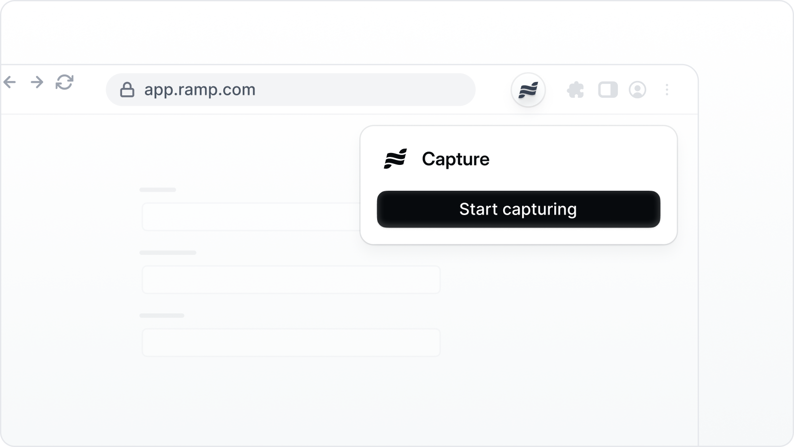
    1. Click the Navattic icon in the extension bar. If it's hidden, click the puzzle icon and pin it.
    2. Open **This Can Read and Change Site Data**.
    3. Select the appropriate sites.
    4. Refresh app.navattic.com and any pages where you want to run the extension.

           <img src="https://mintcdn.com/navattic-app/V8lxP8WymXcsG6Oa/images/captures-11.png?fit=max&auto=format&n=V8lxP8WymXcsG6Oa&q=85&s=66c70bb7889f663300e3b57177dfc343" alt="" width="1304" height="524" data-path="images/captures-11.png" />
  </Accordion>
</AccordionGroup>